Information that has relationships between elements may be represented spatially, particularly if some distance metric can be brought to bear. Using multi-dimensional scaling to assign X, Y coordinates, non-spatial data may be imported into ArcView as tabular data, then added to a View as an Event Theme (point features). Spatial analysis may then be used to facilitate graphical representation of the data and to highlight information previously opaque. This paper discusses the analysis method using examples from research in lexical semantic analysis and author co-citation analysis.
Introduction
Visualization of non-spatial information (statistics, databases, online books, web pages, and so on) is a growing art in such fields as data mining, chemistry and pharmaceuticals, medical diagnosis, economics, and scientific data visualization generally. Non-spatial data may be joined to geocoded files with matching attributes and displayed as regular maps. Unfortunately non-spatial data often has no corresponding geocoded representation; yet valuable information may still be derived if the right representation can be found. Traditionally this has been achieved through charts and graphs. This paper describes methods for enabling the spatial analysis of non-spatial data using spatial information systems, the most mature of which are Geographic Information Systems (GIS).
The main problem for non-spatial data representation is how to identify or extract existing attributes in the data that can be used for spatial representation, or, alternatively, how to convert the data to a form that has spatial attributes. The use of distance metrics (dissimilarity, relevance, disutility, correlation) that are then converted to a spatial format using multidimensional scaling (MDS) techniques, is the primary method suggested here. Other possibly fruitful methods of conversion are factor analysis and Kohonen nets (Small, 1998), clustering and geometric triangulation (Small, 1999), and singular value decomposition. Categorical data also may be converted by assigning numeric indices and utilizing natural distributions in the data.
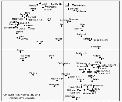
White and McCain (1998) applied MDS to co-citation ( mutual citation) data, extracted from ISI's Social Science Citation Index, of the most-cited authors in the field of information science. The resulting chart or map (based on Fig 6, p. 350, White and McCain, 1998) allows the viewer to gain an intuition about the intellectual relationships between authors, as reflected by their proximity to each other in the MDS output.
This paper aims to demonstrate the power of spatial information systems, in particular, Geographic Information Systems to represent and manipulate this type of data in new and interesting ways. This is not meant to be a re-analysis of McCain and White's data but to show how spatial analysis can contribute to the researcher's set of analysis tools. Some skill is required, but any computer-literate researcher can apply the same techniques with a very short learning curve. Familiarity with the data is primary, as modeling requires an understanding of what objects are in the system and what relationships must hold among them.
Method
Statistical packages such as SPSS can be used to create the X, Y coordinates via the MDS option. GIS systems such as Esri's ArcView (used to create the graphics presented here) can be used to import and manipulate the data as maps. Open Visualization Data Explorer (OpenDX), an open source visualization system (IBM, 1999) is one alternative.
Ignoring the potential pitfalls of various distance metrics and MDS options, such charts as in Fig. 1 represent the relative position of the objects (authors) in a Cartesian coordinate system. The X and Y values can be used to represent the same data in a GIS (analogous to cities and other GIS point data). Once the data are imported into the GIS, any of the powerful spatial analysis algorithms can be brought to bear. In ArcView this is achieved by importing a DBase III, .dbf file (with X and Y values) into a View as an Event Theme (point data).
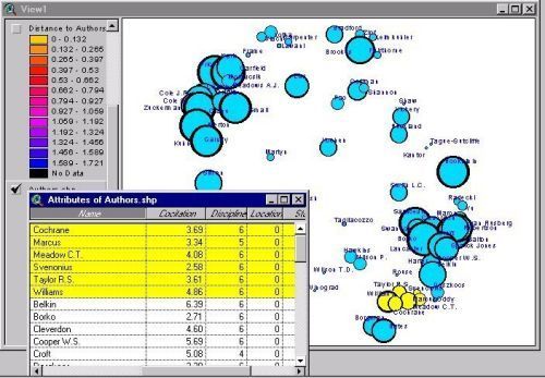
Each object on a map may have many numeric attributes associated with it. In a GIS the displayed data are kept in a relational database that can be manipulated by the system, queried by the user, or used to represent the output of spatial queries applied to the map. For example, White and McCain provide discipline data about the authors in tabular form (Table 2., p. 333, , White and McCain, 1998). This can be represented for each author by colored points or, as is shown here, by symbols.
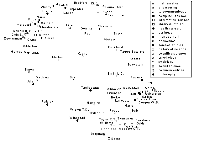
This uncovers a phenomenon previously hidden in the data, namely that what White and McCain identify as the authors interested in information retrieval (the bottom right hand cluster) are also the authors identified as belonging to the disciplines of Library and Information Science (L&IS), and Computer Science. Authors associated with Sociology and Science Studies are clustered at the top left.
Mean co-citation count data from White and McCain (Table 4., p. 339, White and McCain, 1998) can be associated with each author, and contours of like counts can be calculated using the GIS.
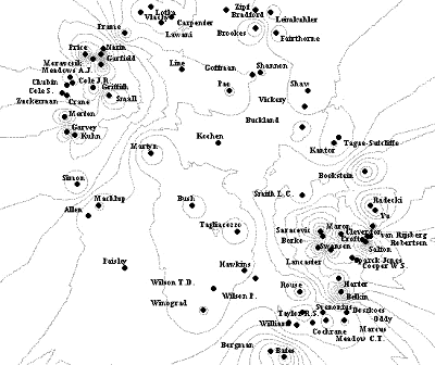
Numbers can also be associated with the contours, or the isolines can be color-coded and a key displayed with the graphic.
GISs also allow the display of bar graphs (or pie charts) of data in place points or symbols. That would be an alternative method of displaying the co-citation counts for each author, while still retaining the inter-author relationship information.
The method demonstrated next builds on the contour information by extrapolating a surface between points on the contours (called a Triangular Irregular Network, or TIN). The process is analogous to connecting points plotted on a graph to form a curve, but here it is drawn in two dimensions.
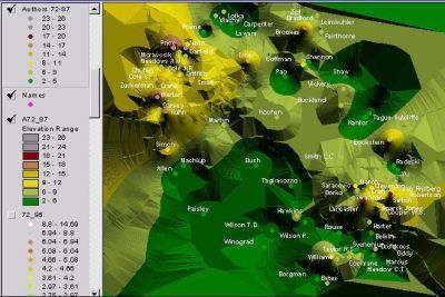
Alternatively, this could be viewed as analogous to a two-dimensional bar chart, where each author's mean co-citation count determines the height of the bar at that point, with a sheet draped over the whole. The "hills" reflect high mean co-citation counts, while the "valleys" reflect low counts. (Keep in mind that "low" here is a relative term; these are the 75 most cited information scientists in the world, as identified in White and McCain's study.) Cartia Inc., a spin-off company from the government-funded Pacific Northwest National Laboratory, produces similar maps using what they call "content mapping" of large document sets. The output "information maps" are interactive and provide a "landscape of information" that functions as a spatial information retrieval system for documents (Cartia Inc., 1999).
A final example, from the field of linguistics (Old, 1999a), shows the relationship between senses of words taken from synonym sets in Roget's International Thesaurus containing the word "over."
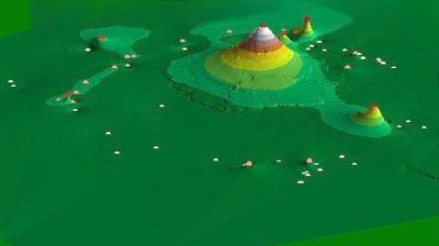
The word/point labels have been omitted and a three-dimensional panoramic view is used. The same methods described above were used to generate this graphic. The central peak represents the word "over." The other points identify synonyms of "over." The height of each point reflects the number of occurrences of that synonym in the dataset. To the top right is "above" and to the lower right is "past." The cluster on the left represents such synonyms as "throughout," "all over," and "roundabout;" and those toward the bottom, "extra," "remaining," "leftover" and so on.
Discussion
The data analysis method introduced here demonstrates just four of the many available spatial processing options; the GIS system utilized also allows for the manipulation of three-dimensional maps enabling rotation and inspection from different angles. Even the two-dimensional maps allow zooming, panning, and the hiding of data layers during inspection. The three-dimensional maps can also be exported as VRML files, viewable in virtual reality environments (e.g. CAVEs) or web browsers.
Any of the data associated with the objects on a map can be identified and displayed concurrently using a GIS. Clicking on a point object displays a tabular output of all of the data associated with that point. For example, in Fig. 3, the author's name, discipline, location, and mean co-citation counts for all periods, can be displayed with one click. Using a spatial selection (click and drag) the same data can be displayed for a range of selected authors. Alternatively an SQL-type query can be made against the tabular data, and the result-set is highlighted both in the map and in the source table.
Even spatial categorization methods (not as yet fully evaluated) may be applied.
This may be compared to the output of the Kohonen feature maps (Self-Organizing Maps) demonstrated, for example, in Fig 2. of White, Lin, and McCain, 1998. This GIS method grows "spheres of influence" according to mean co-citation counts (years 1972-95), in a simple clustering method. This method does not force authors such as Vannevar Bush or Kochen into any particular camp. The authors identified in the imbedded table (highlighted in yellow) are those from the cluster at the bottom right hand corner of the map.
Of course GIS can manipulate other data-types. For example polygons (which represent data as areas such as countries or states) and lines (which represent relationships between points) are powerful options for non-spatial-data analysis. Using points and lines along with labels, graphs and lattices of non-spatial data may also be constructed and displayed, and though spatial analysis has not yet been tested on non-spatial data for these data structures, network analysis tools, common in GIS, can be applied; and the flexible spatial interfaces can be used for browsing and exploring non-spatial data. Utilizing the new map servers to share spatially-enabled data for remote interactive analysis via browsers, Fig. 7 shows a formal concept lattice (Priss, 1997) of the senses of "agitate" derived from Roget's International Thesaurus.
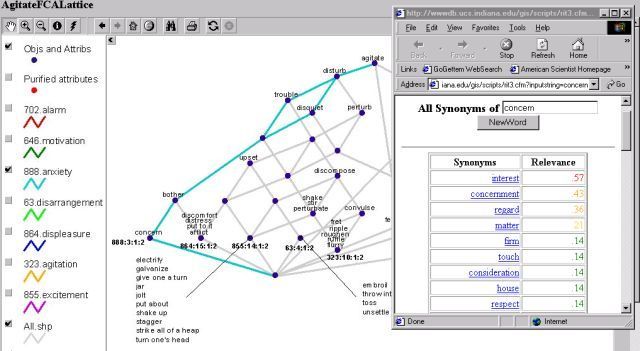
This is displayed in a Java Applet generated by ArcView's Internet Map Server extension. The layers in the map key are the sets of synonyms associated with each sense of agitate (the 'intension,' in lattice terminology). The points labeled by words are "hot links" (clickable points which can invoke a URL or CGI script). The overlaid browser window shows the database result of clicking on the node labeled by the word "concern." Further discussion about modeling using GIS and conceptual structures (formal concept lattices) may be found in Priss and Old (1998).
Conclusion
This paper has introduced a cross section of the many methods available for non-spatial-data analysis in the spatial information systems domain. The methods are applicable to a wide range of non-spatial data however some limitations still exist. The major steps are data conversion to spatial format; importation and map generation; spatial analysis; and selection of presentation parameters.
Time series data have not been demonstrated here as they are difficult to deal with in a GIS. The development of a conceptual model and associated tools for the visualization of spatial-temporal process information is among the goals of the Commission on Visualization of the International Cartographic Association (ICA, 1997). Animated sequences of maps is one potential solution to the spatio-temporal problem. However this requires considerable preprocessing to generate interim data sets for the transitional maps. Morphing software could overcome the preprocessing problem, but then accuracy may become an issue.
The data in spatial information systems appear most easily interpreted in color graphics. As stated previously, the disciplines of the authors can be encoded by color, allowing for a more perceptually intuitive method of analyzing the data--where groupings in the data may be more easily identified (see Old, 1999b for further analysis using color). Future evaluation of the effectiveness of alternative presentation methods will be conducted in terms of usability, the evaluation dimensions for Visual Information Retrieval Interface (VIRI) proposed by the ACM SIGIR (Rorvig & Hemmje. 1999), Edward Tufte's (1983) principles of graphical excellence, and Human-Computer Interaction factors such as Wickens' (1992) proximity-compatibility principle (as described by Yu and Behrens (1995)).
Acknowledgement
I wish to thank Dr Chuck Davis without whose support, encouragement, and enthusiasm this paper would never have been written.
References
Cartia Inc., (1999). Available at: http://www.cartia.com/
Esri (1999). ArcView GIS. Available:
http://www.Esri.comInternational Cartographic Association Commission on Visualization (August, 1997), Overview. Available:
http://www.geog.psu.edu/ica/icavis/ICAvis_overview(1).htmlIBM (1999). Open Visualization Data Explorer . Available:
http://www.research.ibm.com/dx/Old, L. J. (1999a). Spatial Representation of Semantic Information.MAICS99 presentation notes. Available:
http://php.indiana.edu/~jold/maics/maics.htmOld, L. J. (1999b). Spatial Representation and Analysis of Co-Citation Data on the "Canonical 75": Re-viewing White and McCain. Available:
http://php.indiana.edu/~jold/SLIS/L710.htmPriss, U., and Old, L. J. (1998). Information Access through Conceptual Structures and GIS. In: Information Access in the Global Information Economy. Proceedings of the 61st Annual Meeting of ASIS, 1998, p. 91-99
Priss, U. (1997). A graphical interface for document retrieval based on formal concept analysis. In: E. Santos (Ed.), Proceedings of the 8th Midwest Artificial Intelligence and Cognitive Science Conference. AAAI Technical Report CF-97-01, 1997
Roget's International Thesaurus, 3rd Edition, Thomas Crowell Co., 1963.
Rorvig, M., and Hemmje, M. (1999). Conference Notes--1996: Foundations of Advanced Information Visualization for Visual Information (Retrieval) Systems, Journal of the American Society for Information Science. 50(9): 835-837.
Small, H. (1998). Personal communication.
Small, H. (1999). Visualizing Science by Citation Mapping, Journal of the American Society for Information Science. 50(9): 799-813.
Tufte, E. R. (1983). The Visual Display of Quantitative Information, Graphics Press, Cheshire, CT, 1983.
Wickens, C. D. (1992). The Proximity Compatibility Principle. Technical Report (ARL-92-5/NASA-92-3) Savoy, Illinois, University of Illinois Institute of Aviation, Aviation Research Laboratory.
White, H. and McCain, K. (1998). Visualizing a Discipline: An Author Co-Citation Analysis of Information Science, 1972-1995. Journal of the American Society for Information Science, 49(4): 327-355.
White, H., Xia Lin, and McCain, K. (1998). Two Modes of Automated Domain Analysis: Multidimensional Scaling vs. Kohonen Feature Mapping of Information Authors in Structures and Relations in Knowledge Organization, Proceedings 5th Int. ISKO-Conference, Ergon Verlag, Würzburg, pp. 57-63.
Yu, C. H., and Behrens, J. T. (1995, November). Available: The alignment framework for data visualization: Relationships among research goals, data type, and multivariate visualization techniques. Paper presented at the Annual meeting of Society for Computer in Psychology, Los Angeles, CA.
L. J. Old
GIS Specialist and Senior Database
Analyst
Indiana University
2711 East Tenth Street
Bloomington, IN 47408
Phone: 812-855-7705
FAX: 812-856-5242
jold@indiana.edu