As a geographic reference, Figure 1a shows the main seven urban areas: Los Angeles; San Diego; San Jose; San Francisco, Long Beach, Oakland, and Sacramento. California's OPTN is located within Region 5 of the United Network for Organ Sharing along with four other Western states--Arizona, Nevada, Utah, and New Mexico (Figure 1b). Four organ procurement organizations (OPOs), located in large metropolitan areas with high population density, cover a remarkable service area of over 32 million people. The two northern OPOs are located in San Francisco and the Bay Area and Sacramento. The two southern OPOs are located in the Greater Los Angeles Area, and the San Diego Metropolitan Area. Each OPO serves a HCFA defined service area where potential donors are generated from local hospitals by referrals of cadaveric solid organs (i.e., heart, lung, kidney, and pancreas). Interspersed within this vast OPO network is 25 affiliated transplant centers (Figure 1c). It is within this geographically defined area that we will examine the effectiveness of existing organ allocation practices across the transplantation network.
Figure 1. California and major cities (A); location
of California's Organ Procurement and Transplantation Network (OPTN) within
Region 5 of the United Network for Organ Sharing (UNOS) (B); and Organ
Procurement Organizations and affiliated transplant centers (C).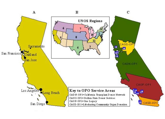
TRANSPLANTS AND MEDICAL NEED: DO THEY CORRESPOND?
One of best ways to illustrate health care access to organ transplantation is to compare an underlying illness (medical need), such as End Stage Renal Disease (ESRD) and the demand it creates for new kidneys, with actual or realized transplantation (treatment). Since kidney transplants account for over half of all organ transplants in the United States, this organ best reflects many of the existing challenges faced by those on the national organ waiting list. According to the End-Stage Renal Disease Network, Regions 17 (Northern California) and 18 (Southern California), as of June 30, 2000, the number of persons with ESRD waiting on a kidney in California was 8,427. To better grasp the magnitude of these State numbers, consider the prevalence of ESRD nationally. On September 14, 2001, the United Network for Organ Sharing (UNOS) National Patient Waiting List included 49,919 persons waiting for a kidney transplant. Estimating the cost of providing renal replacement therapy to this population gives a more accurate picture of the health policy consequences of illness. In 1990, 200,000 patients with ESRD nationally accounted for $7.3 billion per year. By 1997, Medicare spent $11.76 billion on ESRD patients, a significant increase in spending from the early nineties (Tell, Hylander, Graven, & Burkart, 1996).
The literature on ESRD provides compelling evidence about health disparities among ESRD patients. These disparities include the customary renal replacement therapy as well as the distribution of renal transplants. We question how much of the existing disparities are a function of health care access. Disparities seem to favor African Americans who unfortunately have a higher incidence and prevalence of ESRD (U.S. Renal Data System, 1999). Although comprising about 15% of the U.S. population, African Americans account for 37% of the ESRD population. Notwithstanding their sizeable composition of this population, African Americans were found to be less likely than whites to be referred for evaluation for renal transplants. Moreover, of those who are considered appropriate for transplantation, African Americans were significantly less likely to be referred for evaluation. Overall, African Americans receive less than 25% of cadaveric kidneys, and about 14% of kidneys from living donors (Young & Gaston, 2000). Others suggest similar percentages of African American patients that received renal transplants between the period of 1987 and 1995 (Scantlebury, Gjertson, Eliasziw, Terasaki, Fung, Shapiro, Donner, and Starzl, 1998).
Challenges in health care access to the waiting times associated with organ transplantation include the configuration of health care delivery system, organ acceptance and rejection criteria, proximity to transplantation centers, local organ donation rates, clinical criteria for waiting list assignment, and the demographics of the donor pool (Reddan, Szczech, Klassen, & Owen, 2000). There is further evidence of the existence of health disparities in the ESRD program. While much of the existing disparity in health care access is attributed to the biologic differences of susceptibility to developing ESRD among certain races, it is hard to eliminate persistent disparities. This leads many researchers to conclude there are inherent systemic barriers within the health care system, including the possibility of treatment bias in physician practice patterns. Transplantation inequalities among the African American population may imply subsequent inequalities in optimal care. This is also likely that such disparities are not limited to African Americans, but include other minority racial/ethnic groups as well.
RENAL TRANSPLANTATION AS A MODEL FOR HEALTH CARE ACCESS
Renal transplantation is a useful model for the assessment of geographic disparities in health care access to health care and services (Ayanian, Cleary, Weissman, & Epstein, 1999). On the one hand, unlike other medical procedures, all patients with ESRD are assessed for transplantation. Therefore, all potential candidates for transplantation can be located. As emphasized by Reddan, Szczech, Klassen, and Owen (2000), since renal transplants are provided by a single health care provider (i.e., Medicare), it is assumed that transplantation disparities are eliminated. We believe such an assumption to be erroneous. For example, when comparing the United States experience with ESRD to the United Kingdom, the rate of renal replacement (transplantation) among African-Caribbeans and Asians is three to four times higher than whites (Raleigh, 1997). This high utilization was explained by need rather than by proximity to renal units. Therefore, renal transplantation in the United States consists of enough variation in health care access to warrant further examination.
A Geographic Assessment of Kidney Transplantation
Measures for Assessing Disparities in Health Care Access. In order to assess kidney transplantation, we used California Office of Statewide Health Planning hospital data (1995-1998) and U. S. Census derived population estimates. Hospital patient discharges were the unit of service used as a reasonable proxy for the prevalence of the disease, ESRD, and of access to kidney transplantation, the optimal treatment for persons with ESRD. Dialysis, although a life-extending therapy, exacts its own toll on persons with renal failure.
ESRD and transplantation cases were identified and extracted by their corresponding ICD-9 CM codes. The following ESRD codes were used:
- ESRD, Not Otherwise Specified-Code 585
- ESRD with Manifestation of Diabetes-A two-code combination of 585 and 250.40-250.43
- ESRD Due to Hypertension-Codes 403.00, 403.11, 403.91
- ESRD with Hypertensive Heart and Renal Disease-Codes 402.02, 404.03, 404.12, 404.13, 404.92, 404.93.
- Kidney transplantation-Code 55.69.
In general, it is desirable to have the individual locations of cases and underlying population rather than using data aggregated to areas such as ZIP codes or counties. The results will have better spatial resolution since they are not dependent on the location of the area's centroid point. Often, only aggregated data are available because of privacy issues or due to the prohibitive cost of geocoding large health data sets to the street address level. Thus aggregated statistics must often be used to produce regional maps of health disparities indicators. The technique described below was used to alleviate the problem of arbitrariness in assigning the geographic location of ZIP Code centroids (Talbot, Kulldorff, Forand, and Haley, 2000).
Population-weighted centroids were calculated for each California ZIP Code using 1990 census data at the census block level. Census blocks were geocoded by ZIP code using 1997 ZIP Code boundaries. For each ZIP code the latitude was calculated as the mean of the block latitudes, weighted by the number of persons in each block. This technique was also applied to the calculation of ZIP Code longitudes.
For each area ZIP Code in California, we summed the number of kidney transplants as well as the total number of ESRD occurrences. All ESRD discharge events in a particular ZIP code polygon were then assigned to the geographic coordinates of the population-weighted ZIP code centroid.
Spatial smoothing techniques. Smoothing or spatial filtering is a descriptive technique to map data collected at small geographic areas and still maintain the stability of the estimated health parameters. The estimated rate or ratio at a particular location, or grid point, is calculated by incorporating information about the observed data at neighboring areas within a fixed distance from the location in question. Discs centered at specific locations are set to overlap to allow neighboring points to share observations. Contouring or advanced GIS functions to process raster data can then be used to produce smoothed maps where geographic trends are recognizable. Smoothed maps more clearly represent continuous distributions of the underlying illness as a naturally occurring phenomenon, without the administrative boundary constraints of ZIP Codes.
Building upon the ideas proposed by Rushton and Lolonis (1996), Rushton, Krishnamurthy, Krishnamurthy, Lolonis and Song (1996), Kafadar (1996, 1999), and McCleary, Soret, Rivers, and Montgomery (2001), we have adapted the techniques recently presented by Talbot et al. (2000) to implement a GIS-based adaptive kernel estimation method for creating smoothed maps of kidney transplantation access in California (Bailey and Gatrell, 1995; Breiman, Meisel and Purcell, 1997). In these maps, the spatial filter (or kernel) is defined in terms of near constant population size rather that constant geographic size. In other words, the discs are larger in sparsely populated areas compared to urban areas.
The geographic unevenness of California's population density is noteworthy, from the very sparsely populated Sierras and deserts on the eastern half of the state, to the very densely populated metropolitan areas along the Pacific coast (see Figure 2a). For example, San Francisco has more than 6,000 people per square kilometer, Los Angeles 5,000, while several rural towns have less than 0.3 persons per square kilometer. This makes California an ideal geographic region for illustrating the application and performance of spatial filtering methods when there is heterogeneity in the population density.
We compared the smoothing technique using a variable window size with the fixed geographic size approach. For both methods we used a 2 km grid for the disc centroids. The grid contained approximately 120,000 points, which covered the state along with a 2 km buffer around the state line.
Calculation of Standard Risk Ratios. A standard relative risk ratio -traditionally, a standardized morbidity/mortality ratio (SMR)- is defined as a function of the "risk" in receiving a kidney transplant incurred by a randomly selected ESRD patient residing at a certain ZIP Code relative to the average "risk" in California as a whole (Bithell, 2000; Lawson, 2001). SMRs with values greater than 1 indicate local transplantation activity above the state average, while SMRs with values less than 1 indicate transplantation activity below the state average.
Indirect standardization is recommended when simultaneously mapping and comparing statistics of many small areas (Kulldorff, 1999). When the geographic units are small however, the rates can remain statistically unstable even after indirect standardization, providing little useful information, hence the need for smoothing.
SMRs were derived from counts of the number of kidney transplant procedures that occurred from 1995-1998 for ESRD discharge events by ZIP Code. For both smoothing techniques applied here, we calculated the standard incidence ratio for each point. The study area was covered by a fixed number of evenly spaced grid points. Let ni be the number of ESRD events captured at grid point i and let N be the total number of ESRD discharge events in the state. Likewise let ci be the number of kidney transplantation procedures captured at the same grid point i while C is the total number of kidney transplantation cases in the state. The unadjusted, standardized morbidity risk ratio, SMR, is:
SMRi = (ci / ni) / (C / N)
To take into account demographic differences among regions, ratios were adjusted for differences in age, sex, and race/ethnicity (Eggers, 1995; Thamer, Henderson, Ray, Rinehart, Greer and Danovitch, 1999). Access to transplantation is inversely related to age. Although transplantation is increasingly being made available to older persons with ESRD, it still is predominantly a therapy for younger individuals. People 55 years of age and older, while representing nearly two-thirds the majority of incident cases, they only account for 17 per cent of all transplants. Thus, we stratified the ESRD population by two age categories: (1) ages 54 and younger, and (2) ages 55 and older. Males are also more likely to be transplanted than are females. Since kidney transplantation also varies across racial groups, we also stratified the ESRD population by using five race/ethnicity categories: non-Hispanic White, Hispanic, Black, Asian/Pacific Islander, and Native American/Eskimo/Aleutian. The above equation was modified accordingly to incorporate the three covariates: age, sex, and race/ethnicity (Kulldorff, 1999).
Spatial filters with constant diameter. This method captures all transplantation and ESRD discharge events within a fixed geographic radius of the grid point. The kernel size was set to 20, 90, and 205 km, respectively. The latter is the smallest radius that will capture at least 500 ESRD discharge events at each grid point. This is rather large due to the sparsely populated areas of the State's northern and eastern mountainous regions and southeastern deserts (see Figure 2a).
An unsmoothed map is supplied in Figure 2b, showing the SMRs for each individual ZIP code. There are several areas of high incidence scattered around the state, with no easily interpretable pattern. Since the ratios are unsmoothed, the SMRs are unstable for most areas, except for ZIP codes with the largest population. If there is any true geographic variation of importance, it is hidden, and nearly impossible to distinguish from what could be described as random spatial noise.
Figure 2c shows the smoothed map using a fixed geographic filter size of 20 km. Areas that appear "blank or clear" represent regions where no ZIP code centroids were found within 20 km of the grid points. In the most rural areas of the state, this map is similar to the unsmoothed map in Figure 2b, with equally unstable SMRs. Dark patches can be observed in some of the sparsely populated eastern counties, along the border with Nevada. In the urban and semi-urban areas, a considerable level of smoothing has been achieved, furnishing more stable SMRs than in Figure 2b. In the most densely populated areas such as Los Angeles, the ratios may be oversmoothed, masking any real differences in SMRs within the city.
Figure 2. Population density in California (county lines added
for geographic reference) (A); kidney transplantation standard morbidity
(relative risk) ratios, unsmoothed (B), and smoothed (20-km fixed filter)
(C).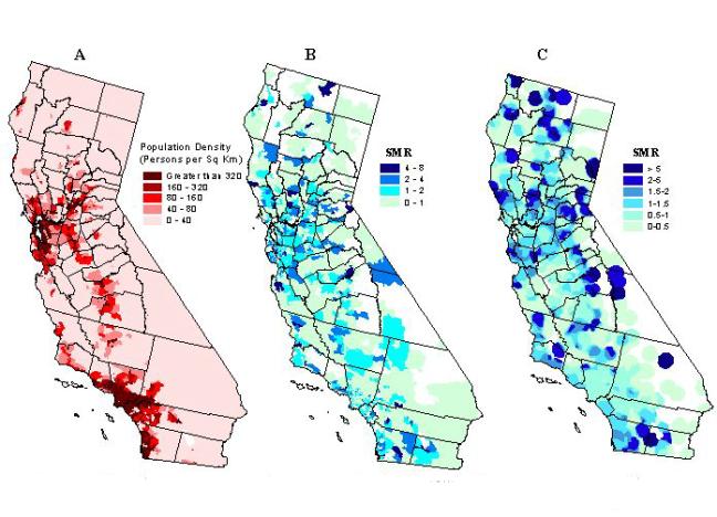
To alleviate the problem of unstable ratios in rural areas, we increased
the size of the spatial filter. The maps in Figure 3 were generated
using fixed filter sizes of 90 km and 205 km in order to reduce random
noise for all grid points. The spatial variation in the distribution
of the SMRs has been reduced considerably. The highest level of smoothing
(see Figure 3b) removed most of the random noise in the rural areas of
eastern California. Overall, this map does not convey much useful information
in determining the spatial pattern of kidney transplantation SMRs.
Figure 3. Kidney transplantation standard morbidity ratios
using a fixed filter size of 90 km (A), and 205 km (B).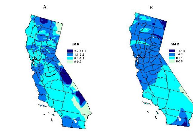
A spatial filter with nearly constant population size.
This method sets, a priori, a minimum number of ESRD discharge events to
capture at each grid point. The nearest ZIP Code centroids are successively
located and the number of ESRD discharge events added until it reaches
a value greater than or equal to the minimum number that has been established.
The number of ESRD cases will exceed the predetermined minimum if the last
ZIP code area captured has more events than needed to reach the minimum
denominator size.
We tested this method using three population based kernel sizes, which were set at minimum number of 500, 1,200, and 10,000 ESRD events, respectively. For example, if 500 ESRD discharges were captured, the expected number of kidney transplants is 6.5 at the grid point if the rate within the circle is the same as the overall California rate of 1.3 renal transplants per 100 ESRD discharge events.
The smoothed SMR map using the spatial filter with nearly constant population size of 500 ESRD cases is displayed in Figure 4a. Many of the areas that had a high SMR in the unsmoothed ZIP code map (Figure 2b) are no longer seen. This suggests that these elevations were likely due to random fluctuations of the ratios because of small numbers of renal patients within a ZIP code area. Some elevated areas remain though, most prominently in parts of San Diego and San Jose, where kidney transplantation is in some cases more than twice the state average.
Figure 4. Kidney transplantation standard morbidity ratios
using a variable kernel size set to capture at least 500 (A), 1200 (B),
and 10,000 (C) ESRD cases.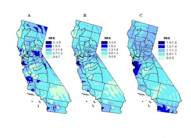
To evaluate the effect of changes in filter size, we created maps with
different population kernel sizes. Maps produced using nearly equal
kernel sizes of 1,200 and 10,000 are shown in Figures 4b and 4c.
Unusually high SMRs are tempered as the population kernel increases.
This is particularly noticeable in the rural areas where the ZIP code SMRs
were unstable due to the small numbers of renal patients. The high
SMRs, which remain as the kernel size increases to 1,200 and 10,000 ESRD
discharge events, respectively, indicate that these differences are less
likely due to chance. Once the population kernel becomes too large,
this technique is not useful anymore to detect elevated transplantation
ratios in all but in some of the most densely populated regions of San
Diego and San Jose/Bay Area. This is apparent in Figure 4c in which
the kernel size is set to capture a minimum of 10,000 ESRD cases.
Elucidating statistical clusters of kidney transplantation. The smoothed maps are purely descriptive tools, showing areas with high or low access to kidney transplantation, after "filtering out" some of the random spatial noise. Spatial patterns of kidney transplantation, however, can be deceiving and might represent a spurious relationship that occurs by chance. Additional analytic tests for spatial randomness can eliminate this rivaling hypothesis. Thus, to complement the smoothed maps of ratios, we compared them with the results of analyzing the same transplantation data using the spatial scan statistic, in order to elucidate whether statistically significant geographic clusters were retained or smoothed out.
The spatial scan statistic is a robust test for spatial randomness that determines the location of any area of California with greater, or less, access to kidney transplantation, after adjusting for multiple testing inherent in many possible locations and sizes of the area. The maximum size was restricted to 10 per cent of all ESRD discharge events in California. Calculations were done using the SaTScan software (Kulldorff, Rand, Gherman, Williams and DeFrancesco, 1998). Discussion and statistical details about this test can be found in Kulldorff and Nagarwalla (1995), and Kulldorff (1997 and 1999). Recent health applications are presented in Sheehan, Gershman, MacDougall, Danley, Mroszczyk, Sorensen and Kulldorff (2000), and Talbot et al. (2000).
The most probable areas where transplantation clusters occur, regardless of size, are shown in Table I and Figure 5a. The general areas that have a SMR that is statistically significant, after adjusting for the multiple testing, also show up as high SMR regions on the smoothed maps of kidney transplantation with a kernel of nearly constant population size (see Figures 5b and 5c). Three statistical clusters of greater access to kidney transplantation were identified. One is located in an area roughly corresponding to the Bay Area, south of San Francisco, near San Jose. A second cluster occurs in San Diego County, which also extends into some of the desert resort communities, such as Palm Springs, of Riverside County. The third, and largest, cluster encompasses several semi-rural counties east of Sacramento, around the mountain resort area of Lake Tahoe.
Table I. Results of spatial scan statistic test for most likely
kidney transplant clusters
| Geographic area |
|
ESRD events
|
|
P-value |
| Bay Area/San Jose |
|
12,054
|
|
|
| San Diego |
|
18,452
|
|
|
| Tahoe |
|
7,013
|
|
|
| South East Los Angeles |
|
41,616
|
|
|
A localized cluster of diminished access to kidney transplantation is in southeast Los Angeles County, including over twenty populous communities adjacent to the city of Los Angeles. This cluster also coincides with a persistent low SMR region in the smoothed maps (Figures 5b and 5c). Therefore, these maps do not smooth over the areas with statistically significant rates except when filters are set too large. We see in Figure 4c that by using a large kernel size of 10,000 ESRD events, the statistically significant areas in the cluster east of Sacramento are smoothed over (Figure 4c). When using a fixed filter size though, areas with a statistically significant SMR are sometimes smoothed out (Figure 3b), and when they are not, there are others with non-significant SMRs that stand out prominently or dominate the map (see Figures 2c and 3a).
Figure 5. Likely clusters of greater (green circles) and diminished
(red circle) access to kidney transplantation using a double sided spatial
scan statistic (p<0.05) (A). Circle diameter denotes geographic
size. Restrictions: no cluster can contain more than 10 per cent
of ESRD cases. Clusters of kidney transplantation overlaid on a map
of smoothed kidney transplantation standard morbidity ratios based on a
variable kernel size set to capture at least 500 (B), and 1200 (C) ESRD
cases.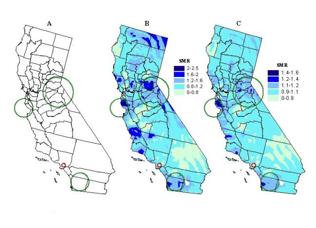
Correspondence Between Illness and Treatment
How Are Organs Allocated? Geography vs. Medical Criteria. As discussed earlier, the hotly contested health policy issue in organ transplantation involves the equitable allocation of organs. Notwithstanding the importance of medical criteria, critics have argued about the role of location or geography in allocation decisions. That is, should persons who live in a HCFA defined service area be given preference for organs over others that live outside of the OPO's immediate network? Both the government and health professional organizations like the AMA argue in favor of medical necessity as the only criteria for the equitable allocation of organs. Assuming equity in health care access currently exists in the U.S. transplantation network, we now ask the following question: Is kidney transplantation randomly distributed to persons with ESRD in California?
By applying a spatial scan statistic to kidney transplantation data (1995-1998), we have demonstrated the existence of statistical clusters as described in the previous section. Therefore, the hypothesis of a geographically random distribution of kidney transplantation is rejected. In other words, the observation of spatial clusters implies that geography (i.e., place of residence) plays a role in determining access to optimal treatment for renal patients in California. What specific local factors influence access to kidney transplantation in the cluster regions remain to be elucidated. Variation in factors such as local health resources, practices, or health care market structure has been suggested (Dartmouth Medical School, 1998). The possibility exists that, simply, local variation in renal disease accounts for the observed geographic clustering of kidney transplantation. We explore this question next.
Elucidating clusters of End Stage Renal Disease. Once again, the important question is whether or not the distribution and utilization of health care is explained by the underlying illness. In other words, does the pattern of variation in access to kidney transplantation (i.e., treatment) bear a relationship to the distribution of the underlying illness (i.e., ESRD)? Theoretically, treatment should correspond to a higher presence of ESRD in local populations. If after controlling for gender, age, and race/ethnicity, clustering of ESRD patients can be demonstrated, then the key question of whether illness and access correspond can be investigated by assessing the geographic agreement between ESRD and transplantation clusters.
Using the same techniques already described for the detection of transplantation clusters, we applied the spatial scan statistic to ESRD hospital discharge data (1995-1998) in order to assess the spatial clustering of renal disease in California. Denominators corresponding to the underlying "at-risk" population by ZIP code were based on 1997 updates of U.S. Census statistics for California (Claritas, Inc., Arlington, Virginia). The SaTScan software has built-in functions that adjust for population changes between intercensual years (Kulldorff et al., 1998). As before, the maximum size of the scan window was set again to 10 percent of the underlying population.
The most likely ESRD clusters, irrespective of size, appear in Table II and Figure 6a. Twenty-four clusters are scattered from north to south, largely on the most western portion of the state, corresponding to the more densely populated regions. These clusters are indicative of medical need, identifying areas where renal disease presence is elevated with respect to the state average. The size of the clusters seems to be related to population density, being smaller in urban areas, and larger in less densely populated areas. We compare next how the detected ESRD and transplantation clusters correspond.
Table II. Results of spatial scan statistic test for most likely
kidney transplant clusters
|
Geographic area
|
ESRD events
|
Total Population
|
SMR
|
P-value
|
|
Oakland
|
18,369
|
961,828
|
1.4
|
<0.001
|
|
Los Angeles/Pasadena/San Fernando
|
41,891
|
4,223,720
|
1.2
|
<0.001
|
|
Napa
|
434
|
6,040
|
8.3
|
<0.001
|
|
South East LosAngeles
|
13,873
|
1,113,343
|
1.3
|
<0.001
|
|
San Diego
|
14,527
|
1,204,105
|
1.3
|
<0.001
|
|
Los Banos/Merced
|
3,016
|
212,074
|
1.7
|
<0.001
|
|
Marysville/Yuba City
|
1,501
|
94,898
|
1.9
|
<0.001
|
|
Carson/Long Beach
|
6,959
|
542,558
|
1.3
|
<0.001
|
|
Hanford/Visalia
|
2,820
|
224,311
|
1.5
|
<0.001
|
|
Modesto
|
2,413
|
202,162
|
1.5
|
<0.001
|
|
Yucca Valley
|
1,220
|
68,662
|
1.7
|
<0.001
|
|
Fremont/Newark
|
2,177
|
181,027
|
1.4
|
<0.001
|
|
Glendora
|
528
|
32,741
|
2.1
|
<0.001
|
|
Ukiah
|
1,664
|
121,864
|
1.5
|
<0.001
|
|
Eureka
|
62
|
562
|
13.1
|
<0.001
|
|
Beverly Hills/West Hollywood
|
3,038
|
237,934
|
1.3
|
<0.001
|
|
Artesia/Bellflower/Norwalk
|
2,913
|
263,402
|
1.3
|
<0.001
|
|
West Covina
|
2,372
|
207,129
|
1.3
|
<0.001
|
|
San Bernardino
|
516
|
35,535
|
1.7
|
<0.001
|
|
Tracy
|
702
|
62,539
|
1.6
|
<0.001
|
|
Upland
|
784
|
60,618
|
1.5
|
<0.001
|
|
Vallejo
|
1,804
|
117,644
|
1.3
|
<0.001
|
|
Petaluma/Santa Rosa/Rohnert Park
|
2,009
|
221,756
|
1.2
|
<0.001
|
|
Victorville
|
921
|
75,125
|
1.3
|
<0.001
|
Comparison of Results. Figure 6b shows a map overlay of ESRD and kidney transplantation clusters. It can be observed that of the three clusters of greater access to transplantation, only the one in the San Diego area corresponds with a cluster of renal disease in the greater San Diego metropolitan area. The other two, around the San Jose and Lake Tahoe areas in northern California, occur in regions with no ESRD clusters. The cluster of less access to transplantation identified in southeastern Los Angeles County overlaps with, and is surrounded by, small urban clusters of ESRD. This seems to be a region of concern for public health officials and policy makers, where higher than expected levels of the underlying illness and poor access to treatment overlap. GIS could be used to produce concomitant information for the identified areas of concern that helps in designing and customizing more effective interventions or health policy.
Figure 6. ESRD clusters using a double-sided spatial scan statistic
(p<0.001) (A); clusters of ESRD (purple circles), of greater access
(green circles), and of less access (red circle), to transplantation
than the state average (B); and overlay of renal disease clusters and smoothed
renal trasnplantation ratios (population kernel size of 1,200) (C).
Only five ESRD clusters (stippled circles), three in north (top inset)
and two in the south (see bottom inset) occur in areas with greater access
to kidney transplantation than the state average.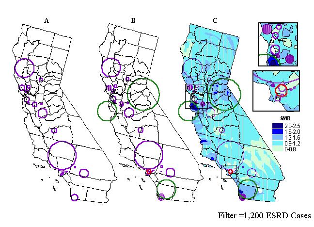
In addition to spatially comparing both types of statistical clusters,
we further explored the correspondence of renal disease and access to treatment
by investigating transplantation activity inside the ESRD clusters.
Figure 6c shows the ESRD clusters overlaid on a map of smoothed transplantation
ratios that are derived by using an adaptive kernel of a nearly constant
population size of 1,200. Visual inspection of this map reveals that
clusters tend to occur in areas where the smoothed SMRs are below the state
average. The results of this technique suggest agreement with the
earlier noted lack of general correspondence between illness and treatment.
Some clusters may include more than one SMR range (see Figure 6c), with one zone, for example, representing greater access to transplantation, next to a zone of diminished access. We further characterized ESRD clusters by applying GIS analytical functions for calculating zonal statistics to the 2-km grid from which the smoothed transplantation maps were derived. Thus, we identified ESRD clusters enveloping grid points with maximum SMRs greater than 1, that is, with greater access than the state average. Table III contains the eleven identified ESRD clusters. In addition, with the aid of GIS spatial functions, we calculated cluster-specific transplantation SMRs based on patient discharge data captured inside each of the eleven ESRD clusters. These ratios can be also found in Table III. Out of the eleven clusters, only five have SMRs greater than 1, indicating greater access than the state average. Three of these five ESRD clusters with elevated transplantation SMRs are located in northern California. They can be seen in the top inset of Figure 6c. They correspond to the geographic areas of Freemont-Newark and Tracey-Livermore, north of San Jose, and Petaluma-Santa Rosa-Rohner Park, north of San Francisco. The remaining two clusters are located in southern California, one in Beverly Hills (see bottom inset in Figure 6c), west of Los Angeles, and the second one in the greater San Diego area. Note that the elevated transplantation SMR in the San Diego area has been also identified as a statistical cluster of greater access paralleling the ESRD cluster. Interestingly, these areas have in common higher than average income and general SES levels of the target population.
Table III. Underlying cluster-specific kidney transplantation
ratios, SMRs, calculated for ESRD clusters which exhibited a maximum
SMR greater than the statewide average.
|
Geographic area
|
|
|
|
Fremont/Newark
|
|
|
|
San Diego
|
|
|
|
Tracy
|
|
|
|
Beverly Hills/West Hollywood
|
|
|
|
Petaluma/Santa Rosa/Rohnert Park
|
|
|
|
Ukiah
|
|
|
|
Modesto
|
|
|
|
Los Angeles/Pasadena/San Fernando
|
|
|
|
Oakland
|
|
|
|
Los Banos/Merced
|
|
|
|
Hanford/Visalia
|
|
|
Geographic Access Issues. A key question health providers and policy makers face when evaluating the existing transplantation network is where health services should be offered. Specifically, is the population better served from decentralized locations throughout the service area or from fewer localized (or central) facilities? Similarly, we ask how well is the population in California being served by existing transplant centers? The impact of such a decision is not an easy one because of the implications for system and provider efficiencies, resource allocations (both material and personnel), and patient needs and preferences. In this case, health care access might be evaluated by providers based on the quality of organ transplantation services, such as patient survivability and cost/benefits for their transplant center's capacity. On the other hand, another important way to evaluate patient access to care is through actual utilization of services with respect to the distance for the closest available services. In this case, we are referring to distances to the organ transplant centers and/or hospitals. To provide insights into distance-related access issues we asked two questions. First, what proportion of kidney recipients came from distance bands defined around the transplantation centers? Second, what proportion of kidney recipients were served by the closest of the available transplant centers?
To examine these spatial questions, we employed the buffering functions and distance measuring tools available in Esri's GIS module ArcView. Using the buffer tool and overlay functions, we estimated numbers of kidney recipients within distance bands of transplant centers. We also calculated the distance from each recipient's zip code of residence to the hospital where treatment was received, as well as distance to the closest of the available facilities. We applied the same smoothing technique described above to the estimates of the proportion of patients who were served by their closest available transplant center. A population kernel of nearly constant size of 100 renal transplant recipients was used in this case.
Figures 7 and 8 show that the proportion of recipients with respect to the total number of kidney transplants in the state declines with distance. Most kidney recipients came from a distance band of approximately 100 km (62.5 miles). After that distance, the proportion of recipients drops substantially. The negative correlation between the proportion of kidney transplants performed and distance was statistically significant. Figure 9 depicts a smoothed map of the proportion of patients served by the closest of the available facilities. This measure seems to be influenced also by distance. The statewide average is 22.2 percent. More kidney recipients residing near transplant centers were served by their closest available facility than those residing at greater distances. In other words, the closer an organ recipient resides from a transplant center, the more likely that same recipient is to be served at the closest available facility. Conversely, recipients who reside far from transplant centers seem to be less likely to be served at the closest available facility. This pattern can be observed in the San Francisco, Sacramento, and San Diego areas. Exceptions are observed for example in central California and in the greater Los Angeles region, where even though an important concentration of transplantation resources exist, the proportion of recipients being served by their closest available facility is well below the state average. This finding is consistent with the detected cluster of diminished access to kidney transplantation in the greater Los Angeles area. Recipients of Ventura and Santa Barbara Counties enjoy better spatial access to kidney transplantation than their counterparts in Los Angeles, and western Riverside and San Bernardino counties.
Figure 7. Proportion of kidney recipients with respect to distance.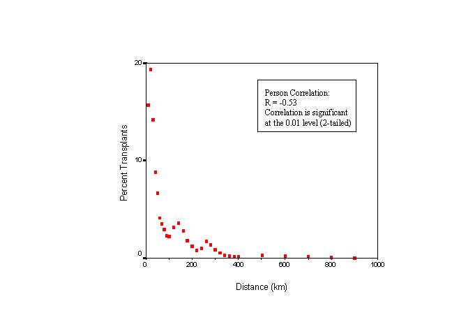
Figure 8. Regression on the proportion of kidney recipients
with respect to distance.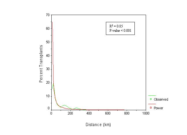
Figure 9. Kidney recepients served by closest of available
transplant centers 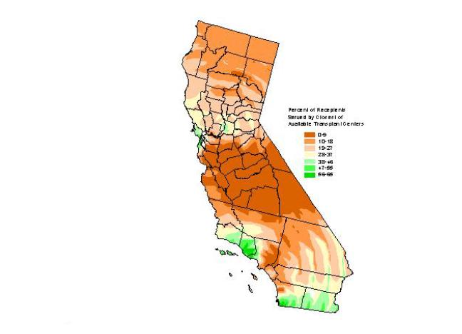
Market-related Issues in Geographic Access to Kidney Transplantation:
Does Competition Matter? To determine whether market-related
factors, like competition among transplant centers for organs, affected
health care access to kidney transplantation services, we employed three
market indices for characterizing population subgroups and medical services
(Walsh, Gesler, Page, and Crawford, 1995): the Commitment Index (CI), the
Coverage Index (COVI), and the Herfindahl Index (HI). Each
index is described below.
First, the service areas for organ transplant centers were defined using the Commitment Index (CI). Using California zip codes as the geopolitical boundary, CI was calculated for each transplant hospital as the number of annual kidney recipients served by the hospital (between 1995-1998) divided by the total number of recipients receiving their organ at the hospital from all ZIP codes (Walsh et al., 1995). CIs were sorted by distance and size, and cumulated to 80 percent of each hospital's kidney recipients.
A Coverage Index (COVI) was calculated for each ZIP code where COVI represented the number of hospitals claiming a given ZIP code as part of their 80 percent service area (Walsh et al., 1995). Competition between transplant centers or hospitals was calculated via a Herfindahl Index (HI) for each ZIP code (Walsh et al., 1995). HI seems particularly appropriate since California's hospitals are located in a variety of markets with a range of competitive changes in health care financing (Zwanziger and Melnick, 1988; Dranove, Shanley, and White, 1993; Gruber, 1994). Likewise, California's hospitals are located in a variety of markets with a range of competitive and managed care environments. The Herfindahl Index has been used in numerous studies of market structure (Joskow, 1980; Melnick, Zwanziger, Bamezai, and Pattison, 1992; Rivers, 1997; Zwanziger and Melnick, 1988). Therefore, HI was calculated and interpreted rather consistently with the existing literature. Namely,
HIzip = Sum {Mi2}
where Mi is the market share of each competing hospital for a particular ZIP code.
The maximum possible value for HIzip is 1. The minimum possible value varies depending on the number of competing transplant centers claiming a given service area (COVI). In any case, HI can never be below 0. Since HIzip does not take into account the number of competing hospitals, an adjusted index was used called the Herfindahl Deviation Index (Walsh et al., 1995):
HIdev = (HIzip - HImin) / (1 - HImin)
HIdev measures the degree that HIzip deviates from its minimum potential value, HImin, which varies depending on a ZIP code's COVI. HIdev still can only range from 0 to 1. A value close to 0 indicates a competitive market that is more evenly distributed between the competing transplant centers in a given service area. Walsh et al. (1995) use this notation:
for COVI > 0, HImin = 1/COVI
for COVI = 0, HImin = 0
A value close to 1 indicates a noncompetitive market, where competition is not evenly distributed among the competing transplant centers. In other words, the transplant center or hospital monopolizes its market in a particular ZIP code either because it's the sole competitor or because it captures the majority of the market share of the transplant medical services (i.e., the minimum HI is 1 and HIdev would be infinity). To stick to accepted convention, we set HIdev = 1, which corresponds to a situation of perfect monopoly.
Figure 10 is a map of the coverage index (COVI) for transplantation discharges. The basic pattern is one of medium to high coverage in the major core urban areas of southern (greater Los Angeles region and San Diego) and northern California (San Francisco-Bay Area-Sacramento). ZIP codes with zero coverage are interspersed throughout the state, like a sea surrounding two large islands, corresponding to the core urban areas. This pattern is consistent with the spatial configuration of the transplantation network in California. The twenty-five transplantation hospitals in the state are clustered around the major urban areas.
Figure 10. Competion indices: coverage index (COVI).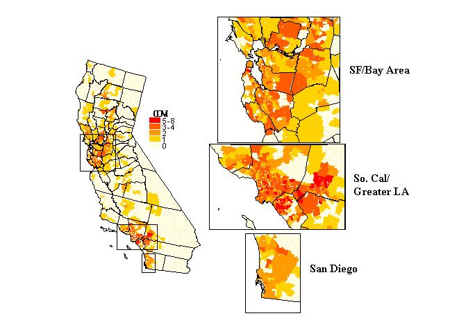
Figure 11 is a map of HIdev. By definition, ZIP codes with COVI
= 0 or 1 will have values of 0 and 1 respectively. The first cases
correspond to situations when there are no competing hospitals ("no data,
COVI = 0", in the map legend). In the second case, there is only
one competing hospital, by our methodology, that captures 100 percent of
the kidney transplantation market share, that is, a perfect monopoly.
Results are more difficult to interpret in areas with more than one competing
hospital, where the spatial pattern resembles a patchwork. There
seems to be a general correspondence between coverage and HIdev.
It is likely that in areas with just 2 or 3 competing hospitals, HIdev
would be low, indicating intense competition among the few players.
This can be seen in portions of northern Los Angeles county, San Diego,
or Shasta county in northern California. Conversely, areas with many
competing hospitals are expected to have high HIdev values. This
would indicate that in reality although many hospitals claim a ZIP code
as part of their service areas (80 percent definition), only one or two
actually capture a large numbers of kidney recipients.
Figure 11. Competion indices: Herfindahl Index (HI).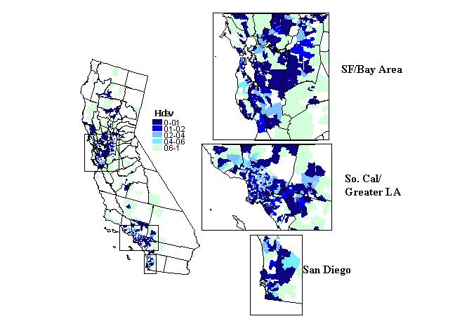
In summary, the Herfindahl Index (HIdev) indicates that competition
tends to be more intense around urban areas near transplant centers, and
less competitive in the less densely populated areas (i.e., rural, sparsely
populated areas). Other trends seem to reveal that the rural, northern
portion of Los Angeles County seems to experience more intense competition
that the southern half of the county, including areas like Long Beach,
etc. To the south, we observe greater competition in the San Diego
area than expected. In that service area, there are three transplant
centers competing for the entire county.
DISCUSSION AND CONCLUSIONS
The Value of a GIS Model of Health Care Access
Figure 12 shows with greater geographic detail the three main metropolitan areas of the state, combining the locations of both types of clusters, ESRD (medical need) and transplantation (access to treatment) with the transplant centers (health care resources). The greater Los Angeles metropolitan area shown in Figure 12 (middle inset) illustrates a situation where medical need is apparent. Several ESRD clusters are matched by one cluster of diminished access to transplantation. The greatest concentration of transplantation centers of the state does not ensure adequate access to treatment for the renal patients of the region.
Figure 12. Overlay of ESRD and transplantation clusters, together
with the location of transplant centers in California's three main metropolitan
areas: San Francisco/Bay Area (top inset), Greater Los Angeles (middle
inset), and Greater San Diego (bottom inset).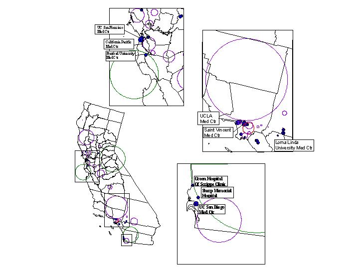
The top inset map in Figure 12 shows the San Francisco and San Jose metropolitan areas. In this region we observe also the presence of several ESRD clusters, indicating medical need. However, they are not corresponded geographically with the location of a cluster of greater access to transplantation approximately encompassing the Silicon Valley. Interestingly, neighboring this transplantation cluster is an ESRD cluster stretching across both shores of the San Francisco Bay, from Oakland to east San Francisco. The two prominent transplantation centers of this region are precisely sitting on this cluster of need. Figure 12 also shows the San Diego area in (see bottom inset), which unlike the two previous regions, represents a case where need and access correspond. This is accomplished with fewer health care resources as only three transplantation centers operate in this region of the state.
In summary, high/low clusters do not correspond geographically to the underlying illness (ESRD). Our analysis suggests that the likelihood for the ESRD population to receive a kidney transplant does not necessary follow the presence of renal disease. Both smoothing techniques and statistical tests of spatial randomness reveal these trends. This suggests that geography seems to play a role in access to kidney transplantation.
The distance-decay (or friction) effect observed for our measures of spatial access suggests that ESRD patients show sensitivity to the geographic location of transplant centers. Perhaps further decentralization of kidney transplantation services should be considered (i.e., more facilities in dispersed geographic areas). As with all statistical results, there is the possibility that some confounding condition might also be related to the identified distance correlations (Rushton, 1999). A specific concern for public health and health policy officials is in determining whether only renal patients with certain sociodemographic characteristics experience access problems. Future research aimed at performing similar analyses on separately defined subgroups of the recipient and ESRD populations is warranted.
Our preliminary findings suggest that the presence of health care resources and competitive health care markets do not ensure (or guarantee) better access to kidney transplantation. We have a cluster of poor access in south Los Angeles, an area with relatively intense competition. Areas with greater access to treatment (transplantation), as detected in our smoothed maps and through cluster analysis, also tend to have better spatial (geographic) access. However, this is not the case in the Los Angeles area, where poor access to treatment and diminished spatial access coincide. All this would seem to indicate that kidney transplantation in California follows more system and provider-related efficiencies than consumer preferences or medical need. Furthermore, the results of our analysis lead us to conclude that geographic health disparities in California suggest local biases. Repeating the popular adage that "all health care is local" bears a surreal truth. We must study the local characteristics of health care delivery and other geographic factors known to effect health. Understanding these clusters of activity may determine our ability to successfully address health disparities on a macro-level. Geographic Information Systems add value to the more accurate and comprehensive treatment of health disparities.
Advantages of Using a GIS-based Approach
A GIS-based approach permits the elucidation and understanding of the geographic variability of health differences, making possible the precise identification of under- or over-served regions. The populations residing in those regions can then be characterized demographically and/or socioeconomically using GIS. Effective planning of intervention strategies customized to specific populations whose characteristics have been described is thus facilitated. Geographic differences within groups (e.g., racial/ethnic) or communities can also be investigated. For example, non-geographic studies may reveal adequate access to kidney transplantation for a certain racial/ethnic group as a whole while negating or omitting how this same group may experience poorer access to treatment in localized areas. In contrast, a whole other group may have poor, but geographically dissimilar access to health care. At localized areas, members of the group may even enjoy adequate access to health services. GIS can significantly improve the ability to discern such local effects. Thus, GIS can assist not only in representing the structural delivery aspects of care (i.e., the distribution of provider and facilities), but in understanding or elucidating key processes and outcomes in health services research.
In closing, GIS can inform public policy and practice. Notwithstanding, its powerful exploratory and analytic capabilities, Geographic Information Systems provide the context for the integration of multidisciplinary approaches and techniques to provide a clearer, more complete picture of health. In our case, we combined epidemiologic techniques with health services research methods. The power for visualizing data elements as well as analytic results provides a more holistic view of the health disparities problem, suggesting areas or problems that require further elucidation. In addition to answering specific questions about health differences, a GIS approach enables researchers to explore potential geographic policies and practices that may contribute to the existing health disparities. In summary, GIS affords the elucidation of health disparities when analyzing geographically defined data. When combined with multi-method approaches, geographic tools and spatial statistics will offer new analytic opportunities for disease assessment and prevention, and will enhance attempts to plan more efficacious interventions.
REFERENCES
Albert, D. P., Gesler, W. M., Levergood, B. (Eds.). (2000) Spatial GIS and Remote Sensing Applications in the Health Sciences. Chelsea, MI: Ann Arbor Press.
Anselin, L. (1996). The Moran scatterplot as an ESDA tool to assess local instability in spatial association. In M. Fischer, H. J. Scholten, and D. Unwin (Eds.), Spatial Analytical Perspectives on GIS. London, UK: Taylor and Francis.
Ayanian, J. Z., Cleary, P. D., Weissman, J. S., & Epstein, A. M. (1999). The Effect of Patients' Preferences on racial differences in access to renal transplantation. The New England Journal of Medicine, 341(25), 1661-8.
Bailey, T. C., and Gatrell, A. C. (1995). Interactive Spatial Data Analysis. Essex, England: Longman Scientific and Technical.
Bithell, J. F. (2000). A classification of disease mapping methods. Statistics in Medicine 19, 2203-2215.
Breiman, L., Meisel, W., Purcell, E. (1997). Variable kernel estimates of multivariate densities. Technometrics 19:135-144.
Chou, Y. H. (1997). Exploring Spatial Analysis in Geographic Information Systems. Santa Fe, NM: Onword Press.
Cressie, N.A.C. (1993). Statistics for Spatial Data. Revised edition. New York: Wiley.
De Lepper, M. J. C., Scholten, H. J. and Stern, R. (1995) The Added Value of Geographical Information Systems in Public and Environmental Health. Dordrecth, The Netherlands: Kluwer Academic Press.
Dranove, D., M. Shanley, & White, W. D. (1993). "Price and Concentration in Hospital Markets: The Switch from Patient-driven to Payer-driven Competition." Journal of Law and Economics, 36 (April): 179-204.
Dartmouth Medical School, Center for the Evaluative Clinical Sciences (1996). The Dartmouth Atlas of Health Care: The Pacific States. Chicago, IL: American Hospital Publishing, Inc.
Dartmouth Medical School, Center for the Evaluative Clinical Sciences (1998). The Dartmouth Atlas of Health Care 1998. Chicago, IL: American Hospital Publishing, Inc.
Devesa, S. S., Grauman, D. J., Blor, W. J., Pennello, G. A., Hoover, R. N., Fraumeni, J. F. (1999). Atlas of Cancer Mortality in the United States: 1950-94. National Institutes of Health, National Cancer Institute, NIH Publication No. 99-4564.
Dorling, D. (1994). Cartograms for visualizing human geography. In Hearnshaw, H. J. and Unwin, D. J. (Eds.), Visualization in Geographical Information Systems. Chichester: John Wiley.
Eggers, P. W. (1995). Racial Differences in Access to Kidney Transplantation. Health Care Financing Review 17(2), 89-103.
Epstein, A.M., Ayanian, J. Z., Keogh, J. H., Noonan, S. J., Armistead, N., Cleary, P. D., Weissman, J. S., David-Kasdan, J. A., Carlson, D., Fuller, J., March, D., and Conti, R.M. (2000). Racial disparities in access to renal transplantation: Clinically appropriate or due to underuse or overuse? The New England Journal of Medicine, 343 (21), 1537-1544.
Fiscella, K, Franks, P, Gold, MR, & Clancy, CM. (2000). Inequalities in quality: Addressing socioeconomic, racial, and ethnic disparities in health care. JAMA, 293 (19), 2579-84.
Gruber, J. (1994). "The Effect of Competitive Pressure on Charity: Hospital Responses to Price Shopping in California." Journal of Health Economics, 38 (2): 183-212.
Hogue, C. J. R., Hargraves, M. A., Collins, K. S., Editors (2000). Minority health in America: Findings and policy implications from the Commonwealth Fund minority health survey. Baltimore, MD: Johns Hopkins University Press.
Joskow, P. (1980). The Effects of Competition and Regulation on Hospital
Bed Supply and the Reservation Quality of the Hospital. Bell Journal
of Economics, 11:
421-436.
Kafadar, K. (1996). Smoothing Geographical Data, Particularly Rates of Disease. Statistics in Medicine 15:2539-2560.
Kafadar, K. (1999). Simultaneous Smoothing and Adjusting Mortality Rates in U.S. Counties: Melanoma in White Females and White Males. Statistics in Medicine 18:3167-3188.
Kulldorff, M. and Nagarwalla, N. (1995). Spatial disease clusters: detection and inference. Statistics in Medicine 14, 799-810.
Kulldorff, M., Rand R., Gherman, G., Williams, G., and DeFrancesco, D. (1998). SaTScan v2.1: Software for calculating the spatial and space-time scan statistics. Bethesda, MD: National Cancer Institute.
Kulldorff, M. (1997). A Spatial Scan Statistic. Communications in Statistics Theory and Methods, 26, 1481-1496.
Kulldorff, M. (1999). Geographic Information Systems (GIS) and Community Health: Some Statistical Issues. Journal of Public Health Practice Management, 5 (2), 100-106.
Lawson, A. B. (2001). Statistical Methods in Spatial Epidemiology. New York: John Wiley & Sons, Ltd.
Loslier, L. (1995). Geographical Information Systems (GIS) from a Health Perspective. In D. de Savigny, and P. Wijeyaratne (Eds.), GIS for Health and the Environment, Proceedings of an International Workshop held in Colombo, Sri Lanka, 5-10 September 1994. Ottawa, Canada: International Development Research Centre.
Maguire, D.J., Goodchild, M.F., and Rhind, D. W. (eds.), (1991). Geographic Information Systems, Two Volumes. Harlow, England: Longman Scientific & Technical.
McCleary, K. J., Soret, S., Rivers, P.A. and Montgomery, S. B. (2001, June). Assessing Health Access to Organ transplantation in California: A Geographic Information Systems (GIS) Perspective. Poster session presented at the annual meeting of the Academy of Health Services Research and Health Policy, Atlanta, GA.
Melnick, G. A. Zwanziger, J., Bamezai, A., and Pattison, R (1992). The
Effects of Market Structure and Bargaining Position on Hospital Prices.
Journal of Health Economics, 11:
217-233.
Merrill, D. W., Selvin, S., Close, E. R., and Holmes, H. H. (1996). Use of Density Equalizing Map Projections (DEMP) in the Analysis of Childhood Cancer in Four California Counties. Statistics in Medicine 15:1837-1848
Niemcryk, S. 1., Aronoff, R., Marconi. K. M., & Bowen. G. S. (1994). Projections in solid organ transplantation and wait list activity through the year 2000. Journal of Transplant Coordination, 4, 23-30.
Novick, L. F., Richards, T. B. and C.M. Croner, C. M. (1999) . Issue Focus: Geographic Information Systems in Public Health, Part I, Journal of Public Health Management Practice, 5, (2).
Odland, J. (1988). Spatial Autocorrelation. Newbury Park, CA: Sage Publications.
Ozcan, Y. A., Begun, J. W., & McKinney, M. M. (1999). Benchmarking organ procurement organizations: A national study. Health Services Research, 34 (4), 855-878.
Organ Procurement and Transplantation Network; Final Rule, 42 C.F.R. Part 121 (1998).
Raleigh.VS (1997). Diabetes and hypertension in Britain's ethnic minorities: Implications for the future of renal services. The British Medical Journal, 314(7075), 209-13.
Reddan, D. N., Szczech, L. A., Klassen, P. S., & Owen, W. F. Jr. (2000). Racial inequity in American's ESRD program. Seminars In Dialysis, 13 (6), 399-403.
Richards, T. B., Croner, C. M., Rushton, G., Brown C. K. (1999). Geographic Information Systems and Public Health: Mapping the Future. Public Health Reports, 114, 359-373.
Ricketts, T. C., Savitz, L. A., Gesler, W. M., and Osborne, D. N. (1994). Geographic Methods for Health Services Research: A Focus on the Rural-Urban Continuum. Lanham, MD: University Press of America.
Rivers, P. A. (1997). The Effects of Market Structure on Organizational Performance: An Empirical Analysis of Hospital. Dissertation. University of Alabama, Birmingham.
Roper, W. L., and Mays, G. P. (1999). GIS and Public Health Policy: A New Frontier for Improving Community Health. Journal of Public Health Management and Practice, 5, (2), vi-vii.
Rushton, G., and Lolonis, P. (1996). Exploratory Spatial Analysis of Birth Defect Rates in an Urban Population. Statistics in Medicine 15, 717-726.
Rushton, G., Krishnamurthy, R., Krishnamurthy, D., Lolonis, P., and Song. H. (1996). The Spatial Relationship between Infant Mortality and Birth Defect Rates in a U.S. City. Statistics in Medicine 15, 1907-1919.
Rushton, G. (1997). Improving Public Health Through Geographical Information Systems: An Instructional Guide to Major Concepts and their Implementation [CD-ROM]. Version 2.0. Iowa City: University of Iowa, Department of Geography.
Rushton, G. (1999). Methods to Evaluate Geographic Access to Health Services. Journal of Public Health Management and Practice, 5, (2), 93-100.
Scantlebury V., Gjertson D., Eliasziw M., Terasaki P., Fung J., Shapiro R. ,Donner A., & Starzl TE. (1998). Effect of HLA mismatch in African Americans. Transplantation, 65(4), 586-8
Sheehan, T. J., Gershman, S.T., MacDougall, L.A., Danley, R.A., Mroszczyk, M., Sorensen, A.M. and Kulldorf, M. (2000). Geographic Assessment of Breast Cancer Screening by Towns, Zip Codes, and Census Tracts. Journal of Public Health Management Practice, 6 (6), 48-57.
Stern, R. M. (1995). Environmental and health data in Europe as a tool for risk management: needs, uses, and strategies. In M. J. C. de Lepper, H.J. Scholten, and R. M. Stern (Eds.), The Added Value of Geographical Information Systems in Public and Environmental Health. Dordrecth, The Netherlands: Kluwer Academic Press.
Talbot, T. O., Kulldorff, M., Forand, S. P. and Haley, V. (2000). Evaluation of spatial filters to create smoothed maps of health data. Statistics in Medicine, 19, 2399-2408.
Tell, GS, Hylander, B, Graven, TE, & Burkart, J. (1996). Racial differences in the incidence of end-stage renal disease. Ethnicity and Health, 1, 21-31.
Thamer, M., Henderson, S.C., Ray, N. F., Rinehart, C. S., Greer, J. W., and Danovitch, G. M. (1999). Unequal Access to Cadaveric Kidney Transplantation in California Based on Insurance Status. Health Services Research, 34, 879-899.
Turnock, B.J. (2001). Public Health: What It is and How It Works. Gaithersburg, MD: Aspen Publishers.
United States Senate (July 26, 2000). Health disparities: Bridging the gap. Hearing before the Subcommittee on Public Health of the Committee on Health, Education, Labor, and Pensions. 106th Congress, Second Session on Examining health care disparities among women, minorities, and rural under-served populations, and the actions of the National Institutes of Health to address these disparities, as well as review an relevant legislation designed to address the issues of health disparities. (S. HRG. 106-695). Washington, D.C: U.S. Government Printing Office.
US. Renal Data System: USRDS (1999). Annual Data Report, 1999. Bethesda, MD: National Institute of Health, National Institute of Diabetes and Digestive and Kidney Diseases.
Walsh, S. J., Gesler, W. M., Page, P. H., & Crawford, T. W. (1995, November). Health care accessibility: Comparison of network analysis and indices of hospital service areas. GIS/LIS Annual Conference and Exposition, Proceedings Volume 2, 994-1005.
Williams, D. R. & Rucker, T. D. (2000). Understanding and addressing racial disparities in health care. Health Care Finance Review, 21(4), 75-90
Yasnoff, W. A. and Sondik, E. J. (1999). Geographic Information Systems (GIS) in Public Health Practice in the New Millenium. Journal of Public Health Management and Practice, 5, (4):viii-xi.
Yasui, Y., Liu, H., Benach, J, and Winget, M. (2000). An empirical evaluation of various priors in the empirical Bayes estimation of small area disease risks. Statistics in Medicine, 19, 2409-2420.
Young, C. J. & Gaston, R. S. (2000). Renal transplantation in Black Americans. The New England Journal of Medicine, 343, (21), 1545-1552.
Zwanziger, J., & Melnick, G. A. (1988). The Effects of Hospital Competition and the Medicare PPS Program on Hospital Cost Behavior in California. Journal of Health Economics, 7 (4): 301-20.
Author:
Samuel Soret, Ph.D., M.S.
Assistant Professor and Health Geographics Program Coordinator
Loma Linda University School of Public Health
Nichol Hall 1202
Loma Linda, California 92350
909-558-8750
909-558-0493
ssoret@sph.llu.edu