Gary Ostroff, P.E.
From History to
Hydrodynamics: Creating Animations of Political Data and Ocean
Currents with ArcView GIS and the Tracker Analyst
ABSTRACT:
This paper describes an approach to creating
animations of tabular data files that provides valuable
guidelines for doing the same with data generated by
sophisticated hydrodynamic and water quality simulation models.
Creating an animated map of American presidential election
results presents problems regarding data representation that are
similar to, but simpler than those encountered with animations of
multi-variable data (velocity, direction, salinity, temperature,
etc.) produced with computer simulations. The approach developed
with ArcView Tracking Analyst can be used for any data set that
can be shown as point varying through time for a set of
locations. This animation technique has the tremendous benefit of
allowing users to 'run' model results directly in the ArcView
environment, with the ability to start, stop, reverse, or query
them at will, rather than in a stand-alone video player
environment that provides no leveraged value for assembled
geographic data sets.
Keywords: Tracker Analyst, animation, simulation, historical cartography
Introduction:
HydroQual, Inc. is an engineering firm dedicated to producing state-of-the art mathematical models of hydrodynamic and water quality systems. Using proprietary and public models, we create virtual systems to address problems such as: what is the optimal location for a wastewater treatment plant discharge?; what sort of stresses will ocean currents place on a planned drilling platform?; or given the known pollutant loads to a system, what sort of treatment is required to bring the waters up to mandated standards? Hitherto, these project efforts have been unrelated to GIS, and have employed custom software to represent time series model results in the form of animations on UNIX platforms, transfers to video, or MPEG-type animations. Today, we are increasingly using GIS as an integral tool of the model development process, but until recently, the task of animating model results was too demanding for ArcView GIS.
Animated cartography long pre-dates GIS, and has been used in educational and propaganda films, as well playing bit parts in Hollywood and other entertainment productions. In an article entitled "Stretching Space and Splicing Time", Daniel Dorling discussed animated cartography developed to represent the changing political geography of the boroughs of England over a period of 30 years. The basic approach outlined there, using symbols linked to centroids of voting areas, seemed to indicated a method that could be applied to the results of HydroQual models using the ArcView Tracker-Analyst extension (which treats only point and line features), and we are now exploring multiple avenues for porting model results into ArcView, thereby greatly leveraging its value. The advantage of running animations within AV, rather than producing them to be run as stand-alone files, is that they can be controlled by the user, halted, run backwards, and queried at any time. Users can relate the animated results to contextual geographic data, such as population, land use, location of infrastructure features, etc. The model animation works as a regular GIS data theme, but one that has motion in time. As a prototype project to work out a general methodology for animating model results, we first attacked a simpler, but analagous problem: animating election results in the USA.
Political History as Prologue to Modeling:
The prototype problem selected to develop a methodology for animating models was to depict the voting history, by state (only the "lower 48") for president in the national elections since 1932. The period of record chosen was that for which state-by-state percentages were available in digital form. Originally, a more ambitious plan was envisioned that would have animated the voting history by county, resulting in a map that contained a sea of arrows, waving to and fro with the political winds of the century, as Democratic and Republican candidates took their turn at the nation’s helm. With such a map, as Bob Dylan remarked, "you don’t need a weatherman to know which way the wind is blowin’." Why is this problem an analog to water quality modeling? Consider the images below:
The one on the left shows the model grid, or framework, from which our water quality and hydrodynamic models are built. The one on the right shows the results of an initial animation of the voiting results. The important point here is their structural similarity: each is simply a map of areas, polygons, boundaries, within which attributes change over time. On the one, hydraualic and water quality parameters vary at a time step of one minute or one hour, while on the right, voting results change every four years. If we could find a way to represent the votes, itself a much simpler problem, we could probably animate our models.
Making the History Live:
There were three sorts of problems to overcome to animate the voting history: data; technical execution; and developing symbology. Of these, the third was by far the most difficult, and was directly relevant to any future attempt to animate scientific water quality models. The other two, proved to be relative simple to overcome.
As mentioned above, acquiring the raw data on voting history in the USA was not easy, but eventually several public domain datasets were found on the Internet that did provide voting tallies by party, and by state, for the elections back to 1932. At this point, a decision was made to focus only on the contest between the two major parties, leaving out independents, third party insurgents, and the like, some of which have tremendously influenced American politics over short periods of time. In fact, this was a crucial simplification as it substantially reduces the number of legend classes required. (It also explains why no victor is depicted in Alabama in 1948 when the States' Rights part triumphed.) Acquiring the data digitally, albeit in PDF format, eliminated the need for keypunching, but some pre-processing was required to reduce the raw numbers to percentages, and to assign a victorious party for each state in each election. The final product was a flat file that contained one record for each state for each election year, with fields for the victorious party (D or R), and the percentage of votes won. Of course, because not all voters cast votes for one of the two major parties, sometimes the victor in a state did not have more than 50% of the vote, a fact that will be discussed more below.
Achieving the animation of these data with the Tracking Analyst (TA) extension required some specialized configurations to make the extension work as planned for this application. The guiding conception was that animating voting behavior by state was, in principle, the same problem as animating weather maps, something for which TA is well suited. That is, a point is created for a number of locations on a map, and rather than displaying moving points or lines in the mapped space, as with TA applications for GPS generated data in real or playback time, the points stay still but change appearance according to time-series attributes. These attributes might be wind velocity, temperature, or in our case, voting results.
On the map of the continental United States, a point was placed in the approximate center of each state, and a tracking theme was created for those points with the time-series voting data. This process was greatly simplified by using the Esri sample extension, p2ttheme.avx. This extension takes care of all the mechanical details of setting up files in the proper format for TA, once the shapefiles and their attributes in time have been created. After initial trials, an animated timeline was added to give the viewer a visual cue for the election year. This is easier to read than the playback manager object, and if the animation were to be saved to an mpeg or other file format for distribution, the playback object would not be visible. With the timeline, viewers will have clear information regarding the year they are observing. Adding this timeline required creating an additional set of points, in essence, a fictional additional state, but for which the attributes always were the same while the coordinates changed. Graphic features, circles and text, to indicate the year, were added. When the animation runs, the point indicating the year is the only feature on the map to move without changing appearance – the other points stay put, but constantly change symbols. The image below shows the animation in the year 1944, when the Democratic candidate FDR won handily. Please note that the playback window indicates a different year from the time line because the animation was stopped before the results for November 1948 were displayed.
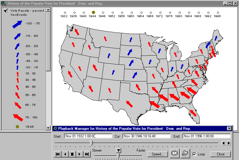
The legend for the animated tracking theme, visible on the left in the View TOC, indicates that the theme displays two variables (victorious party and margin of victory in percentage points) in two different ways each. The victorious party is indicated by color (red for Democrat, blue for Republican) and direction from north (to the west, or left for Democrats, and to the east, or right, for Republicans). Obviously, there are many opportunities here for introducing cold-war propaganda values, by emphasizing the "redness" and "left leaning" propensity of Democrats. Similar creativity could, no doubt, be applied to the Republican side. (See Mark Monmonier for more on these dubious cartographic tendencies.) Our purposes here were purely investigatory. Finally, note at the bottom of the legend that the single dot used to mark the year has a single, unchanging value.
The issue of how to represent the voting history in symbols, and how to animate it, was a creative challenge, and a testing ground for the problem of animating the water quality models. Several different schemes were tried, such as using dots instead of arrows. The image below illustrates the election of 1972, in which Richard Nixon achieved a landslide victory over George McGovern, the Democratic challenger. Although the nature of the election victory is clear (McGovern carried on Massachusetts), the animation does not do justice to dramatic changes that occurred, e.g. Nixon’s "Southern Strategy" to bring democratic voters in the south into his camp. Arrows which swing about, like a weathervane or a compass needle not only more effectively impress the viewer with the fact that change occurred, but they also have cultural connotations, alluded to above, that add richness to the display.

Once a decision was made to employ directional arrows (color to represent party, left/right to represent party, with the degree of declination from north and the size of the arrow to represent margin of victory) the problem of how to construct a legend arose. Class intervals for the percentage of the vote, positive and negative depending on the party, were developed with ranges that would encompass the range of data and reduce the classes to a workable number. The arrow symbols were developed by hand to produce a set that was visually compelling, legible, and suitably dramatic, but there was no analytical algorithm used to set the size or degree of rotation. The percentage values of the classes began at +/- 15 and ran to >+/- 75. Rarely, did a state see the loosing party get less than 15% of the vote.
Another reason why arrows were employed, despite the fact that using variable dots is very much more simple (no rotation is possible), was that we were looking ahead to animations of hydrodynamic models for which vector representation of velocity is a common tool. In HydroQual’s proprietary animation applications, water velocity from model output is shown by an arrow within the subject grid cell, and the arrow has a length indicating the magnitude of velocity, as well as a direction. The voting animation was a dry run for this type of work, but a little consideration will make apparent that it is a much simpler problem to solve. Before discussing that point further, some further background on the modeling enterprise is appropriate.
The Modeling and Animation Environment:
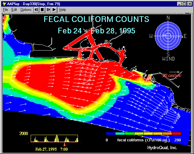
This image below represents modeling results of coliform contamination of waters surrounding New York City, NY that result from combined sewer overflows (CSOs) during a rain event. It is a still frame from a typical animation produced by HydroQual using our proprietary software, which was then ported to a PC video format. A few things to notice about this image are that it appears distorted because it is not in projected coordinates – that’s an advantage of displaying the data in GIS. It is also clear that the coastline of the region, shown in white, does not register precisely with the land areas as designed into the model frame work (shown in black.) This is a consequence of the fact that not every geographic detail can be included in the model, and such detail is not necessary to answer the questions at hand. The model is based on a model framework, or grid (a confusing term in that it has nothing to do with a grid as it is known in raster GIS, e.g. Spatial Analyst) like the one shown earlier. It is also clear from examining this image that the model results, although they are derived from computations based

on individual grid cells, are not displayed as bounded polygon values. Instead, they are interpolated using a complex Gouraud shading algorithm that gives a finely graded appearance, very appropriate for displays of hydrodynamicaly based phenomena. Unfortunately, there is not a way to reproduce this technique in the ArcView environment, so the problem becomes, what is the next best thing? The next best thing is to use the ArcView TA extension to represent the time series values of the model grid output as variable symbols at the corners or centroids of the grid cells, as shown below.

In the image above, the velocity properties for the individual model cells are represented by two symbols that are superimposed on one another: an arrow indicates the direction of the average velocity within the model cell; a circle, varying in size, indicates the magnitude of the velocity. Using superimposed symbols allows us to make other interesting maps, e.g., velocity arrows superimposed on salinity circles to show how the salinity in the tidally influenced hydrodynamic regime is directly related to the direction in which the prevailing currents are flowing at a particular time of day. Alternatively, symbols can be separated to emphasize the change in a single parameter, as with salinity in the pair of images below, where the size and darkness of the dot increases with salinity:


The image on the left shows the salinity in the NY Harbor as the tide has begun to come in, bringing with high-salinity sea water. The image on the right shows the same area as when this phase of the tidal cycle is near its peak, and the harbor salinity has seen a marked increase, especially in the part of the harbor adjacent to Brooklyn, as indicated by the darker coloring and larger size of the dots, . Of course, the animation from which these frames were saved, depicts this process as a continously pulsating rhythm that may be stopped at any time. It is important to keep in mind as well that although this technique is useful, it was derived from necessity, driven by the more complex nature of the problems regarding representing modeling data rather than election results.
What are those differences? At bottom, election results data, however troublesome certain details may be, are very simple. The problem, at least as we defined it, was to map one of two possible outcomes for the victor (D or R). That result determined the color and direction of the arrow symbol. The size of the victory determined the tilt and the thickness of the arrow, but this too was reduced to a manageable task because only certain ranges could be easily and meaninfully interpreted by viewers. It would be inutile to depict election results to the nearest percentage point when it is the overall patterns of victory and loss that are of interest. For scientific models, however, such details can be of great importance, and the raw data itself is more complex.
For the relatively simple task of animating the current velocity data, we were presented with the following situation: the data record could contain values of velocity magnitude from 0 meters per second to 1.8 meters per second, and the direction of flow associated with those values could be any value on the compass. That is, for each velocity magnitude, if we limit ourselves to directions rounded to the nearest degree, there could be 360 corresponding azimuths. If only ten discrete values of velocity are tabulated, then for each record, 3600 possible combinations are possible. This presents a great difficult for developing a legend simply. Compare this situation to the voting results animation where for each possible victor (two possibilities) there were six possible magnitude-of-victory values, for a total of twenty-four classes for the entire two-party set. This is a number that can easily be manipulated by hand. Even if we reduce the number of directional values to twelve (with a range of 30 degrees each), the number of possible values would still be 120, a large number to manipulate by hand, and we would lose an important visual element of the animation, i.e., clear depiction of the direction of flow. Because it is so important to develop the legend schemes in an interactive manner that allows for fine judgements of visual impact, these large numbers present a very serious problem.
HydroQual's proprietary visualization software deals with the vector data directly, automatically creating arrow symbols with a length proportionate to the velocity magnitude, while the direction varies according to the azimuth of the current, an example of which is shown below.
This image depicts the model results used to evaluate the location and movement of a pollution plume in Hawaii, in this case coliform contamination from urban runoff and overflows, that vary in time according to dynamically induced dilution and die-off from the intese solar energy input which is normal for that location.
Currently, we are investigating ways of automating the legend creation for simulation model output withing the AVENUE programming environment. Such a program would read in the model results file, establish the range of values present, and generate unique values for each possible combination, or values at some grouped interval. This would be a labor saving first step, but adjustment by hand would, no doubt, still be necessary to ensure that the animations properly communicate their intended messages.
Conclusion and Assessment:
This paper has summarized the investigations we at HydroQual have undertaken to bring adapt the Tracking Analyst extension to the animation of our proprietary water quality and hydrodynamic models, a task for which it was not designed. This entailed finding a way to represent model data, generated from polygonal modeling cells, as time-varying symbols with a fixed location. Attacking a simpler but analgous problem first, the representation of time-series data on the results of U.S. presidential elections, allowed us to understand and find ways around the significant problems attendant on representing complex, multi-variate, time-variable data. The results we achieved, although they are not perfect, and in some respects are inferior to the stand-alone animations we currently make, have one tremendous advantage: the model can be animated directly within the GIS environment, stopped, reversed, and queried, in the context of other relevant spatial data, rather than viewed in an animation player. With the developement of scripts to assist in creating appropriate legends, the most difficult aspect of the enterprise, it will be feasible to carry out this sort of work quickly for any project.
References:
Daniel Dorling, "Stretching Space and Splicing Time: From Cartographic Animation to Interactive Visualization", Cartography and Geographic Information Systems, Volume 19, No. 4, October 1992.
Mark Monmonier, Maps with the News, The University of Chicago Press, 1989
Mark Monmonier, How to Lie with Maps, The University of Chicago Press, 1991
Author Information:
Gary
Ostroff, P.E.
Senior Project Manager
HydroQual, Inc.
1 Lethbridge Plaza
Mahwah, New Jersey 07430 USA
Tel: 201.529.5151
Fax: 201.529.5728
e-mail: gostroff@hydroqual.com
www.hydroqual.com

