Robert
N. Martin
The Shrinking Student Pool and Higher Education: An Example from Pennsylvania
Abstract: The Commonwealth of Pennsylvania is one of those
states experiencing an aging population. The impact of this demographic
change on higher education is increased competition for a shrinking pool
of available students. This paper presents the results of a cartographic
analysis of the market areas for the fourteen universities that make up
the Pennsylvania's State System of Higher Education. The cartographic analyses
used in this paper are contiguous cartograms.
INTRODUCTION
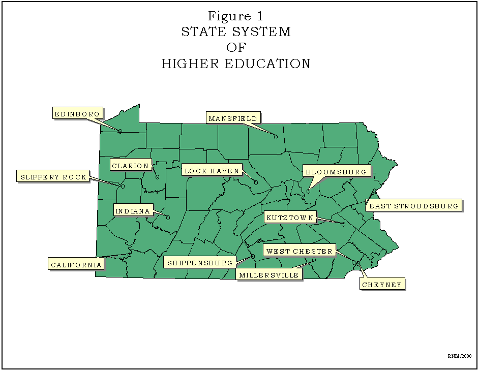
The State System of Higher Education of the Commonwealth of Pennsylvania
comprises fourteen state-owned universities. The System universities are
located in rural, suburban, and small-town settings throughout Pennsylvania.
See Figure 1. These universities grew out of the Normal School Act of 1857,
which established regional teacher training institutions and the School
Code of 1911, which required the Commonwealth to purchase all normal schools.
These fourteen institutions evolved from state normal schools to state
teacher colleges and then into state colleges. Based on Act 188, the State
System of Higher Education was established "...to provide high quality
education at the lowest possible cost to students."
The System universities exist in a highly competitive environment. Within
Pennsylvania there are 128 other colleges and universities which are seeking
to enroll individuals seeking a higher education. Given this amount of
competition it must be noted that the System universities educate more
students per year than any other higher educational institution within
the state with over 95,000 enrolled in 1999. While the System universities
are leading in enrollment, the potential market has not been growing. Over
the last several decades Pennsylvania has been experiencing a low population
growth rate. The Bureau of the Census projects for 2000 that state will
show a total increase in population of around 218,000 or 1.8% since 1990.
Another factor that compounds the competition among higher education institutions
within the state is the fact that Pennsylvania is ranked third oldest in
terms of median age of population.
Taking these factors together the System universities will be facing
increasing competition, which means that the limited resources available
to recruit students will have to be used wisely. This paper present an
analysis of the enrollment patterns for the fourteen System universities
in an effort to identify those geographic regions where recruitment efforts
should be focused.
METHODS OF ANALYSIS AND DATA SOURCES
Three cartographic techniques are used to map the enrollment pattern for
the System universities: contiguous cartograms, non-contiguous cartograms
and three dimensional prism maps. The contiguous cartograms were generated
based on the Avenue script written by C.B. Jackel, which accompanied his
article in Cartography and Geographic Information Systems. The non-contiguous
cartograms were generated using the Cartogram extension in ArcView 3.2,
which was coded by Jeffery Lane. Finally the three-dimensional prisms were
created using the 3D Analyst extension for ArcView.
Previous research by the author has shown that there is a very strong
distance decay relationship between the student's county of residence and
the System university that they choose to attend. Based on this research
and the history of the institutions it was anticipated that there is a
strong regional pattern in enrollments.
The Office of the Chancellor, State System of Higher Education, provided
the data used in this paper. These data gave the number of students attending
each System university broken down by county of origin for 1999. These
data were in an Excel format and FIPS codes for the counties had to be
appended. County boundaries for Pennsylvania were drawn from the data sets
provided with ArcView. The enrollment data was joined to the county tables
by FIPS code and saved as a new shape file. A new data field was added
for each of the System universities that indicated the percent of the county's
students attending that university. The final data adjustment that was
necessary was to add one to each county for each university in order for
the contiguous cartogram code to operate efficiently.
RESULTS OF ANALYSIS
The results of the analyses are presented in the following four sections:
overview, contiguous cartograms, non-contiguous cartograms, and three-dimensional
prisms.
Overview
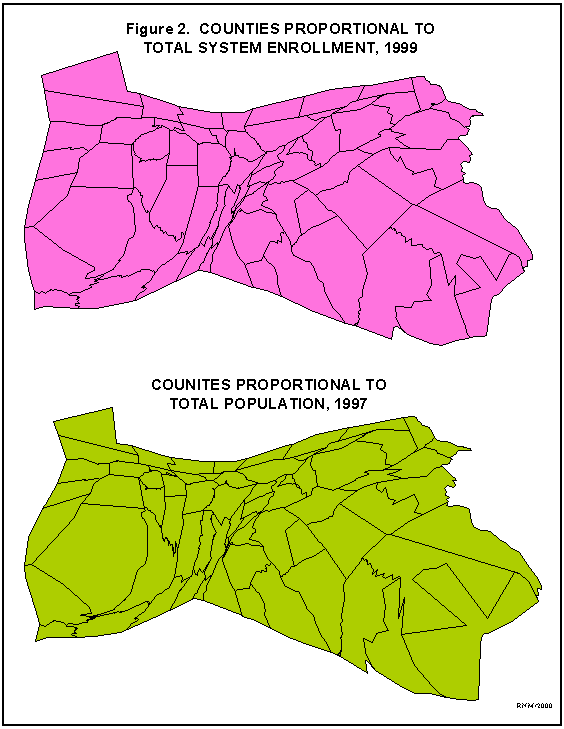
The contiguous cartograms in Figure 2 compare the total enrollment by county
to total population for the counties within the Commonwealth. As can be
seen by comparing these two maps the number of students attending System
universities is similar to the total population distribution.
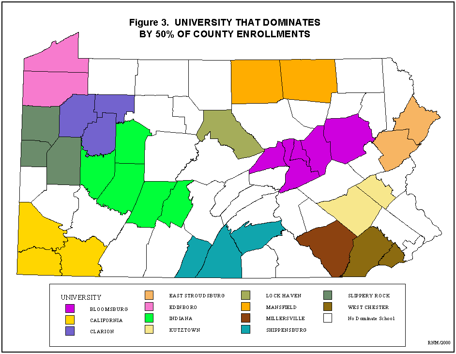
As mentioned above the System universities were established as regional
teacher training schools. This regional nature can be seen in Figure 3
where the counties are coded which university dominates enrollment by fifty
percent or more. For thirteen of the fourteen universities they dominate
the county in which they are located. The exception being the historically
African-American Cheney University of Pennsylvania in Chester County that
draws the majority of its students from nearby Philadelphia.
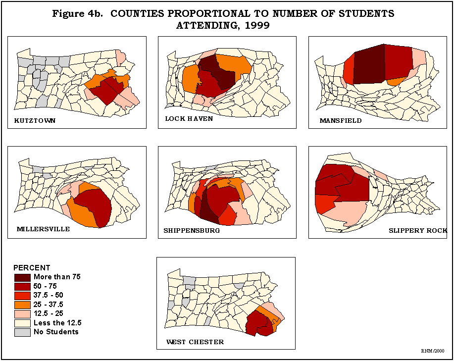
Contiguous Cartograms
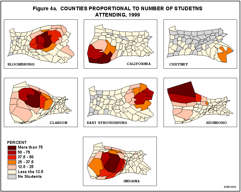
The regional pattern of dominance by the universities is strongly reflected
in the maps in Figures 4a and 4b. In these maps the size of the counties
in the contiguous cartogram is proportional to the number of students attending,
while the shading pattern is percent of the county's students attending
the respective universities.
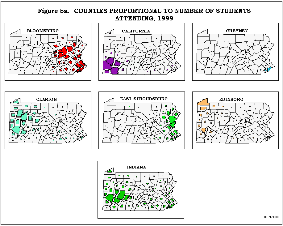
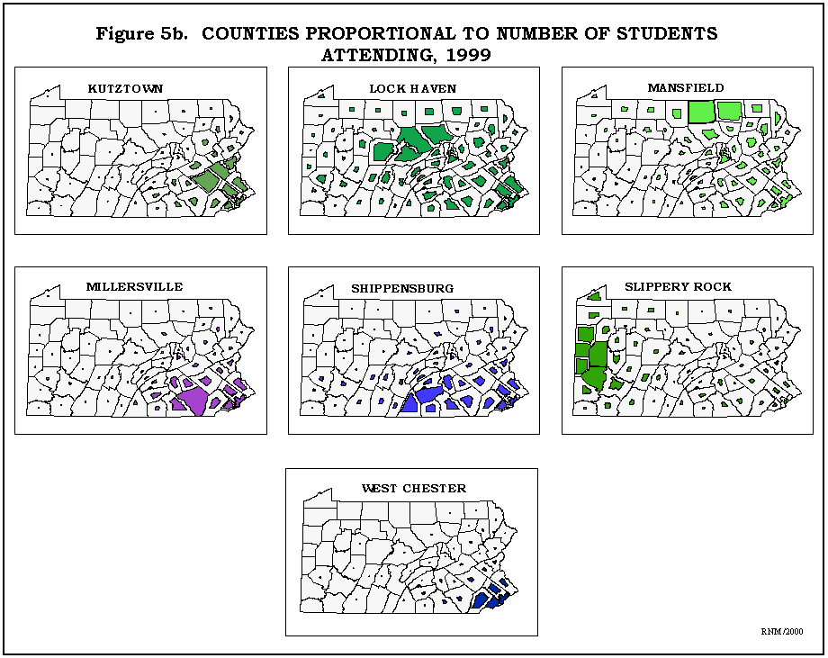
Non-Contiguous Cartograms
Because of comments that the contiguous cartograms were 'disorienting',
a set of non-contiguous cartograms were generated using the Cartogram!
extension in ArcView. See Figures 5a and 5b. Here the counties are proportional
to number of students attending the respective universities. And again
the regional nature of the enrollment is evident.
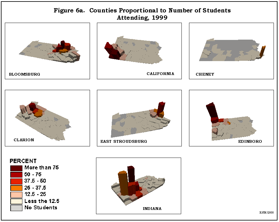
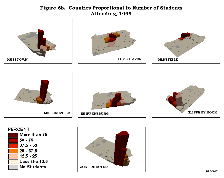
Three-dimensional Prisms
The final set of figures demonstrates the third mapping techniques through
the use of prisms generated by 3D Analyst. See Figures 6a and 6b. The height
of the counties is proportional to the number of students attending and
the shading pattern indicates the percent of the county's students attending
the respective universities. These maps have the advantage that high enrollment
but low percentage counties are evident.
CONCLUSIONS
The three mapping techniques provide visual evidence of the enrollment
patterns for the fourteen System universities. Each of the mapping techniques
indicated the regional pattern of enrollment for the System universities.
These maps can provide a guide as to where to direct recruitment. Specifically,
since each university dominates it local area it may be best to look farther
a field for students. This is a strategy that has been already implemented
by several of the schools.
References
Charles B. Jackel, "Using ArcView to Create Contiguous and Noncontiguous
Area Cartograms", Cartography and Geographic Information Systems, Vol.
24, No. 2, 1997, pp. 101-109.
Robert N. Martin, "Using GIS to Monitor University Enrollments, Part
Deux", Annual Meeting Pennsylvania Geographic Society, October 1996.
Robert N. Martin, "Using GIS to Model University Enrollments: An Example",
90th Annual Meeting of the Association of American Geographers, March 1994.
Robert N. Martin
Professor and Chair
Department of Geography
Kutztown University
Kutztown, PA 19530
e-mail: martin@kutztown.edu
phone: 610-683-4364