Utility Data Conversion Done Right:
A Unique Approach to Creating a First-Class GIS
Sara Mace
Christine Wilcox
ABSTRACT
Gannett Fleming, using Esri’s suite of software, has created a distinctive methodology for converting hard-copy utility data. Our data conversion process includes several steps, beginning with georeferencing hard-copy maps and ending with an automated QA/QC procedure. This paper will document our conversion process, identify common problems organizations face when converting utility data, and make recommendations for organizations looking to convert their utility data. The conversion of water and sewer maps in Spotsylvania County, Virginia will serve as a case study for this paper.
INTRODUCTION
Hard-copy map sheets have long been the standard method that many municipalities have used to maintain their utility data. While paper maps served their purpose in the past, several disadvantages keep this method from providing the flexibility needed to manage the large amount of data maintained in utility systems. For instance, each individual sheet may only provide data for a small segment of a particular pipeline, thus requiring thousands of map sheets to represent one system. Not only must there be enough physical space to store all of these maps, but repair technicians need to carry several maps to the field in order to cover their area of interest. In addition, these maps sheets become worn and clumsy to handle, making it difficult to gain a broad perspective of the entire system and its functionality. Paper maps are also more difficult to keep current because a significant effort is needed to produce a new set of maps with the updated information. It is also difficult to conduct any type of analysis on the entire utility system using hard copy maps.
Spotsylvania County, located in central Virginia, was faced with these problems. There are approximately 3,500 as-built and profile drawings which the County uses to maintain its water and sewer systems. Some of the data was becoming hard to read, as many of the sheets were more than twenty or thirty years old. Updates to the data were being hand-drawn on the existing sheets, sometimes creating confusion. The County also maintained CAD drawings of planimetric data, such as road centerlines, streams, and parcels. However, with the utilities data still on hard-copy maps, the planimetrics data was not of much use. Figure 1 below is a representative data sheet from Spotsylvania County. The top of the page depicts the as-built of a water pipe segment while the bottom half contains the profile information. The sheet is hand-drawn, making some of the information difficult to interpret.
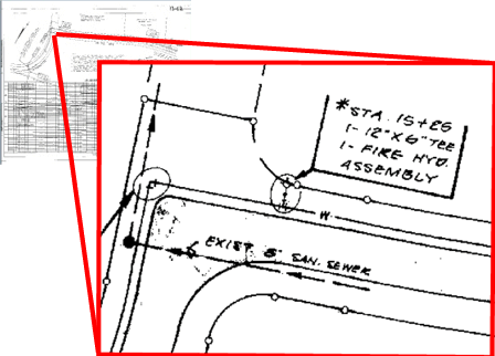
Figure 1: Sample hard-copy as-built drawing, insert shows detail.
The obvious solution to the problems Spotsylvania County encountered has to convert the hard-copy maps into a digital format and work with the data in a GIS. The spatial nature of utilities data lends itself well to the advantages GIS offers over hard-copy data. Perhaps the most important advantage is the ability to update the data instantly and perform complex network analysis on the systems. In digital format, the utilities data can be available to all users through their PC. Utilities data can be queried quickly and any area of interest can be plotted out within minutes. In addition, a topological network for the system could be created, allowing for more advanced analysis and modeling.
While working with the County, Gannett Fleming has developed a distinct methodology for converting hard-copy utility data. Our data conversion process includes several steps, beginning with converting the hard-copy maps into a digital format and ending with an automated QA/QC procedure. This paper will document our conversion process, identify common problems organizations face when converting utility data, and make recommendations for organizations looking to convert their utility data.
CONVERSION PROCESS
Data Tracking
One of the most important components of a large data conversion project is determining how all of the data will be managed throughout the entire process. With 3,500 sheets and several employees concurrently working on the project, there is a great potential for confusion as to which map sheet is in what stage in the conversion. Before we proceeded with any of the data conversion, Gannett Fleming created a Project Tracking program. This software, which resides on every analyst’s desktop, monitors the progress of each sheet as it passes through all stages of conversion (Figure 2). Our employees, using our GIS Project Tracking program, will document every step in the conversion process. With this process, Gannett Fleming is able to resolve data discrepancies issues quickly, whether that means returning to the source data provider for clarification, using other data sources to allow further interpretation and clarification. This allowed us to provide the County with real time updates regarding the status of any data currently under conversion. Our GIS Project Tracking software gave us the tools to quickly solve problems as they appeared and insured the high quality of the data Gannett Fleming delivered to the County.
After a sheet completed each phase of conversion process, a simple check mark in the application recorded the status in a database, along with the date and the user who completed the task. Another important component of the data tracking application is that it allows the user to enter comments about that particular sheet.

Figure 2: The data tracking application interface
Clipping
Most of the as-built drawings had excess information in the margins, such as profiles and notes (Figure 1). While this information is important, it was not needed for the subsequent phases in the conversion process. This information was removed by “clipping” out the unnecessary information from the as-built drawing.
The map sheets were converted into digital format by scanning them and creating images in .tif format. All of the images were then converted into a raster grid format using Arc/Info. Since the area to be clipped from each sheet was not the same size, a polygon of the clip extent was created on each sheet individually in ArcView and written to one shapefile. The degree of rotation was also noted, based on the position of the north arrow on the maps (Figure 3). An Avenue script was compiled to facilitate the clipping process. Once the clip extents (polygons) and rotation degrees were stored in the shapefile, the actual clipping of the grids was run overnight in batch mode, utilizing Spatial Analyst to manage the grids. The result of the clipping was a new grid containing only the as-built information, rotated so that the data was shown facing north.
One of the most important things we learned during this phase was to be flexible with the software by not limiting ourselves to only one Esri product. There are advantages to using both ArcView and ArcInfo - when one piece of software seemed to better fit the task (or the employee assigned to the task), that software was used. For example, ArcInfo was better suited to batch conversion of a large number grids, but ArcView was a better choice for creating the clip extent polygons.

Figure 3: Clipping in ArcView
Georeferencing
Georeferencing (also known as warping or rubber sheeting) was a crucial step in the data conversion process. The clipped and rotated map sheets were not referenced to a known coordinate space, so placing them in the correct location within the county would have been difficult. To aid GIS analysts with locating the position of the map sheets, the County created a shapefile with individual reference locator boxes (Figure 4). This shapefile, along with the planimetrics data converted from CAD, provided the base mapping needed to perform the georectification.
The warp extension in ArcView was utilized for the georectification process (Figure 4). The warp extension requires that two views be set. The “From” view holds the clipped and rotated map sheet. The “To” view contains the planimetric data, which is already georeferenced. To find the approximate location of interest in the county, the user performs a simple query that selects the reference box for the specified map sheet(s).
To establish the geographic relationship between the two views, control points were placed on easily identifiable landmarks. Features that could be readily discerned on both the clipped sheet and the planimetric view produced the most successful results. The best features were found to be road intersections and parcel lines (building corners and stream crossings also proved useful) (Figure 4). A minimum of four control points were needed with better results resulting from more control points. It was also crucial to spread the points out over the entire sheet to ensure that warping would not distort one corner of the sheet more than another. The (x,y) location for all of the control points was stored in a link table for each map sheet. The warping scripts calculated the mathematical relationship between the same points on the unrectified and rectified sheets to find the best fit and stretch the clipped sheet into the planimetric view. The result was a map sheet georeferenced to the planimetric data.
In our opinion, the warping process was found to be the best use of time in this project. While warping need not be an exact procedure, care must be taken to ensure the best fit possible with the amount of data available for control points. Without these warped sheets, the job of the digitizer in the next phase of the project would have been extremely difficult. Georeferencing eliminates much of the guess work in placing the utility lines.

Figure 4: The warping environment
Data Conversion
Once the sheets were georeferenced, the next step was to extract the required water and sewer features and attributes. Some utility conversion projects are completed using the flexible editing system provided by Arc/Info’s built in the ArcTools menu interface. However, the ArcTools interface is designed for general data editing and does not have some of the tools needed to facilitate utility conversion projects. In addition, it provides many features that are not used in these types of projects, forcing the user to step through multiple palettes to perform a desired function. ArcTools also does not remember key project elements that need to be re-entered at the start of each session.
In order to efficiently and accurately process the 3,500 sheets covering Spotsylvania County, a custom system to digitize water and sewer data was designed and implemented using the Arc/Info Macro Language (AML). The system provides editing tools, controls the display and edit environment, and allows the user to navigate between map sheets. The system is controlled from a single main menu. This menu provides access to basic system functions and to the editing system. The editing system is composed of four threaded form menus: a selection menu, a display menu, feature editing palettes, and attribute palettes.
Upon starting the menu system, the main menu is used to choose the coverage to work on (sewer or water). The system then prompts the user to select a map sheet from a scrolling list. To distinguish sheets containing data from different utilities systems, an “s,” “w,” or “ws” was placed in front of the file names to quickly separate those sheets that contained water lines, sewer lines, or both. By displaying the sheet numbers with only one of these prefixes at a time, the menu loaded much faster (Figure 5).

Figure 5: Main Menu and Sheet selection Menu
After a sheet has been chosen, the system sets the map extent of the coverage to the boundary of the selected sheet. It then displays the map sheet as a background image and sets up the draw and edit environments (Figure 6). The selection menu automatically appears next, which controls the editing system environment. It loads the display, feature editing, and attribute editing palettes, saves edits, allows the user to quit the system, and provides access to the command line.
The display palette controls how features are displayed on the screen. It provides the user with a selection of reference coverages, including parcel lines, buildings, railroad lines, hydrography and land cover. These can be added as background coverages with a user specified line color. This palette also allows the user to show feature attributes (such as manhole numbers) while digitizing, ensuring that features are correctly coded. In addition, map sheets can be turned on and off at the user’s discretion.
The feature editing palettes provide buttons for adding, deleting, moving, and changing arcs and nodes. They also provide access to the palettes that are used to edit feature attributes (Figure 6).
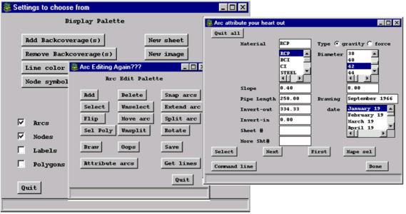
Figure 6: Editing system menu and palettes
Using an NT workstation with two monitors helped organize the edit windows, menus, palettes, and other software needed for the conversion process. The left monitor is used as the editing screen for the Arc Edit window. This window contained the selected sheet, reference background coverages, and the utility coverage being edited (Figure 7). The right monitor holds the editing menu system and associated palettes (Figure 8). Since the georeferenced sheets have been clipped, eliminating many of the attributes, the original .TIF image map sheet with profile information intact is viewed using an ArcView session, also on the right monitor. This provides full and convenient access to the unaltered source data in an easy to use interface without having to incorporate this function directly into the menu system.

Figure 7: Left monitor

Figure 8: Right monitor
To distinguish the utility features from the primarily white background of the scanned sheets in Arc Edit, the arcs are drawn in red and highlighted in green when selected. Arrows are added to the arcs to symbolize flow direction, to make certain that arcs are oriented correctly when added or changed. This was especially critical for the sewer lines.
Resolving Issues with Source Data
Some of the original as-built sheets were more than 20 years old. The age of the sheets and difficulties with legibility created some uncertainty regarding location and attribute information. Also, some areas of the county were covered by more than one sheet, providing conflicting information from multiple dates.
Map sheets that were not warped accurately due to lack of good control points created a dilemma for the digitizer. However, much of this information could be recreated “on the fly” using the original map sheet and planimetric data as a guide. For example, the as-built information clearly indicates whether a pipe follows the left or right side of a road. If the warped sheet did not place the pipe on the correct side of the road, then the pipe was drawn where it was supposed to be by approximating the location with the aid of appropriate background coverages. If there are no features to help position a pipe (as was the case in rural areas), the pipe was digitized in the exact location on the warped sheet and a comment was added to the tracking system.
If there were areas covered by two or more sheets with conflicting data and no drawing dates to indicate the most recent information, the most logical configuration was chosen using a combination of data from all the sheets. Appropriate engineering principles were followed in these situations. A comment was always added to the tracking system if this was the case.
Illegible or unclear pipelines and attributes on the as-builts are approximately positioned and attributed using previously digitized information from nearby pipes and background coverages, if available. These instances were also documented in the tracking system.
Quality Assurance and Quality Control
Quality assurance and quality control (QA/QC) are critical aspects of any data conversion project. Hardcopy paper maps provide a simple method for checking utility data and noting corrections that does not require a computer or any GIS experience. In the Spotsylvania County data conversion process, 1:2,400 scale hard copy check maps were generated to evaluate data accuracy. An index grid containing 550 grids at 6,000 by 4,000 feet was created to cover the county. Due to the large number of check plots, an Arcplot AML was written to automate the map production process. Having the capability to produce large number of standard plots in batch mode saves significant amount of time. Arcplot AML allows the check plots to be created automatically for each index grid, including selection of map extents, automated text placement, and update of the grid position in locator map. The check plots can be run in the evenings and on weekends without supervision of the hardware or software, freeing the workstation and time for conversion and other projects during the day.
The check plots contained all critical utility features and attributes as captured during the digitizing stage. Pipe material was differentiated using line colors and line symbols. Nodes representing features such as manholes, fire hydrants, and blind tees were symbolized using a markerset created specifically for Spotsylvania County sewer and water features.
Pipe diameter annotation was the most challenging data to place on the check plots. To better place some of the densely spaced text (especially in areas with many short pipes) the overpost environment was used. The overpost environment is designed to label points, however, we also used it to positioning text on arcs. Overpost enables some pipelines to be labeled precisely while permitting Arc Plot to determine the best position for other, hard-to-annotate pipelines. It also adds leader lines where necessary. Moving the text might cause it to overlap with lines, particularly when there is a great deal of data on the map
In general, the sewer check plot annotations were legible. However, the water line coverage had a large amount of data in small areas and could have benefited from a larger scale. However, it would have taken four times as many check plots to cover the. Spotsylvania County if the scale was enlarged to 1:1,200. There would have been over 2000 maps to plot and edge match. As a result, preliminary versions of the water and sewer coverages were provided to the County to look at with ArcView. This would allow them to zoom into any area containing a dense amount of information.
The County reviewed the check plots and any changes to be incorporated into the utility coverages were symbolized directly on the plots. To avoid any misunderstanding concerning the changes, a standard for marking up the check plots was developed. It consisted of a simple system involving highlighter colors and notations where possible. A different color was used to identify which arcs should be deleted, moved, or added to the coverage.
Conclusions
All utility conversion projects are similar in that they begin with paper maps and end with a fully attributed GIS coverage. However, every project is unique, mainly in regard to the condition of the original data. The data conversion for Spotsylvania was no exception. While some methods were designed specifically for Spotsylvania County (such as the QA/QC procedure), many are applicable to other utility conversion projects. For example, rotating the clipped as-built sheets to face north greatly facilitated the georectification process would be applicable to any project working with hard copy maps not aligned north.
In similar localities that cover a large area, it may be worthwhile to devote time early in the project to the production of programs that automate the conversion process. Although this application development consumes some of the start-up time, it can improve efficiency and actually reduces the total time spent on the project. In addition to speeding up the conversion process, automating the digitizing and attribute calculations standardizes coding of similar situations and avoids human error, thus improving accuracy.
Program design can be taken one step further by identifying elements that utility data conversion projects have in common and incorporating them into a generic data conversion system. Although it involves additional programming effort, the resulting system can be used with minor alterations for future utility conversion projects, eliminating the need to produce custom menus for each new project. Gannett Fleming has designed this type of generic data conversion system based on what we learned during the Spotsylvania County project (Figure 9). It allows the user to interactively specify GIS data pathnames, copy and rename coverages, and create workspaces. These settings are stored for each user and project, allowing simultaneous data conversion projects to use the same data conversion system.

Figure 9: The settings palette allows the user to specify the location of utility GIS data
Gannett Fleming's broad experience in data conversion is based on our creative approach to the entire process. Our project tracking software provided Spotsylvania County with instant access to the status of their conversion process and insured data completeness from our technical staff. Using our custom conversion system, our staff of analysts and technicians can quickly and accurately develop timely and accurate data for Spotsylvania County. Once the data has been converted, our team reviews the data using proven QA/QC techniques, including custom plotting software. All of these innovations enables Gannett Fleming to provide the best possible services with the best possible value.
GIS Analyst
GIS Analyst
11818 Rock Landing Dr.
Ste. 101
Newport News, VA 23606
757-873-0768