AirTime: Visualization of Change in Philadelphia
Robert Cheetham
City of Philadelphia, GIS Services Group
Abstract:
While visualization of phenomena through a spatial metaphor has been significantly enhanced by GIS technology, understanding the structure of spatial phenomena as they change in time still represents a challenge. Only recently have database vendors begun to provide the tools and data structures necessary for the creative manipulation of time-stamped data. Extensions such as the Tracking Analyst and the tracking layer object in Map Objects have begun to enable visualization of this type, but there are several limitations on these tools. The City of Philadelphia Police Department, GIS Services Group and Health Department have begun developing a set of applications using MapObjects and Spatial Analyst that enable visualization of point and GRID data from air quality and crime data. The air quality data has been collected over 30 years from detectors spread across the City and includes NOx, CO, SO2, Ozone and various particulate measures. The crime and other incident data is drawn from the 2 million unique incidents per year to which the Police Department responds. The paper will demonstrate these applications, discuss the development process and suggest future directions for this research.
As human beings, we are attracted to things that change, shift, and transform. If we are moved by a still photograph, we are transfixed by the moving fixtures of the cinema. Some of the most interesting spatial questions are those that involve an element of time. A map of species habitats is very interesting, but in order for a nature conservancy to make intelligent decisions about where to target land purchases, it is better to know how those habitats are changing or have evolved in the recent past. While it is helpful for a business to understand where opportunities are available now, it is even more useful to understand trends, past and present, and to be able to conduct forecasts of where customers will be in 5 years. Traffic, epidemiology, crime, economics, climate change, trade and real estate all share a need to not only understand spatial patterns and see time-series trends but also be able to understand interaction of changes in space through time.
These are not new concerns. We have attempted to represent change and shift in space for as long as we have been making maps. Edward Tufte highlights some brilliant examples of static (paper) representations of change in time and there are many others from the print world.
However, with some outstanding academic exceptions such as Ben Schneiderman's work at the Human Computer Interaction lab, the MIT Media Lab and others, we have done a relatively poor job of translating some of these print models into screen-based, interactive visualizations. Until recently, there have been relatively few tools to make this type of work possible.
ToolTime (Time Tools?)
The above-described state of affairs has begun to change. In the past few years, the growth of GPS and other influences have caused the mainstream GIS vendors to begin to incorporate real-time tracking and other temporal features into their products.
MapObjects Tracking Layer - The TrackingLayer and GeoEvent objects allow the display of dynamic data in the MapObjects Map control. These are very useful elements of the MapObjects component set and their applications are not limited to simply GPS or real-time data representation.
ArcViewTracking Analyst - This Esri extension is a real gem. It supports real-time network and serial connections to GPS units and other measurement devices. It also includes several viewing and analysis tools for replaying and visualizing point data. It allows some fairly sophisticated representations of data changing through time including the ability to associate symbolization actions with tracking events and the capacity to assign time windows.
Oracle Time Series Cartridge - Oracle Time Series allows time-stamped data to be stored efficiently in an Oracle8i database. It supports a basic set of functions-calendar, time series, and time scaling-to retrieve and process data. By offering basic functions and data types, the Time Series Cartridge allows users to develop data provisioning, data warehousing, and full-analysis time series applications using the Oracle8i Server.
SQL3 Part 7: Temporal - Temporal SQL deals with time-related data with the idea that it is often useful to query data to discover what it looked like at a particular point in time.
SDE Geodatabase - the geodatabase now includes some capacity for versioning of data. While this appears to be intended for conflict resolution during editing sessions by multiple users, it is also raises the possibility of tracking historical change in a database.
So What is Philadelphia Doing with all of its Time?
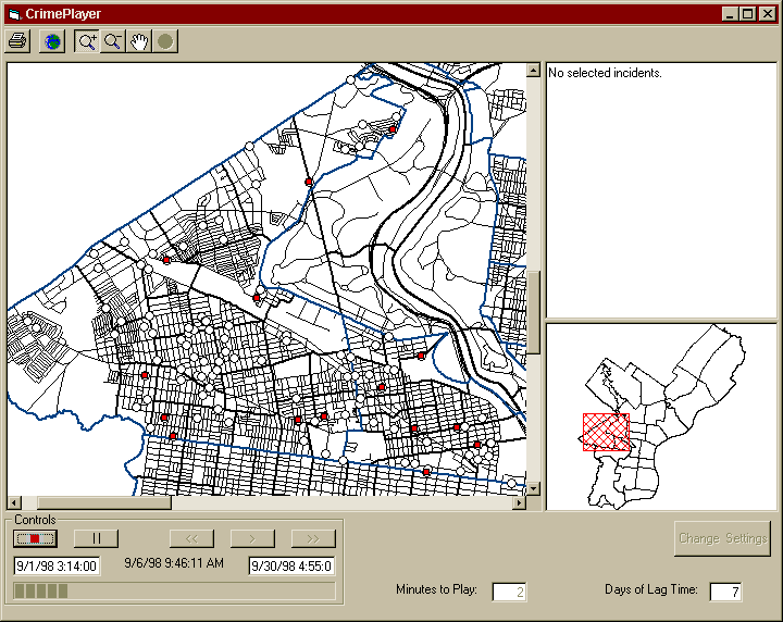
But despite all of these very interesting and useful tools, with one exception , we didn't use any of them for the projects I am about to describe. Prior to the release of Tracking Analyst, we actually developed a MapObjects-based 'CrimePlayer' that resembled some of the functionality that later appeared in the Tracking Analyst, in particular the ability to accelerate playback and suppress events to those that are relevant at a particular point in time. When we were experimenting with this approach, the Tracking Analyst would have been ideal, but it was not yet available and we therefore took the homegrown approach with the MO TrackingLayer instead.
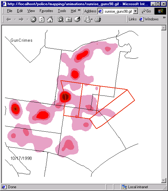
These CrimePlayer experiments covered several different means of representing crime events in time. The first was simply to play back the events (crimes) as they had happened but faster. This seemed like a good idea at the time. We thought that if we could compress the replay of events, we would be able to see spatiotemporal patterns in the data. As it turned out, this approach was not terribly useful and was much less interesting than watching fireworks. After several views of a particular crime class, it was indeed possible to detect some temporal clustering, but it was tough to tell if it was really a pattern or a product of staring at blinking dots for an hour. We then changed the interface and data extraction routines to delay the departure of the points from the screen, creating a time window or moving slice in time. This stabilized the thousand blinking points of light effect somewhat. We then added a symbolization 'decay' effect in which the occurrence of a crime produced a flash of red which decayed to orange, then yellow and then transparent. We also tried adding sound to the display of points. This final element may have been the most useful, but in the end, as interesting as they seemed at inception, it was very difficult to find patterns in crime data through these methods. It was often more useful to simply look at a line graph summary of the same set of crimes.
The Data
Before continuing, it will be useful to understand a little more about the data. For the initial work, we focused on crime data from the Philadelphia Police Department's incident database. The Philadelphia Police Department responds to more than 2 million unique incidents annually. This incident database includes all of them from traffic violations to assaults. Every incident has a date and time associated with it. The database also includes a crime class code. The combination of these two elements constitutes the primary means by which the data is broken down into manageable units. Changes in this crime data are downloaded daily from a transaction-based mainframe database to a SQL Server data warehouse containing about 6 million records. During the download process, the addresses are scrubbed and geocoded to assign a spatial location. All of these records are accessible to the two dozen district offices and special units through a set web-based applications deployed on the City's intranet. The animation work used this SQL Server data warehouse to extract its data. As described above, the original idea of creating a 'crime player' was not very successful in terms of our effort to identify patterns and change in time. We had already worked with attempts to display two or three density surfaces on paper maps and the ability to string several density maps into a sort of film strip seemed a promising approach. However, none of the tools available would allow the animation of GRID surfaces in the manner required.
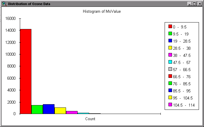
The second set of data considered in this paper was from the Public Health Department, Air Management Services. The AMS monitors a dozen real-time air quality sensors scattering around the City. The sensors detect and report levels of carbon monoxide, sulfur dioxide, nitrous oxides, temperature, wind speed, wind direction and other measurements. In addition, particulate and other chemical components are post-processed by the AMS lab to arrive at measures for lead, fine particulate matter, and other pollutants. The AMS was particularly interested in making this data available to the public in a user-friendly format and a GIS seemed to offer the most potential. Several obstacles needed to be overcome. The air sensor system was based on an old minicomputer that with which only one terminal could communicate and it had no TCP/IP support. So extracting the data and transmitting it to a network point of connectivity in a timely fashion was an issue. The AMS group had already created a set of procedures for regularly packaging and uploading data to the State Department of Environmental Protection as well as the EPA and it was straightforward to adapt these processes for our purposes. Unlike the crime data, the air quality data are not records of actual events but are samples that represent very large portions of the City. While there are a dozen sensors, not all of them monitor all pollutants or other measures. Therefore the data was very sparse. The Tracking Analyst and MapObjects Tracking Layer didn't offer us much in this case since the points are fixed. We would need to interpolate the points to produce surfaces before they would be effective visualizations. It was also suggested that it would be useful to animate these interpolations into a series of frames that could be strung together.
What We Did
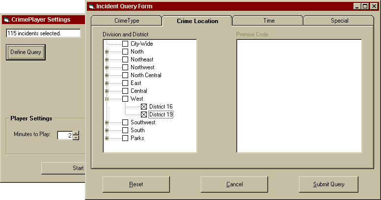
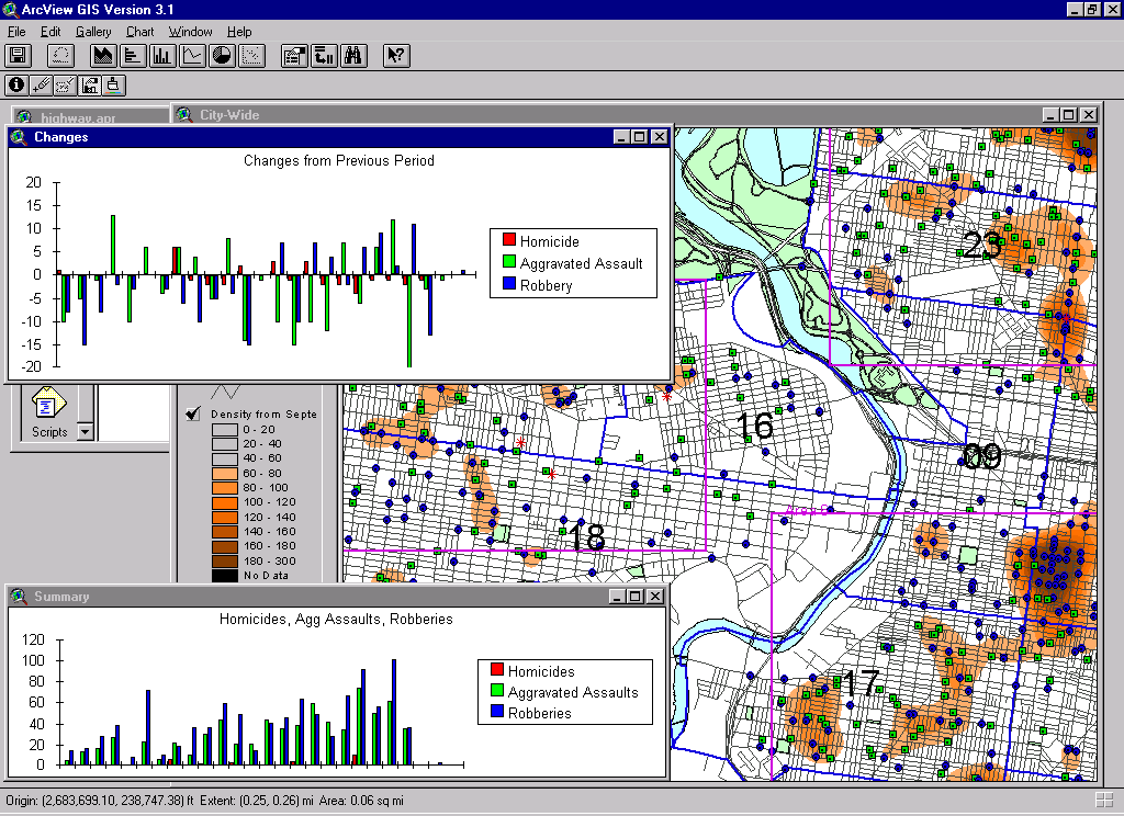
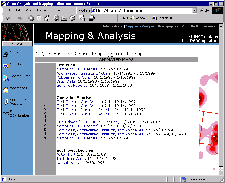
The resulting systems combined several software products and a fair amount of custom code to allow an operator to produce the animations as required. The process begins by defining the subset of the data that would be required. For the crime data, this meant defining a crime class, a district of the City, a date span, a time window and an amount (number of days or hours) by which the frames would increment. For the Air Quality data, it was necessary to identify a pollutant or other measure and a data span for taking the displaying the measurements. These were custom dialogs built in Visual Basic with the end result being a SQL query. This SQL query was repeatedly passed to the database to extract a slice in time fitting the parameters and creating a series of shapefiles. When complete, these shapefiles were passed to ArcView and Spatial Analyst created a GRID (either a density calculation or an interpolation), applied a standard legend, added annotation to the View, and then exported the view as a BMP file. When this was complete, control was returned to the Visual Basic application and the MapObjects IMS WebLink control was used to change the BMP files to GIF files and assemble them into an animated GIF.
Refinements
Once the process had been established, it became clear that some refinements would be necessary in order to both speed it up and make the application more maintainable. The SQL Server database (for the crime data) was adjusted to apply a Clustered Index to the date/time field, thereby re-organizing the data into a temporal order and making time based queries very fast. In Oracle, the same result might be achieved using Partitions. Next, because the Air Quality data was arriving in text files with a variety of formats, a data import utility was designed to ease this process of loading the data. Third, because the original Visual Basic code was not designed as a set of classes, it ended up mixing data access logic, presentation logic and business logic. These logical layers were separated through the implementation of a TimeSlicer object that could accept a series of parameters and a connection string to produce the necessary shapefiles. Finally, the in order to achieve a smooth animation of the crime data, it was important not to show Week 1 as the first frame and then Week 2 as the second frame, but rather to show 7-14 day time windows incremented by only one or two days at a time.
So What's the Use?
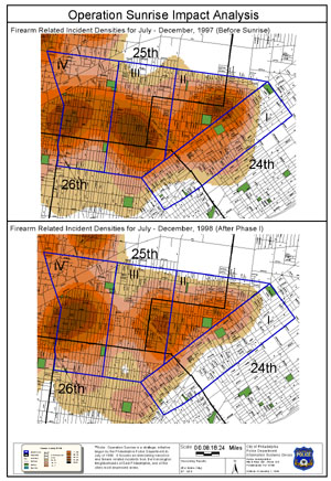
So what did all of this accomplish. We now had a set of animations and a means for producing more on demand. The animations, particularly of the crime data turned out to be very interesting, but in ways we did not expect. District Captains did not find them very useful. Like showing an epidemiologist an animation of the spatial dispersal of a disease, we were showing them something they already knew. But several of the special units expressed real interest. In particular the narcotics enforcement units requested several versions of the animations that showed violent crime levels and drug arrests surrounding their interdiction efforts. They had two motivations. First, they needed to be able to show their own officers, for morale purposes that their efforts were being rewarded, and the animations were a very graphic way of doing this. Second, they needed to be able to show financial sources such as the federal government that the drug interdiction efforts were having an effect and therefore deserved to continue receiving funding.
Plans for a Future Time
While the software resulted in an automated method for producing the maps, it still required some user intervention. We would like to continue to eliminate steps in the process in an effort to allow the animations to be ordered through the intranet and delivered in e-mail or through a browser. This will require some work with C and the GRID I/O that is shipped with Spatial Analyst. Another option will be to wait for the COM implementation of GRID and Spatial Analyst expected to accompany future versions of Arc8. The goal would be the creation of a reusable set of components that could be applied to a variety of different data sets.
Another area we would like to explore is the use of the time slicing routines to arrive at a more measurable detection of change. The visual movement of a blob can be dramatic but we would prefer to know about changes at a variety of scales and not simply when we decide to look for it. We have developed a methodology for creating a background canvas of average crime levels and a means of testing current crime levels against this canvas to detect when significant change occurs. We hope to test this over the next few months and possibly present it at the next Crime Mapping Research Conference to be held in San Diego in December 2000.
We had thought that the latest version of MapObjects, with its new ZRenderer might allow us to use the third dimension as a means of representing different slices in time. Alas, the Zrenderer did not allow a three-dimensional map control but simply the ability to use a Z value in a 3D shapefile as a means of symbolizing a theme. However, one can imagine a set of time slices that can be rotated, collapsed, separated, and zoomed to visually assess relationships between events in the different levels. It is possible we might achieve something like this with the 3D Analyst extension but we have not yet attempted it.
Pervasive Linking - our web-based intranet system represents several opportunities for changing the structure of the crime information from the table-based storage mechanism to one that is more web-like. We have begun working in this direction by cross-linking addresses. Whenever an address appears on a database lookup, whether from a map, a chart or a search, we link that address to a lookup that allows the officer to find other incidents that have occurred at that address in the past year. This can be enormously helpful from an officer safety point of view as well as for issues such as domestic violence. To extend this into a temporal realm, it would be helpful to have links sprinkled throughout the web site that allow an officer to view a table, map or chart and then see the same scene a year, a month, or a week earlier. It would also be helpful to see what else what happening on that day at that time when the crime occurred. In addition to weather, knowing that a block party, a big game, or a festival was occurring nearby would aid officer deployment the next time that event occurs.
What We Ignored or Didn't Do
Temporal Registration Issue - the majority of change detection processes as well as standard regression procedures assume that calendar data has meaning from one year to the next. However, we know that both crime and air pollution are affected by weather patterns and while the general trajectory of weather is similar from year to year, we all know that it is certainly not the identical. This variation caused by external influences, such as weather, can cause inconsistencies in the data to be interpreted as change when in fact, there is a temporal misregistration. We are all familiar with spatial registration techniques through tools such as the Projection Engine or resampling, but we don't have great tools for corresponding temporal processes. None of the projects we have developed in Philadelphia address this temporal misregistration issue and the results must therefore be viewed with some caution.
Moving Phenomena - we continually ran into the difficulty of addressing moving phenomena. Is a crime pattern in the Operation Sunrise area actually moving? Without more rigorous spatial statistical tools, it was impossible for us to make an evaluation. But more significantly, few of the tools we developed would assist with the analysis of phenomena that are truly mobile such as animals, criminals or automobiles. Many of these may be best addressed with some of the existing tools such as the Tracking Analyst and the MapObjects Tracking Layer.
Non-Point Data - none of the tools, visualizations or procedures we developed would be helpful with line or polygon data. These non-point feature types introduce several complications such as scaling and transformation that result in differences in size and shape as well as location. This absence of spatial uniformity makes the visualization quite complex.
TemporalStatistical Visualization - the financial market makers have begun to do a great deal of work with visualization of multi-variate statistics in a way that 'borrows' the spatial dimensions to show relationships between otherwise non-spatial attributes. There are several examples of this including the Dow Jones, Nasdaq, Bloomberg and State Street Corporation. We did not do any experimentation with visualization of crime data using these techniques but it seems a fruitful avenue for future research.
Some Other Time-based Projects in Philadelphia
Virtually all of the data collected by the City of Philadelphia has a temporal element to it and there are several other GIS-based projects that are addressing this.
Guaranteed Pavement Information System (GPIS)
The GPIS project is essentially a paving de-confliction system. The project's goal is to minimize street re-paving necessitated by serial openings of the streets by utilities and other services. This has become a serious problem in recent years with the rapid growth of the tele-communications infrastructure.
Centerline Change History
Philadelphia's street centerline is one of the best maintained coverages in the City. It is also a core, mission critical data set used in a variety of agencies including Streets, Planning, Police, Fire, Water and others. A relatively large amount of feedback is generated by its widespread use and it is therefore also a dynamic coverage. The combination of a changing data set and the dependence of several disparate systems upon this data set is recipe for disaster without a comprehensive program for tracking the history of change in the coverage.
Toward a Temporal GIS
Since beginning this work, I have run across other, similar projects, particularly in the area of crime analysis but also in the area of air quality. The EPA now publishes ozone maps of the eastern seaboard that are animated GIFs showing the change over a period of time. These maps are compiled on the basis of sensor readings collected from throughout municipalities and counties throughout the region. A product called the Hotspot Detective was released for MapInfo. The software allows the user to create hotspots (density maps) and incorporates several temporal charting features into the process. As vertical crime analysis application, this seems a helpful development for the MapInfo community though it does not address temporal issues in a comprehensive way. The City of New York's COMSTAT crew as well as the City of Boston have also experimented with moving hot spot maps. The Amsterdam Police Department is developing applications that will allow officers to create their own movies as well as 'difference maps' that attempt to get at the change issue.
Despite the work that has been done in recent years, however, there are several fundamental problems to developing a temporal-enabled GIS. Gail Langran Kucera's work since the 1980's has highlighted some of the issues surrounding the incorporation of spatiotemporal data into a GIS to create a temporal GIS. These include new forms of query algebras (Temporal SQL), spatiotemporal indexing, efficient storage and access of the larger quantities of data, and user interface innovations. Many of these remain to be implemented by vendors. There are good reasons for this. It's hard. And there are so many other important priorities (the web, PDA's, . By adding a temporal dimension to our GIS's, we are introducing a layer of enormous complexity to something that is already quite complex. However, I believe this will be a worthwhile investment. My shortlist might something like the following:
- Better integration of time-series data into core RDBMS - the status of SQL3 Par 7 is unclear. Oracle and a few other RDBMS vendors now have extensions that address time series data. SQL Server seems the single big holdout, though their clustered index allows data to be physically re-organized according to a time stamp. Much more work remains to be done in this area and none of the vendors have begun to integrate the spatial extensions such as SDE or Spatial Cartridge with the Temporal extensions.
- New graphical user interfaces that enable easy access to spatiotemporal data. The fact that ArcView does not come with a time series graph out-of-the-box is a serious handicap as are the problems with the date/time field in the shapefiles format (really a dBase file issue)
- More exploratory spatiotemporal pattern detectors and relationship seekers. Many of these may need to be implemented on the database to be effective, but the ability to find sequence patterns and detect change in the database would be invaluable. The current crop of data mining tools begins to address these concerns, but few incorporate spatial operations into the mining engines.
- Better Krieging tools that would implement some of the more advanced Krieging operations discussed in the literature, allowing visualization of trend and directionality. Esri's Geostatistical Analyst extension for ArcInfo is a terrific product, but other vendors will need to follow suit.
- Better GUI widgets - despite some good work at the academic level (see the GeoVista project at Penn State), there are few widgets that address the formulation of complex space-time queries.
- Spatial and Temporal Deconfliction routines - I have come across several projects in the past few years that would have benefited from a set of software components that allow spatial and temporal conflicts to be resolved as they arise. The GPIS pavement project described above is one, but the crime analysis world has another. The plethora of law enforcement agencies engaged in anti-narcotics work often results in multiple operations taking place in the same location at the same time. There is a significant requirement for spatial (GIS) software that can also highlight operational conflicts and contact the relevant officials to prevent disasters that can result in the loss of life. I suspect the logistics and facilities management side of the business world would also benefit from such components.
References:
ArcView Tracking Analyst
http://www.Esri.com/software/arcview/extensions/trackingext.html
GeoVista Project at Penn State:
http://www.geovista.psu.edu/storage/edsall/Tclets072799/tclet_home.htm
Graphics the Hard Way: Time Series in Avenue
http://www.Esri.com/library/userconf/proc96/TO250/PAP246/P246.HTM
Hotspot Detective
http://athene.csu.edu.au/~jratclif/ware/hsd1.htm
Oracle Time Series Cartridge
http://www.oracle.com/database/options/index.html?timeseries.html
Time in Geographic Information Systems, Gail Langran, 1992, Taylor & Francis
Robert Cheetham
Senior GIS Developer
City of Philadelphia, GIS Services Group
1234 Market St
Suite 1500
Philadelphia, PA 19107
215.686.5921
robert.cheetham@phila.gov