Abstract:
This paper describes the development of SMART Map (Statistical Mapping and Research Technology), a custom thematic mapping and spatial analysis tool developed for the office of the Chancellor of the NYC Board of Education.† The application integrates scores of databases that were hitherto kept separate, and provides a tool for the creation of compelling maps that have been successfully used to brief superintendents, principals, parents, and the press, and as tools for a new system of administrative accountability within the Board of Education.† The application includes extensive AVENUE programming, and required an in depth examination of the structure of the Boardís databases.
Introduction:
The New York City public school system is the largest in the United States, comprising all five boroughs of the city of New York, over 1.1 million students, more than 1200 schools, and a population that is drawn from scores of different national and linguistic groups. Like many school systems across the country, the NYC Board of Education has been struggling to introduce a greater degree of accountability into the complex and massive organization that it manages, and to identify schools with educational strategies that are working well and could be applied more widely.† In order to do this, the first requirement is to have sound, comprehensive, and accessible data on what is currently happening in the schools, where it is happening, and how it has changed over months or years.
CommunityCartography [ComCarto] was retained by the Chancellor of the NY City Schools to develop an in-house, desktop GIS that would enable users to view city-wide schools data, to analyze that data statistically and with reference to spatial characteristics, and to distribute the data in an easy-to-use application to school district superintendents throughout the five boroughs.† The application was dubbed SMART Maps for Statistical Mapping and Research Technology.† With this application, the Chancellor's office would have a powerful tool with which to stimulate concrete discussions of performance with local district officials, as well as a powerful means of communicating information to the press and the general public.† The application would also, of course, enable analysts to perform spatial data mining in a way never before possible within the organization.
Modeling the Data:
An organization as large and complex, and operating under many regulatory and oversight mandates as does the Board of Education will naturally gather large amounts of data.† Student characteristics, school spending, student achievement, attendance, transportation services, teacher characteristics - all of these items and many more are tracked by the Board.† As a GIS integration task, the basic scope of the job was clear:† to associate each record with a school, and to enable the various relationships and links to make it possible for users to gather data as needed on a record or spatial select basis.† The implementation of this required dealing with some difficult database and GIS issues.
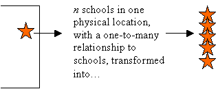
The first digital mapping task to be addressed was creating a shapefile that accurately indicated the location of each school building in the city.† The New York City school system is not simply an enlarged version of a traditional red brick school for each neighborhood.† At the time that the project began, only a tax parcel map of the city was available:† no building footprints were present in that data layer.† This presented several problems for the data creation task:† some properties have more than one distinct school facility located within their boundaries; in some cases, these facilities house completely different school programs.† In addition, there are many school facilities that house within their walls, on separate floors, or on separate parts of a single floor, educational institutions that are tracked as separate schools.† One solution would have been to create a single point at each real-world location at which at least one educational facility exists, and to have a one-to-many relationship between that point and the educational data records.† This would have made it very difficult to graphically depict data for multiple schools at one point, so, instead, we created a distinct point for each institution and offset them slightly one from another. Our decision was also influenced by the fact that the application was to be completely independent of any other software, e.g., MS-Access, which would have facilitated such relational operations more efficiently than ArcView (see below).
 |
|||
|
|||
Concurrently with the facility-mapping task, we began the modeling of the actual schools and student data.† At our initial meetings with the staff of the Board of Education, it was clear that the task was quite daunting.† Not only was the aggregated data extremely complex, but it was maintained by several different groups within the agency, each with its own mandate and reporting requirements, and no common data keys were in place.† Of course, the staff had realized long ago that this was a problem, and had developed what they dubbed the Cross-walk file (Xwalk) to allow the disparate data sets to be related, but its integrity had never been fully tested or ensured.† There were many cases of orphan records, non-unique keys, and other reconciliation problems.† Several months of combing through the data were required before we could be confident that each mapped facility would be properly related to its associated data records for each year of the data period, and many new keys had to be created on an as-needed basis to create some necessary data relationships.
The modeling of the data was not limited to relating records to mapped facilities because the school system does not simply aggregate data on that basis.† Besides aggregating data for schools and for school districts that are clearly geographic, there are levels of aggregation that are not easily mapped.† The city school system includes some 'districts' that are city-wide, i.e., they have no boundaries but comprise a class of schools that can be located anywhere.† Some schools are physically located within one district, but are aggregated into another district, known as the Responsible District.† Finally, all the data are collected over many years, and the† aggregation target for a particular record type can vary from year.
Enabling Analysis with a Custom Application:
The schedule for this application development was extremely tight - there was an immediate need for an analysis and mapping tool that the staff of the Chancellor's office could deploy.† A† complete remodeling of the Board of Education's business rules for data collection and warehousing would be a very large task, requiring extensive staff input, and a lengthy period of development, testing, and review.† Consequently, the application was developed to produce results quickly, using methods that could be implemented in an ArcView3x environment, without any additional software.† In practice, this meant that elegance and efficiency in the structure of the database had to be put aside in favor of pragmatic, sturdy solutions that would be easily understood, and that would be transparent to the user of the GIS.† Fundamentally, this required that tools be put in place to reduce the complex data relations to one-to-one relations between shapefile features and attribute flat-files in ArcView .
The application was built using the AVENUE Dialog Designer, and was based on a series of discussions with the staff of the Chancellor's office.† Simultaneously with the development of the application, the Chancellor's office staff was beginning to employ ArcView on its own, and to gain a greater understanding of what was possible and not feasible with the application.† Thus, the design process of the application was quite fluid, and underwent several evolutions in a short time.
A crucial design concept for the application was that users be able to 'mine' a 'slice' of the data at will, i.e., not only was there a need to be able to drill down into the data in a conventional GIS sense, but since the data has such a long and complex period of record, there was a need to extract on the fly any fiscal year of interest.† Recall, that for any fiscal year, the schools involved, and not just the attribute data, would change, as schools are formed, disbanded, or combined from time to time.† This slicing activity was enabled by tools that apply masks.† Masks are analogous to, but somewhat more complicated than a shapefile theme definition.† They not only define, i.e., mask out geographic features, but perform similar functions on all associated tables in the application.†
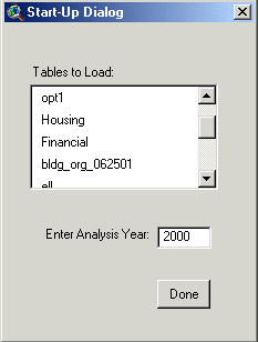
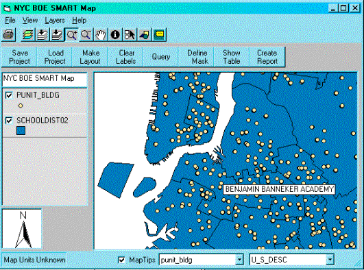
The dialog at below left is the initial start-up interface for the Smart Map application.† It allows the user to load a selection of data tables, and to select a particular year for analysis.† This immediately applies a mask (i.e. a database select) to all themes and tables in the project.† Allowing the user to limit the amount of tables that are loaded into the project keeps the interface manageable, and makes it easier for users to focus on the particular analytical investigations at hand.† Of course, the tables that are loaded, and the particular analysis year selected, can be changed at any time by the user with additional dialogs.† The purpose is to place a minimal burden of SQL querying on the user.
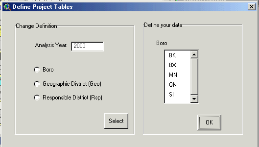
The dialog shown below right is a further example of how the database is made transparent to the user.† This form allows the user to Ďdefineí the data that is loaded into the project, and to select, i.e., mask data for geographic borough, geographic or responsible school district, and year.† The result of a query/selection carried out with this form is to provide the user with a shapefile for which there is a one-to-one relationship with the attribute records in each distinct ancillary data table, e.g., transportation, school lunch provisions, teacher† certifications, etc.† Once the one-to-one relationship is in place, thematic maps can be generated easily using the standard ArcView legend functions.
 ††††††††††††††
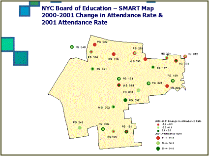
As the users gained sophistication in their GIS skills, and deepened their understanding of the data they had at hand, they became able and adept at producing thematic maps of greater richness.† The examples below show two thematic maps, one depicting the change in attendance rates, the other plotting the prevalence of school lunch programs (a surrogate measure for child poverty) plotted with varying point symbols for the schools and with shading functions for the underlying districts.† These two images are examples of the sort of map created for meetings held with district superintendents, maps that focus on one geographic portion of the school system.††† These maps are a powerful tool for stimulating frank and constructive discussions about regional school performance, and they provide a completely new view of the data for the staff charged with running the schools.
 ††††††††
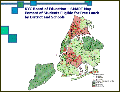
The map on the left above exhibits the Ďstuffed oliveí approach to representing multi-variate data, a graphic style developed and named by the Chancellorís Office staff.† Dots representing different variables, or time periods, are superimposed one on another so that the difference between them is apparent as contrast in color and size.† It is a very elegant solution to a difficult problem of data presentation.
Distributing Data:
Originally, the Chancellorís staff conceived of a web-based application that would make the data and maps widely accessible to both the school administration and the public, however as they presented the project to the superintendents and their principals, it became clear that there was a greater need for a simple desktop tool that would allow them to look at the data for their own jurisdictions, make their own maps, analyze information in their own way.† CommunityCartography proposed several possible tools to use.
The preference was for a desktop application that could easily work in tandem with other widely used word processing and spreadsheet applications, and ArcExplorer was suitable in most respects.† Using ArcExplorer had many advantages, not the least of which was that it is free, but its functionality for the creation of legends was not sufficiently rich for the† complicated statistical data that is the daily material of analysis within the Board of Education.† CommunityCartography† created a custom data viewer/analysis tool from MapObjects Lite, that included all the features specified in a series of testing meetings with the Board of Education staff.
The application, shown below, is distributed on a CD-ROM with a complete dataset, rendered in flat-file format, so that thematic maps can be produced immediately.† Custom reporting, layout, and selection tools have been programmed, tailored specifically to the needs of the Board of Education application.
Conclusion:
The SMART Map application successfully applied GIS technology to the NYC Board of Education database so that staff could see their data spatially in a way never possible before.† An additional benefit of the project was to bring together in one format and application disparate data sets that had never been so easily available.† The lessons learned with this project, which must be seen as only a first step towards a potential enterprise solution, were invaluable for all future efforts.†
Gary Ostroff, P.E.
Senior Project Manager,
HydroQual, Inc.†††††††††††††††††† www.hydroqual.com
Vice President, CommunityCartography, Inc. †††††††††† www.ComCarto.com
Education:
M.A., Analytical Geography,
Hunter College - CUNY, 1993
B.E., Civil Engineering, The City College of New York -CUNY, 1985
A.B. History Art and Archaeology, magna cum laude, Princeton University,
1979