L. John Old
In 1982 Howard White and Belver Griffith proposed using authors as markers of "intellectual space" (White and Griffith, 1982). Since then, many in information science have made use of the metaphor between points in a real-world Cartesian coordinate system and points in abstract information spaces. "Spaces" now may be prefixed by the intellectual subtopic, such as cyberspace, conceptual space, document space, information space, and so on. The common theme here is that of representing objects of information spatially--as maps. This leads to old issues of how to organize or structure the information to meet the pragmatic navigation needs of the information traveler, researcher, or adventurer, while retaining familiarity, orientation, and accuracy.
The goal of this paper is to present current methods, models, techniques and research for solving the problems of visuo-spatial structuring of information, with an emphasis on documentary type information (as opposed to, for example, scientific data visualization), and to systematize the use of cartographic metaphors and techniques for application to non-geographic data.
Maps, as metaphors of reality, may be seen as a natural extension of the organizing principle of human perception--albeit a facet restricted to the spatial percepts. The use of spatial metaphor to define relations between abstract objects or between real-world objects represented in an abstract, hypothetical, space, is so common in digital 'environments' or on the computer 'desktop' that it often goes unrecognized. Such metaphors are too many to be addressed by this paper, which restricts its survey to those commonly found in a cartographic context.
Our penchant for using spatial metaphors appears to be based on our natural ability to organize information spatially. Benking and Judge (1994, [Mnemonic Advantages]) trace the use of spatial metaphors for information organization to prehistory:
It is appropriate to note that mnemonics [mnemotechnics] was a highly developed art prior to the widespread availability of paper - and especially to facilitate the task of orators of renown. A major feature of this art was the distribution of information onto visual surfaces which could subsequently be walked through and interrogated for the next points in an argument. Typical surfaces were so-called "memory palaces" and garden-scapes (mandalas should also be seen in this light). It can now be argued that there is an analogous need for such visual metaphors to enable individuals to handle information overload and retain some control over the information they endeavor to possess. Spatial metaphors can be seen as vital to retaining possession of information and avoiding "memory leakage" or the effective "dismemberment" of one's information space (ibid., Paragraph 11. [Mnemonic advantages])
It is noteworthy that these ancient orators were able, consequently, to give their speeches in reverse order--or begin at any point, for that matter.
Metaphors have entailments through which they highlight and make coherent certain aspects of our experience (Lakoff and Johnson, 1980, p.156). They are grounded in correlations with our experience--and we live in a spatial world. This leads naturally to metaphors that provide cues for orientation and navigation. We fix on a target or object at a distance and navigate to it, taking the most economic route while avoiding obstacles.
Navigation in space may be fundamental to intelligence. Llinas (1987) points out that the development of a nervous system is a property of actively moving organisms, that there exist organisms that appear as plants in one stage of life while in another stage of life swim freely, and that in the former stage they have no nervous system, while in the latter they:
...possess a brain-like ganglion which can be informed about the environment by peripheral sensory input... [which has] the necessary connections to deal with the continuously changing environment. (p. 341)
Navigation is so important in human conceptual processing that it is difficult to define a boundary between actual navigation and the metaphoric use of the term navigation. It is also bound inextricably to the spatial substrate it navigates--whether physical or metaphoric.
Navigation, like many of Lakoff's life metaphors, involves a journey (as in, Life Is A Journey, Time Is A Journey, An Argument Is A Journey, and A Journey Defines A Path). Few journeys or paths are taken in a straight line. They involve overcoming or avoiding obstacles in order to arrive at the destination--this is why we need and employ maps. Map metaphors take consideration of the shape of the land, or landscape, where the action is expected to occur. This always involves identifying prominent or significant features ('landmarks') to provide orientation as the landscape changes. In this way a landscape is both a substrate and a container which forms the boundaries within which the landmarks (the prominent or significant features) are found. In vector cartography (as opposed to raster-based cartography (remote sensing) as used for satellite images) these features have been reduced to three types: points, lines and polygons. Used in combination they may represent any real-world object which may have any number of values associated with it, and in modern Geographic Information Systems (GIS) they are capable of a three-dimensional representation.
Points, lines and polygons are not discrete classes. Basic geometry defines lines in terms of points while polygons are made up of lines. In cartography, areas (polygons such as counties) are bounded by lines, and adjacent polygons share lines--in the same way that two adjacent segments of a line share a common point.
When using the spatial metaphor of landscape there is usually an assumption of a two-dimensional substrate, or plane, and when using the stellar metaphor, an assumption of a three dimensional space. The landmarks assigned to, contained in, or identified as belonging to, locations in these coordinate systems may extend or modify the metaphor.
Lakoff and Johnson noted this phenomenon of interacting metaphors and use the term 'coherence' to describe the overlap between the entailments of differing metaphors. For example, where the number of objects of interest becomes dense, as happens with clusters of stars (and their metaphoric counterparts, points) they may be referred to as 'clouds'. In a plane, individual trees (points) may lose their identity to 'areas' of forest (polygons). This reflects a phenomenon of aggregation of count nouns which crosses many facets of perception (count nouns are identifiable by prefixing 'many' to them--as in, 'there are many trees.' Their nemeses, mass nouns, may be identified by prefixing 'much'--as in, 'there is not much forest left.' These two concepts correspond to the mathematical terms "discrete" and "continuous."). Conversely, mass nouns may be discretised by prefixing them with a measurement or container word, as is the case for bread in 'a slice of bread' or for honey in 'a spoonful of honey' (as opposed to, 'one bread' or 'several honeys'). That understanding is essential when choosing data representation modalities. For example, it is difficult to envisage "intellect as markers of author space" (though it does have some interesting connotations) because intellect is the mass noun ('much intellect'), while author is a count noun ('many authors'). That is, for the purposes of mapping, mass nouns are far better suited to playing the role of substrate--the plane or space for a metaphoric mapping--than are count nouns.
If mass nouns are to be used as landmarks (identifying features of a landscape) or points they must be quantified or scaled. For example text, a mass noun, may be broken into documents, sentences, words, or any data structure which can contain them (such as lists, table or vectors) --or intelligence into I.Q. (intelligence quotient) points. Count nouns easily accommodate to the role of points or landmarks, but in order to be used as the basic matrix, they must be aggregated or categorized. For example points can be converted to a topology or surface, or authors can be viewed as a field or discipline, rather than as individuals.
Lines live in the twilight between objects and points. They may be seen as relations between points (as used in graphs and networks), or boundaries to polygons, or as landmarks representing some shared feature, value, or connectivity between other landmarks. The attributes and roles of lines, omitted from this part of the discussion, will be dealt with more fully later, when discussing Relational Models below.
The maps (or cartographs) themselves, as mentioned above, form the substrate or boundaries (the domain of discourse) for features of interest such as landmarks. Their associated metaphors need to be consistent with their usage to be coherent. Though they form the conceptual boundary of a spatial metaphor, they need not themselves have a bound--they are open systems. Stellar maps represent a view of the sky, yet the universe is (by present science) infinite. Maps are usually 'of' something. That 'of-ness' usually implies the domain of discourse but rarely defines a distinct boundary. For example a map of Indiana, without the inclusion of neighboring states, restricts the domain to things-Indiana. But the south-west boundary traces the path of the Ohio River, the north-west corner is formed by lake Michigan, and all other boundary lines are shared by neighboring states and as much define what is not Illinois or Kentucky or Michigan or Ohio, as they define what is Indiana.
In summary, we have identified three facets to the map metaphor: the substrate, which may be two-dimensional, three-dimensional, or multidimensional; the landmarks which exist within the confines of the map, and which may take on almost any persona; relations between landmarks; and the usage to which the map may be put--navigation in some guise. This metaphor and its entailments may reflect the organizing principles of perception and intellect, suggesting that the human mind is primarily a kind of modeling system for the purposes of navigation. We can use this as a guide to the design of information maps.
Classes of spatial metaphor point to generalities that can be used to characterize information maps systematically. Florin (1990) (who comes from the field of instructional design, and is oriented to a paradigm of 'information landscapes') identifies different spatial metaphors suitable for specific types of information:
- 1) collections of data => fields in the landscape. Fields with older data 'vanish to the horizon'
- 2) interactive documentaries => visualized as a kind of village
- 3) annotated movies => have a linear structure and can be visualized as rivers or highways
- 4) networks of guides => other persons in the landscape
- 5) hands-on activities => range from simple games to complex simulations
Number 1 corresponds to the polygonal features discussed briefly above, and more fully below under Models. The village, games and simulations (Numbers 2 and 5) are metaphors on space akin to virtual reality environments, the extension of maps by the addition of interactional dynamics. Number 3 would perhaps be better described as having a temporal structure (from which we can assume a linear structure through Lakoff's Time Is A Journey metaphor). The rivers are directed arcs and the highways are relations. Florin emphasizes aggregated data and dynamic models, and other than "guides, " omits or overlooks metaphors which would utilize the points data-type.
Benking and Judge (1994) distinguish six classes of spatial metaphors:
geometric forms (cube, sphere, polyhedra in general),
artificial forms (townscapes, house, room),
natural forms (landscape, trees, etc.),
systemic structures (highway systems, pathways, flow systems),
traditional symbol systems (mandalas, sand paintings, etc.).
dynamic systems (atomic, molecular, planetary, galactic systems),
(ibid., Paragraph 1. [Classes of Metaphors])
All but the last class correspond to the common cartographic or Geographic Information System objects--points, lines and polygons--represented in a plane or extruded from the plane (in three dimensions). They can be represented literally, in the case of Benking and Judge's geometric forms, or iconically (as point symbols), in the case of natural forms and traditional symbol systems. Systemic structures can be represented by lines. All may have attributes associated with them--commonly as an index or key, for physical maps, or as relational tables, in the case of GIS. The examples given in the last class, dynamic systems, are all circulating systems controlled by field forces--beyond our direct daily sensory experience. This suggests that they are themselves metaphors of metaphors. The class is still valid, however, as any system which has a temporal component (that is, it changes) may be animated. Geographic Information Systems do use dynamic metaphors--the daily weather maps on television are an example.
Rorvig and Hemmje (1999) developed a list of metaphors (and "layouts") as part of a larger list of discussion points to provide a framework for understanding presentations at the 1996 conference "Foundations of Advanced Information Visualization for Visual Information Systems " (Rorvig and Hemmje, 1999, p. 836):
All items correspond to the elements already discussed except for the "clouds" metaphor. Usually the clouds metaphor in visualization refers to point clouds. These are dense collections of points; or areas or volumes representing collections of points. The first may be modeled directly as points in GIS and the second as polygons occupying the same coordinate space as the points they represent. Graphs and trees (a special kind of graph) may be represented as combinations of points and lines.
The classes of spatial metaphors identified here can readily be reduced to the basic map metaphor and represented by the basic map data-types of points, lines and polygons. These data-types themselves suggest generic classes of locations, relations and objects that may range over any chosen set of spatial metaphors.
Tversky (1996), from a cognitive perspective, describes three frames of reference which may be fundamental to maps, navigation, and spatial metaphors. They are not presented as classes of metaphors (and she prefers the term "cognitive collage" (Tversky, 1993), rather than map) but they do add a dimension of understanding that can be used to clarify and disambiguate the use of spatial metaphors. Tversky has observed experimentally that when people describe large spaces, they adopt one of three perspectives: the first, "gaze tour, " corresponds to a stationary observer identifying the relative positions of objects (relative to the observer); the second, a "route, " corresponds to a traveler identifying the locations of landmarks (with respect to the traveler) in sequential fashion as they travel; the third, a "survey" corresponds to an observer identifying landmarks "relative to one another with respect to a fixed point of view above the environment in terms of north, south, east, and west." The third may be viewed as a generalization of the first and obviously relates to the map metaphor. The second clearly relates to navigation.
Systematic biases and distortions in both accuracy and time to retrieve information reflect people's conceptions of space, which vary with the situation--the specific space--and are rooted in people's knowledge of their own bodies interacting in the perceptual world. Interestingly, spatial descriptions are similarly composed of elements (typically expressed by nouns) and spatial relations among them (typically expressed by prepositions and verbs). (Tversky, 1996, [Introduction]).
GIS can be used for representing, manipulating, transforming, or extrapolating these objects to model real-world phenomena. For example, given a point location for a toxic spillage a GIS can be used to model and identify the extent of contamination of land, waterways, ground water, or air. The model is, in a sense, a complex metaphor of the real world. Provided that each component metaphor is coherent, and accurate data is available to associate with each component feature, 'navigation' through time can make predictions that anticipate real-world outcomes. The caveat here is on the word 'accurate.' In abstract applications of spatial metaphors, such as in the representation of intellectual space by relationships between authors, measurement may be the limiting factor. It doesn't matter what relationship between authors is chosen--shared publications, co-citation, shared citation, or even shared terminology (terms) --the metaphor, and any consequent conclusions drawn from it, will be only as good as the measurements used to implement it.
Another caveat before continuing: it is a maxim that "we see what we expect to see. Conversely, we are sometimes blind to possibilities that don't match our current paradigm. Metaphors and paradigms simplify our reality--they are models or ideals which we can manipulate and measure against. We use them to predict outcomes. But they can lead us into false conclusions. Ackerman (1994) warns against using, accepting, or basing policy on metaphors, uncritically, because metaphors bring with them connotations which may not apply to the new domain--they are always limited in some way and the limitations must be defined if they are not to mislead. Lakoff and Johnson put it this way:
Metaphors may create realities for us, especially social realities. Metaphor may thus be a guide for future action. Such actions will, of course, fit the metaphor. This will, in turn, reinforce the power of the metaphor to make experience coherent. In this sense metaphors can be self-fulfilling prophecies (p. 157).
Spatial metaphors give insights into the assumptions and possible conceptual structures that underlie the models or representations that are information maps, but their actual creation requires formal modeling and raises representation issues regarding human visual perception and human-computer interaction. Maps represent real-world information. The map user is expected to interpret and project meaning from this caricature (this reduction in detail that the navigator must refurnish), and it is the map creator's responsibility to model and present that information in ways that are both interpretable and not misleading.
This section begins with the origins of information maps. The emergence of information maps leads into a definition of what is an "information map, " and lays the foundation for discussion of representation issues later in the paper.
The use of geographic models to represent, analyze and display non-geographic information is a historically recent practice. According to Edward Tufte (1983):
It was not until the seventeenth century that the combination of cartographic and statistical skills required to construct the data map came together, fully 5, 000 years after the first geographic maps were drawn on clay tablets (p. 20).
He identifies Edmond Halley's 1686 map showing trade winds and monsoons on a world map as, if not the first, at least one of the first data maps (thematic maps, in cartographic terminology). Halley used arrows of varying thickness, and varying densities of arrows to signify direction and strength of winds between continents--information valued by navigators of wind-driven ships. This data was displayed on a substrate of geographic coordinates (a regular world map).
A question arises at this point: "Is it a map if it doesn't have geographic features or a geographic coordinate system?" Tufte divides the general class information graphics into "data maps" and "data graphics" (or "relational graphics").
The invention of data graphics required replacing the latitude-longitude coordinates of the map with more abstract measures not based on the geographical analogy. Moving to statistical graphs was a big step, and thousands of years passed before this step was taken by Lambert, Playfair and others in the eighteenth century (Tufte, 1983, p. 43).
Playfair's innovation was to make use of the correspondence between the size of real-world amounts, such as number of coins laid down in a straight line, with lines on a chart. For large amounts a scale was introduced so that the correspondence was not exact, but proportional. He then went on to use area to depict quantity (pie charts), and to combine scales and variables to facilitate comparisons between them. Lambert used scales (in fact, before Playfair) to plot X and Y coordinate points where X and Y represented two variables (temperature and rate of evaporation of water, in his earliest example), resulting in changing slopes, implying trends or rates.
In addition to Tufte's data maps and relational graphics, this paper discriminates a third class or type, "information maps." They are distinguished from geographic data maps in that they do not use geographic coordinates, yet still use the 'geographic analogy, ' that is, spatial metaphors. They may be combined with the broad range of statistical representations of the 'data graph' class, nesting the data as landmarks on an abstract plane (map) or in a three-dimensional coordinate system (space). They include the whole range of digital spatial metaphors discussed in the Introduction and will be discussed for the remainder of this paper, in the context of computer systems, as analogues of Geographic Information Systems. We will use the term 'information cartography' (Old, 2001) to label the development and use of information maps.
The key to the power of GIS is the dual relationship between the relational database and its visualization--the map. If it has coordinates, or values that can be used as coordinates, any entity in the database can be presented on the map, and any attribute associated with an entity can be represented as a feature (color, size, shape, and so on). The field of GIS has also developed a range of generic methods, techniques, and powerful algorithms that may be applied to any situation that can be modeled using the map metaphors. They may be applied equally to information cartography as will be advocated and demonstrated, in context, in later sections of this paper.
It is important at this point to state what GIS do not do, as it helps to clarify information cartography and to distinguish information maps from other forms of data representation. First, GIS do not transform the coordinates of the current map, though they are capable of importing or transforming data to conform to a particular projection (a function which determines each point uniquely, and enforces consistency and congruity on the location of different objects from different information sources). This is in contrast to graphing software, which changes the coordinates of data points depending on the input data values. Information cartography instead adjusts other dimensions (color, size, symbol, and so on) to reflect variance in data variables. In a three-dimensional model a GIS may increase the elevation of a point, but the X, Y location will remain the same. Second, an information map, as exemplified in a GIS, does not provide directions--that is it doesn't focus information that supports a particular conclusion as a graph does (though it may bias unfairly, by emphasis or omission). Instead it provides context through which various paths may be chosen and/or taken. In the real world when you give a friend directions to your house you must assume a fixed starting point and path (and end point, obviously), but if several people need directions and they will be coming from different locations, a map is the best solution. Theoretically, if it is a good map, your friends could also use it find their way to each other's places. An information map provides sufficient context and detail that a navigator can explore alternatives and answer questions not anticipated by the map maker.
Scientific visualization utilizes data that has real-world coordinates--think of medical imaging, laminar flow modeling in rocket design, particle physics, astronomical mapping, or molecular modeling. By this definition GIS models are a form of scientific visualization, even when utilized to visualize non-geographic information, so long as the information is anchored in geographic coordinates (geo-referenced). Card, Mackinlay, and Shneiderman (1999) define information visualization, in contrast, as the visual representation of nonphysical information--information that has no obvious spatial mapping. By these discriminations information cartography is a form of information visualization even though GIS software is utilized to manipulate and visualize it.
Data modeling is well documented by the database, object-oriented design and other sub-fields of computer science; geographic analysis is well documented by the cartographic and geography communities. What is not well documented is the interactive transformation for visualization of non-geographic data or non-geo-referenced information, such as documentary information. This is the domain of the emerging field of information visualization as documented by Card, Mackinlay, and Shneiderman (1999), who view information visualization as an extension of cognitive working memory. They define information visualization as "The use of computer- supported, interactive, visual representations of abstract data to amplify cognition, " (Card et al., 1999, p. 7 [emphasis added]) rather than as a field of formal modeling. They don't neglect the formalization, however. Their model of visualizations is of "adjustable mappings from data to visual form to human perceiver" (Card et al., 1999, p. 17). This is achieved by:
transformation of raw data to database relations ("case by variable" rather than entity by attribute) (p.21)
"visual mappings" of database relations to visual structures (p. 23)
transformations that produce various views on the visual structures, controlled by users adjusting parameters such as position, scaling, and...restricting the view to certain data ranges (p. 31) ).
These steps or transformations (from data, to database, to structures, to views) parallel the processes described above for the development of geographic and information maps in geographic information systems. The visual structures referred to by Card, Mackinlay, and Shneiderman are "spatial substrate, " "marks, " and "graphical properties." These correspond to the container substrate (coordinate system), information objects (landmarks), and features (unary and binary relations) of information maps, discussed earlier in the paper.
Whereas one would expect from Card et al.'s model to generate the spatial substrate from the database relations, in information cartography the generation of substrate involves raw data-to-relation transformations (see the discussion on Choice of Substrate, below). This is because, as stated under Geographic Information Systems, GIS do not transform coordinate systems. Instead, the coordinate system, and thereby the substrate, must be derived or generated from the raw data. The GIS then takes the coordinate system and assigns any information objects to it based on the object's coordinate information. Thus, visual mappings in information cartography relate only to the information objects and their features--the user cannot adjust the position of the visual structures as is done in information visualization.
Though the coordinates of an information map are indeed fixed, the raw data can be transformed repeatedly, generating new coordinates, to create new information maps for exploration. The same information objects are viewed, but hold different positions relative to each other. Furthermore, as the data store is a relational database, new data relating to the information objects may be imported, joined with the existing data (using a common key field), and displayed instead of, or alongside the existing data.
As with the user described by Card et al., the information map navigator conducts the iterative process of invoking GIS operations and functions (transformations) to utilize the information associated with the information objects, and creates and explores different views. In a GIS, points, lines and polygons exist in separate layers --they overlie each other transparently. Because of this transparency many layers can be viewed simultaneously, differences or commonalities observed, and spatial queries applied.
In order to avoid ambiguity when describing transformations in following sections, a particular coordinate system, along with the objects sharing the coordinate system, will be referred to as a "base map." The various views produced by altering display features of a base map (and following geographic analysis conventions) will be referred to as "models." The later discussion on types of models is primarily concerned with understanding, designing, and enabling view transformations
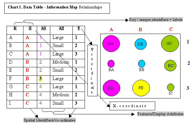
Chart 1 demonstrates the relationship between the data model and the visual structures in an information map. The relationship is simpler (but perhaps less flexible) than for general information visualization as the data objects have fixed coordinates derived from the data table (X, Y). The identifier for entities is usually a label, in this case the compound key index (K+X). Any of the information in the table may be used as display variables. In this case A1, a numeric attribute, has been represented as colors; and A2, an ordinal scale which refers to the entity, not the size of the circles, maps entity size to circle size.
Chart 1. Data Table-Information Map relationships
Perhaps the most innovative map described by Tufte is that by Charles Minard (drawn in 1861) because it adds data as spatial dimensions, adds more than one data set, and displays the data over time--a time-series map. It portrays the attrition of Napoleon's soldiers during his1812 campaign against Russia by the thickness of the line tracing the path of the campaign, using two colors--one color to indicate the trek to Moscow, and another to disambiguate the return trip. The line begins with a thick band representing 422,000 soldiers and reduces to a narrow band as it reaches Moscow, representing the 100,000 soldiers who survived the first leg. The return trip across Europe amid a bitter winter, disasters and desertions, reduces to a small pencil line entering Paris.
Along with the temperature scale and landmark incidents projected on the X-axis, Minard's map represents six variables: the geographic, spatial location plus five data variables. This map exemplifies variable density (the number of variables superimposed on the same space) and raises the issue of dimensionality. Each variable in a map is a dimension. Spatial dimensions are easily identified--if an object is flat it has two dimensions; if it has volume, it has three dimensions; if it changes (relationships between elements change i.e. if it is dynamic) it has a temporal dimension. But data dimensions are more complex--or at least, less intuitive.
The following map of Native American population statistics has the geographic spatial dimensions of the United States, plus several data dimensions.
Figure 1. Population-Total (Height) versus Population-Density (Color) of Native Americans
The states are the first elements recognized--the arrangement and familiar shapes of the states orient us--but they provide only symbolic labels for the statistics (through our familiarity with their planar substrate). The surface area of the states bears no relation to the data--it is a misleading variable as it simply reflects size, in area, of each state. The complex variable, volume, entails area; so it is in a sense corrupted by it.
The primary data dimensions are height (technically, 'extrusion'), representing total number of Native Americans by state; and color, representing density, or proportion of each state's total population that are Native Americans. So, for example, California has the most Native Americans (largest population, by state) by dint of having itself a huge population. Alaska and Oklahoma are, on the other hand, the most densely populated by Native Americans. When modeling information domains, not only the choices of metaphor, objects, relations and substrate are important, but also the appropriateness of the dimensions--their number, type, and possible interactions between them.
The problems of scale or resolution are also demonstrated here. States were chosen to represent aggregated point information of individual Native Americans. If cities had been chosen instead of states, New York City would have shown up as the place with the highest population of Native Americans (renowned as fearless steeple-jacks and steel workers in the New York sky-scraper building industry). This all-or-nothing use of aggregation usually makes sense only when modeling voting outcomes such as the American Electoral College, or if there is a strict hierarchical relationship among the data as there is in the containment (spatially nested) hierarchy of:
Continent-Country-State-County-City-Census Tract-City Block-Lot.
When several data dimensions must be represented in a single map there will always be some tension between them and an expectation that the user switch between perceptual cues (color, height, gradient, perspective, texture, proximity, and so on) in order to interpret the dimensions. It is the mapmaker's responsibility to provide keys, indexes, title, description, labels, and context that prevent, or at least reduce, ambiguity and misinterpretation (Mickey, 2000).Topographical methods that derive height (elevation) from point data (discussed below under Three-dimensional and Temporal Models) are a more appropriate alternative for representing the kind of information shown in the map in Figure 1.
Ahlberg and Shneiderman (1999), suggest a scatterplot (or "dot plot") method to "support selection and zooming." In order to generate the scatterplot, information axes need to be chosen:
...if a natural map did not exist for an application, such as a set of documents, photos, songs, etc., could we create one that would be suitable? While we need to try further examples, our initial answer is affirmative. For many situations we have been able to create meaningful two-dimensional displays by selecting ordinal attributes of items and use them as the axes...Our intuitions about what choices are most effective is still rough, but there is hope that we can formalize our decisions (p. 246).
Ahlberg and Shneiderman suggest using such attributes as year of publication, length in (number of) words, author importance, or number of references, for documents; age, number of years of education, salary, or other demographic variables, for humans; and in their prototype FilmFinder system they use "time" (release year) for the X-axis and "popularity" for the Y-axis--to represent the actual movies they use a nominal variable: movie category, or genre.
Interval or ratio data will do as well as ordinal data for a scatterplot, as a scatterplot is simply a relation--either between two sets or between elements of a set. If the relation is between elements of the same set or between two sets with a strong correlation between them, there will be a problem of the data agglutinating or piling up along the (identity) diagonal. In this case other methods than scatterplot must be used to assign coordinates.
Multidimensional scaling (Davison, 1992), Kohonen self-organizing feature maps, or SOMs (Kohonen, 1989), factor analysis (Small, 1999), and singular value decomposition (Berry and Brown, 1999) are methods by which coordinates may be generated for information objects. In the first case, multidimensional scaling, some metaphoric distance measure between objects is chosen, such as similarity or relevance, usually based on some feature of interest. Next, a distance metric is developed for calculating values which then represent the relationship between the information objects. Finally, a statistical program is used to generate the relative position of each object in a plane--objects with a lot in common (figuratively close) will be situated in close proximity on the "map" (literally close).
Kohonen SOMs are neural networks that map input objects, represented as N-dimensional vectors of some feature, to a two-dimensional grid; output is a map of objects based on a proximity relation. This was first demonstrated for documents (using words for feature vectors) by Lin, Soergel, and Marchionini, (1991), and has been used recently by Poincot, Lesteven, and Murtagh (2000) to implement a "cartographic user interface to bibliographic and other information subspaces in astronomy." Chen (see, for example Roussinov and Chen, 1998) extends the map metaphor by using a SOM method that produces polygons, like a map of US states, rather than points.
Singular value decomposition (SVD, Berry and Browne, 1999), also known as latent semantic indexing (LSI), can be used, with similar results. SVD has the advantage that it takes account of transitivity information, pulling objects which have no direct relation but which share a lot of common context, closer together in the information space. In either case the optimal solution is usually a higher-dimensional space, but which is then projected algorithmically into a two-dimensional plane, or three-dimensional space, for display.
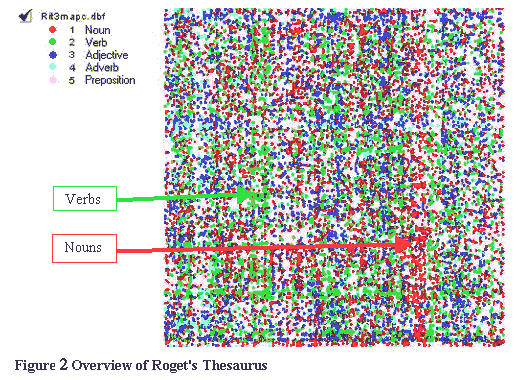
Categorical (nominal) data may also be used to form an axis of the substrate, especially if an ordering or a grouping can be applied to it. Alternatively, an integer sequence can be assigned to the categories. Neither method is always successful for visual displays as the organization of the data is more-or-less arbitrary. The graphic of Roget's Thesaurus in Figure 2 demonstrates the interacting problems of the organizing principle of the data and visualization of it. The words from Roget's (categorical data) have been ordered alphabetically and assigned numbers from 1 to 113,000. The senses in Roget's (also categorical) are organized in a conceptual hierarchy with positions in the hierarchy denoted by "sense numbers."
In Figure 2 the points represent a 73,000-sense (on the X coordinate) by 113, 000-word (on the Y coordinate) grid (8,249,000,000 possible points). There are 200,000 actual entries in the grid (a ratio of actual points to possible points of 1:41,245). The colors represent parts of speech. A row in the grid represents all instances of a word, while a column represents all the synonyms of one sense. Because of polysemy (words having more than one sense) a word can potentially be spread horizontally across the whole graphic--because of synonymy (senses being represented by several synonyms/words) a sense may potentially be spread vertically throughout the length of the graphic.
The sum effect of this display is that the entire context (the words and senses associated with an entry) of an entry (a particular sense of a particular word) is impossible to view while zoomed-in. While it is possible within a GIS to pan and zoom down to a single point, no amount of panning and zooming can show all the senses of a word, or all the words of a sense, at a level of detail which at the same time prevents overlapping of the points that represent the words or senses. In other words it is impossible to see the detail and the broad picture for a particular word, at the same time.
Figure 2. Overview of Roget's Thesaurus
Note that this display does allow observation of global features such as a concentration of verbs (green column, quarter left) which, as it happens, appropriately represents the Roget Class, Space: Sub-Class MOTION (Travel, Navigation, Impulse, Progression, Propulsion etc.). Also, a by-product of visualization was highlighted by this example. The red column of nouns to the right--an unexpected density--turned out to reflect a processing error during the development of the electronic version of Roget's used to generate this map. For several categories in the range 768 to 775, verbs were all miscoded as nouns. So, though this paper focuses on visualization for the purposes of information discovery, data integrity and coherence may also be scrutinized via the observation of outliers and anomalies in the visualization.
Card et al., (1999) suggest methods by which the basic map substrate may be manipulated to enhance or accommodate to the information content. For example by repeating an axis at a different position in space (repetition), by continuing an axis in an orthogonal dimension (folding), repeating subdivisions of space (recursion), and reuse of the same space for the same data (overloading). Geographic Information Systems achieve similar results through their ability to present different layers (or themes) of data concurrently, and to expose different sets of data depending on resolution (level of "zoom"). Superposition of layers allows the same perceptual processes that detect similarity in a plane (to aggregate disparate information objects using color or shape) to form groupings or identify relationships between objects of different types. A GIS example would be where an annual income demographic theme is superimposed on a city crime reports theme, and correlations observed or calculated between the overlaps.
An alternative to manipulating the interface model is to manipulate the data or information model by clustering, scaling, or decomposing, before visualization. As information is lost through such processes, this is suitable mainly for creating overviews of very complex data.
As stated at the beginning of this section, in the absence of a real-world coordinate system a framework must be generated to contain the information objects in an information map. There must also be some systematic method of mapping the information objects into the information map from their source, while retaining the relevant relations between the objects. Both GIS and information visualization methods use data tables to store the information used to generate visual representations (either visualizations or maps). Not all representations are suitable for all data or all uses. Design considerations discussed in this section such as choice of substrate, control, and perception issues require adaptation to the particular use to which the data is expected to be put, that is, what models are expected to be developed.
A GIS has few limitations to its ability to manipulate the features of the objects assigned to a coordinate system, or the amount of information contained therein. Ben Shneiderman's mantra, "overview first, zoom and filter, then details on demand, " is satisfied by GIS. Though traditionally used to visualize cartographic data, GIS may be seen as generalized spatial information processing systems with well-established, optimized algorithms for processing large data-sets. Current GIS can handle millions of data points with up to 256 attributes each.
Models are broadly based around points (unidimensional models), lines (relational models), and polygons (planar models). Any of the three types may be transformed into one of the other two models, or extended to three-dimensional models by the addition of a Z coordinate. For time-changing data, temporal models can also be developed, though this is currently limited in GIS. Finally, models can be mixed. These will all be discussed in the next section, with examples.
The representation of cartographic information objects follows a (perhaps lumpy) continuum. The earlier discussion about using data features as landmarks or maps pointed out that areas (polygons) on a map can represent mass nouns such as water, but that in the case of forests they also represent an aggregation of count nouns--trees. A row of trees, fence posts, or power pylons may be represented by a line. Standing in the middle of an eight-lane highway or floating in the middle of the Mississippi surely feels like being present on a large flat plane, as much as it does standing on this globe we call the earth; but when viewed from the sky, rivers and roads are better represented as lines. There is an easy crossover from points to lines to polygons as data density increases, or as an information navigator zooms in to or out from complex visual data. This reflects the effect in the real world where, when we approach complex objects such as trees or houses, we see more detail--more parts. And as we move away, elements blend and aggregate; for example polygons may become points. Conversely we can remain still but change our "focus" between form and detail. This process may be abstracted as hierarchical organization and formalized as graphical trees or lattices that can also be represented and manipulated within information maps.
The following categories of models illustrate some examples of each type of feature, and briefly describe the types of transformations that may be used to switch to other types of features. Transformation of substrates involves manipulation of data tables, and is not addressed in this paper: refer to Choice of Substrate above, for a discussion on generating substrates.
The first step in the development of a unidimensional model, (assuming an existing substrate) is to concretize or reify the landmarks. Points are iconic objects and may be represented by pictures of real-world objects to support interpretation. For example pictures of coins of various denominations and size, proportional to a financial desirability weighting, may be used.
Lines may be viewed as relations between points, or boundaries to polygons, or as landmarks representing some shared feature, value, or connectivity between other landmarks. The most common use of relations is in graphs (or networks), where the arcs (lines) joining nodes (points) represent some relation such as connectivity, correlation, distance, or proximity between the objects that the nodes represent. Examples are lattices, small-world networks, or road systems (see Old, 2001b, which displays screen shots of an example of online information cartography, where a navigator, via a web browser, may interact with a lattice of one word field (semantic neighborhood) to highlight components, or hyperlink to an online database which automatically retrieves and lists word fields of selected words).
Arcs may represent information such as direction, time, or an ordering on the nodes, in which case they are called directed arcs and usually represented as arrows. Graphs with directed arcs can be naturally extended to represent dynamics such as flow or state change (Petri nets), or workflow (Gantt charts and Pert diagrams). These may all be represented in GIS (in conjunction with any of the other information maps) and manipulated using GIS network algorithms. This is demonstrated by Klumar, Plaisant, and Shneiderman (1999) in their LifeLines, where the X-axis is a timeline, the substrate is a matrix of events which represent a record such as a medical history, professional history, or legal case; and the events are information objects such as doctor visits, or legal reviews.
Other metaphors can be introduced and applied. For example, circuit design networks utilize the concept of "source" (literally the source of the electricity) and "sink" (the complement of source). Digraph models can have strongly connected nodes without going arcs (sources with high "fan-out") and strongly connected arcs with path-ends, or in-going arcs (sinks with high "fan-in"). This type of model has been applied to Internet sites by members of the IBM Clever Project (Clever Project, 1999) who call their sources "hubs" (hub-ness is the sum of the authority scores of locations to which a page points) and sinks as "authorities" (authoritative-ness is the sum of the hub scores of pages which point to the authority).
Not only lines can represent relations. As was shown in Chart 1, the relations in a map reflect relations in a relational table containing the data and information used to generate and control the map. A relational table is a form of map. Columns and rows are lines that guide our eyes to associated data. The overview of Roget's Thesaurus in Figure 2 was tabular, with rows and columns. Bertin (1999) discusses the problems and potential solutions of representing tables or matrices graphically, directly. He also describes the transformations that are possible to graphs, networks, and topographies (which he calls non-transformable networks).
Henry Small (1999) has developed a Map of Science which he defines as:
The Map of Science is implemented as a large, complex, citation network--a directed graph where nodes can be chronologically ordered, and whose arcs connect earlier with later nodes.
Planar models include anything with a two-dimensional surface and are characterized by the objects referred to previously as polygons. Polygons may be overlapping or intersecting as in Venn diagrams. They may be disjoint, or nested, as are islands in a lake or lakes in an island. They may be unioned and may form tree structures as do the polygons representing ZIP codes or Area Codes "nested" within counties, which are in turn nested within states, which are in turn nested within countries. They may have location, shape, area, volume (if extruded), annotations (labels), and any number of additional attributes associated with them.
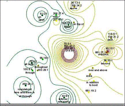
As stated in the discussion of Figure 1, by using three dimensions for representing single dimensions of data (extrusion), interactions between area, height and volume may confound or mislead interpretation. Topological methods that derive height (elevation) from point data are amore appropriate alternative.
Figure 3. Contours of a semantic field from Roget's Thesaurus (for the word over) .
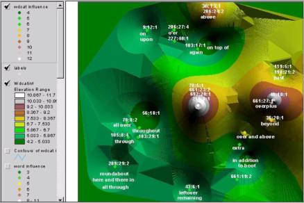
Figure 3 shows a contour surface derived from a multidimensional scaling of senses of a word (a semantic field). From this a three-dimensional elevation model (or TIN: Triangular Irregular Network) can be derived. This is classified here as a planar model as it is a warped plane rather than a strict three-dimensional object with volume. Figure 4 shows a TIN of the semantic field shown previously in Figure 3.
Figure 4. 3D Landscape: "semantic surface" generated from the data shown in Figure 3.
Planar models may be transformed to points and lines by reversing the transformations discussed previously (Unidimensional Models and Relational Models); and transformed to three dimensions by warping (as in TINs) and extrusion, as in Figure 1.
Three-dimensional models may be generated by extending unidimensional and planar models. Cartia Inc., who described themselves as "the leading provider of relational text mapping software" and the only apparent commercial implementation of information cartography, sold a product called ThemeScape: a software system that automatically organized document collections based on their content. The result was an interactive landscape of information--a topographical map where mountains and islands represented topics. Cartia's proprietary algorithm probably used MDS to place the points, then the GIS contour-to-TIN algorithm illustrated in Figure 4. ThemeScape's main advantage was a Java interface that facilitated online, interactive, queries. Cartia was taken over by Aurigin Inc., intellectual property specialists, in February 2001, and the software is now used to "analyze the trends of thousands of patents and present the information in a visual landscape in real time for users to intuitively obtain insight on the patents underlying content and relationship to one another" (Aurigin Inc., 2001, [Press Release 02.13.01]).
ThemeScape was originally developed at the Pacific Northwest Laboratory (funded by the CIA), where Galaxy, and many other visualizations based on spatial metaphors, were developed. The Galaxy system is one of several 3D information visualization systems based on the galaxy of stars, or star cloud metaphor. Another product now available on the web, similar to ThemeScape, is WebMap, a 3D topographical landscape of web pages organized into areas similar to Chen's self-organizing maps, with levels of zooming and textual search. Search results are represented as click-able, numbered flags on the "terrain".
In a 3D GIS environment models are not limited to topography. There may be extruded objects such as buildings, contour-filling bodies of water, and network structures such as power grids, road and rail systems, all projected onto the same topographical contours.
Temporal models in which objects change position are not possible in GIS, as coordinates are fixed. Dynamically changing features and trends, however, may be simulated by sequences of models, or snapshots, showing changes over time. In addition, positions through time may be represented in map coordinates similar to temporal axes in regular graphs. Geraldine Kochan, research analyst for the National Center for Missing and Abused Children, uses interactive mapping to represent and analyze patterns in the data collected about missing children, to assess leads based on chronological and geographical proximity to reported addresses of a suspect and/or a missing child (Kochan, 2001a)
Using a 3D representation a third variable can be used to summarize multiple maps. For example a 3D map showing prime abduction (high loss) states and prime "abducted to" (high gain) or destination states, can summarize 50 individual state maps that show source and destination abduction data for each state. In such a 3D map, however, it is not clear to which states children are abducted from a particular state. So questions like "What states do children abducted from Illinois tend to show up in?" require analysis of the original maps. Note that children are usually recovered in their home states-those who are taken out of state are the most difficult to recover and are the focus of Kochan's research.
Kochan (2001b) has used information cartography to show trends in the location data for abducted children. Using MDS to arrange states with close associations so that they are near each other, and adding the loss-gain information from the 3D map as contour zones (similar to the method used in Figure 3) source and destination trends can be read directly from a single map. For example, it was observed that children abducted from Illinois (a high loss state) tend to be recovered in California and Indiana, while children from California tend to be recovered in Texas (a high gain state), Washington and Georgia.
Using information cartography multiple temporal variables may be represented and analyzed, such as when a child went missing; when a child was reported missing (these may be up to two years apart); when a child became "media ready" (for milk cartons and posters); when the child was returned; age at the time of abduction or absconding; and age on return. With an appropriate substrate such as a MDS of child's age, gender information such as sex of the child and sex of the abductor can be superimposed to answer questions such as "Do women tend to abduct younger children?" and "Do men tend to abduct older girls?"
Changes over time may be superimposed to produce an animation, or aligned to allow static comparison. Hierarchical relationships can be likewise displayed. Figure 5 shows three snapshots of Roget's Thesaurus at different levels of the conceptual hierarchy, or classification system, found in the front of the "real" Roget's Thesaurus (as opposed to those paperback alphabetic synonym dictionaries).
Figure 5. Hierarchical layers of Roget's Thesaurus
Mixed models may be combinations of any of the previously described models, or combinations of these models with other forms of information representation.
Information maps are based on a substrate, usually an information object that is a mass noun and has quantitative values, implemented as a coordinate system. Once the decision of choice of substrate has been made, features can be manipulated to highlight facets of interest in the information. The "contents" of an information map are information objects, or landmarks, situated in the coordinate system. The landmarks are organized and displayed based on relations between (binary) and within (unary) them. Information features--properties of the information objects--are used to modify the display attributes to produce different models that highlight facets of the information store. Facets may be hidden relationships or patterns in the data, as well as known relationships.
Several modeling methodologies have been mentioned in passing, in context. These are all designed to either bring attention to or create visually, trends, discontinuities, outliers, regularities, structures, clusters, or groupings (similarities within the data).
The map, landmarks, and display attributes are derived from transformations of data in the following stages (Card et al., 1999):
Data => data model => visual structures => information model
Models may be unidimensional, planar, 3D, or mixed. Because coordinates are fixed, temporal models (dynamic models) must be simulated by sequences of snapshots. Transformations are possible between types of models by the transformation of spatial data-types--sets of points, lines, or polygons. Visual display can be expanded by transformations in other dimensions such as the extension to contours or addition of statistical graphs.
Information maps are based on the cartographic metaphor, so may be processed in the same ways as geographic maps, using geographic information systems. All of the functions, display utilities, and models of GIS may be used, including representing data dimensions with perceptual features such as color, size, and shape.
Information cartography techniques can be used to view patterns, extract information from raw data, and supplement the process of using GIS to browse data; but some techniques are no doubt more effective than others for different data sets. An example of an experiment to test the relative effectiveness of techniques would be to make a comparison between point data, contour, surface, and extruded point visualizations for the same data, testing speed and accuracy of interpretation for facets of the data, along with a Likert scale for preference of use for each visualization method.
Large amounts of abstract data in documentary form (text or graphics) exist. Reducing it to manageable analysis is clearly an escalating problem. GIS are designed to deal with and facilitate visualization of gigabytes of data in all forms. Filtering and focusing are essential supplements when dealing with information, as opposed to data, but overviews of complete data sets can highlight trends, patterns, clusters and outliers--these are also important to focusing analysis.
Analysis of data involves representation. Traditionally this has been in the form of tables, summary statistics, or graphs. Computers have facilitated an ease of analysis and display of data (spreadsheets, statistical packages, scientific visualization) including spatial data (CAD, Geographic Information Systems). This has led to new methods of analysis and information extraction (data mining, knowledge dredging, information visualization, visual querying, information browsing, spatial queries, spatial browsing, interactive/iterative querying), and with it, new methods of displaying the results (increasingly, concurrently with and as part of, the analytic process). Edward Tufte (1983, 1990, 1997) has discussed methods of information design in terms of "accessible complexity, " "graphical integrity, " "data density" and "friendly versus unfriendly" graphics. Cognitive and perceptual studies add a further dimension to facilitating representational insights to the design of methodologies and systems for "supplementing thinking" or, as Card et al. put it, "amplifying cognition."
...the fundamental problem for developers of information visualizations is that, because the data is nonspatial, it lacks natural physical representation. The information visualization research challenge is how to invent new visual metaphors for presenting information and developing ways to manipulate these metaphors to make sense of the information. (Eick, 2001 p.46).
This paper has attempted to address a narrow thread of this new and evolving area by focusing on information visualization through the use of spatial metaphors used in modern technology and information science, defining and developing models from the systematization of these metaphors, then connecting the models to the mature science of cartography and its computerized implementation, geographic information systems. We have shown that metaphors share basic properties with maps, and are fundamental to conceptual processing, suggesting that the cartographic models and their use for information navigation are a natural fit for exploration, research, and discovery. Finally we have illustrated these models with examples.
Ackerman, M. S., (1994). Metaphors along the Information Highway. Proceedings of the Symposium on Directions and Impacts of Advanced Computing (DIAC'94) , Cambridge, MA (April 1994). Available at http://www.ics.uci.edu/~ackerman/pub/94b10/diac.final.html
Ahlberg, C., and Shneiderman, B. (1999). Visual Information Seeking: Tight Coupling of Dynamic Query Filters with Starfield Display. In Card, S. K., Mackinlay, J. D., and Shneiderman, B. (Editors) (1999). Readings in Information Visualization, Morgan Kaufmann Publishers, San Francisco, CA.
Allen, C, and Saidel, E. (1998). The Evolution of Reference. In D. Cummins and C. Allen (Editors), The Evolution of Mind, Oxford University Press.
Aurigin Inc. (2001). Aurigin Systems Strengthens Integrated Solution for Intellectual Property Position With Acquisition of Cartia. [Press Release 02.13.01]. Available at http://www.aurigin.com/press/press.html#press.
Benedikt, M. (1991). Cyberspace: Some proposals. In M. Benedikt (Ed.), Cyberspace: First Steps. MIT Press. Pp. 273-302.
Benking, H., and Judge, A.J.N. (1994). Design Considerations for Spatial Metaphors: reflections on the evolution of viewpoint transportation systems. Position paper, ACM-ECHT Conference, Edinburgh 18-23 September 1994, (Invited Workshop: Spatial Metaphors for Information Systems). Available at http://www.uia.org/uiadocs/spatialm.htm.
Berry, M. W., and Browne, M. (1999). Understanding Search Engines: Mathematical Modeling and Text Retrieval, SIAM, Philadelphia, NJ.
Bertin, J. (1999). Graphics and Graphic Information Processing. In Card, S. K., Mackinlay, J. D., and Shneiderman, B. (Editors) (1999). Readings in Information Visualization, Morgan Kaufmann Publishers, San Francisco, CA.
B�rner, K., Chen, C., and Boyack, K., (2002): Visualizing Knowledge Domains. Annual Review of Information Science and Technology, Volume 37.
Brown, A., and Laverty, C., (2000). Searching the Web. IBAP Librarians Workshop, SEALS Conference, Singapore 28-30 Nov 2000. Available at Card, S. K., Mackinlay, J. D., and Shneiderman, B. (Editors) (1999). Readings in Information Visualization, Morgan Kaufmann Publishers, San Francisco, CA.
Carlotto, M.J. and Brennan, M.W., (1993). HyperMap: a Geographical Information System for Imagery and Text Storage and Retrieval. In Proceedings of the International Society for Optical Engineering (SPIE) conference on Digital Image Processing and Visual Communications Technologies, Boston MA, 1992.
Cartia Inc., (2000). ThemeScape. Available at http://www.cartia.com/products/techoverview.html (see Aurigin Inc., above).
Cleveland, W. S., and McGill, R. (1984). Graphical Perceptions: Theory, experimentation and application to the development of graphical methods. Journal of the American Statistical Association. 79, pp. 531-534 (Sept.).
The (IBM) Clever Project, Members of (1999). Hypersearching the Web, Scientific American, June 1999, pp. 54-60.
Cohen, I., (1999). Anthropomorphic Maps. Available at http://www.councilfire.com/israel.htm.
Davison, M. L., (1992). Multidimensional Scaling, Krieger Publishing Company, Malabar, Florida.
Dorling, D., and Fairbairn, D., (1997). Mapping: Ways of Representing the World. New York, Prentice Hall.
Downes, A. (1971). The bibliographic dinosaurs of Georgian geography (1714-1830), Geographical Journal, cxxxvii, pp. 383).
Eick, Stephen G., (2001). Visualizing Online Activity. In Communications of the ACM--Visualizing Everything, Vol. 44 No. 8.
Esri, (1994). Understanding GIS, Environmental Systems Research Inc., Redlands, CA.
Fabrikant, S. I. (2000). The Geography of Semantic Information Spaces. GIScience 2000, Savannah, GA Oct. 28-31, 2000. Available at http://www.giscience.org/GIScience2000/papers/016-Fabrikant.pdf
Fabrikant, S.I. (2001). Evaluating the Usability of the Scale Metaphor for Querying Semantic Information Spaces. In: Spatial Information Theory: Foundations of Geographic Information Science. Conference on Spatial Information Theory (COSIT '01), Lecture Notes in Computer Science 2205, Montello D. R. (ed.), Springer Verlag, Berlin, Germany: 156-171. Available at http://www.geog.ucsb.edu/~sara/html/research/cosit01/appendix/index.html
Florin, F. (1990). Information Landscapes. In S. Ambron, and K. Hooper, (Eds.). Learning with Interactive Multimedia. Microsoft Press, Redmond, CA, pp. 28-49.
G�rdenfors, P. (2000) Conceptual Spaces, Bradford Books, MIT Press.
Garson, David G., and Biggs, Robert S. (1992). Analytic Mapping and Geographic Databases. Newbury Park: Sage Publications (A series in quantitative applications in the social sciences).
Gazzaniga, M. S., Ivry, R.B., and Mangun, G.R. (Eds). (1998). Cognitive neuroscience: The biology of the mind. New York: W.W. Norton and Company.
Goldblatt, R., (1984). Topoi: The Categorial Analysis of Logic, North-Holland, Amsterdam.
Herman, I., Melancon, G., and Marshall, M. S., (2000). Graph Visualization and Navigation in Information Visualization: A Survey, IEEE Transactions on Visualization and Computer Graphics, vol. 6, pp. 24-43.
Hildebrand, C., (1995). Information Mapping: Guiding Principles. In CIO Magazine, July 1, 1995. Available at http://www.cio.com/archive/070195/map.html
Hofstadter, D. R., (1999). Analogy as the Core of Cognition. In Holyoak, Gentner, and Kokinov (Ed's), Advances in Analogy Research: Integration of Theory and Data from the Cognitive, Computational and Neural Sciences, MIT Press.
Jackendoff, R. (1983). Semantics and Cognition. London: MIT Press.
Klumar, H. P., Plaisant, C., and Shneiderman, B., (1999). Browsing Hierarchical Data with Multi-Level Dynamic Hierarchies and Pruning. In Card, S. K., Mackinlay, J. D., and Shneiderman, B. (Eds.) (1999). Readings in Information Visualization, Morgan Kaufmann Publishers, San Francisco, CA.
Kochan, G., (2001a). Law Enforcement, MapObjects, and the Recovery of Missing Children, Esri International Users' Conference, San Diego, CA, July 2001. Available at http://www.Esri.com/library/userconf/proc01/professional/papers/pap274/p274.htm
Kochan, G., (2001b). Using Spatial Analyst to Recover Missing Children of Family Abductions. Fifth Annual International Crime Mapping Research Conference, December 1-4, 2001, U.S. Department of Justice, Office of Justice Programs, National Institute of Justice, Dallas, TX.
Kohonen, T., (1982). Self-Organization and Associative Memory. 3rd Ed., Springer-Verlag, Berlin, NY.
Kohonen, T., (1990). The Self-Organizing Map. Proceedings of the IEEE, 78 (9), pp. 1464-480.
Lakoff, G., and Johnson, M., (1980). Metaphors We Live By. Chicago: University of Chicago Press.
Lin, X., Soergel, D., and Marchionini, G. (1991). A self-organizing semantic map for information retrieval. In Proceedings of 14th Annual International ACM/SIGIR Conference on Research and Development in Information Retrieval, pages 262-269.
Llinas, R., (1987). 'Mindness' as a Functional State of the Brain. In Blakemore, C. and Greenfield S., (Eds.) Mindwaves: Thoughts on Intelligence, Identity and Consciousness, Pub. Blackwell, Oxford, UK, pp. 339-358.
Lohse, G. L., Biolsi, K., Walker, N., and Rueter, H. H., (1994). A Classification of Visual Representations, Communications of the ACM, Vol 57, No. 12.
Mackinlay, J., (1999). Automating the Design of Graphical Representations of Relational Information. In Card, S. K., Mackinlay, J. D., and Shneiderman, B. (Editors) (1999). Readings in Information Visualization, Morgan Kaufmann Publishers, San Francisco, CA.
Mark, D. M., (1993). Human spatial cognition. In Medyckyj-Scott, D., and Hearnshaw, H. M., editors, Human Factors in Geographical Information Systems, Belhaven Press, 51-60.
Mickey, K., (2000). Designing Maps that Send the Correct Message. Workshop and handout booklet at the Midwest GIS Conference, March 6, 2000, Indianapolis, IN.
Miller, G. A., Beckwith, R., Fellbaum, C., Gross, D. and Miller, K. (1993). Introduction to WordNet: An On-line Lexical Database (Revised August 1993) . Available: http://www.cogsci.princeton.edu/~wn/papers/
Moore, T. and Carling, C., (1988). The Limitations of Language. Macmillan Press, Houndmills.
Old, L. John, (1999a).Spatial Representation of Semantic Information.MAICS99 presentation notes. Available: http://php.indiana.edu/~jold/maics/maics.htm
Old, L. J., (1999b). Spatial Representation and Analysis of Co-Citation Data on the "Canonical 75": Re-viewing White and McCain. Available at http://php.ucs.indiana.edu/~jold/SLIS/L710/L710.htm
Old, L. J., (2000). Using Spatial Analysis for Non-spatial Data. Proceedings, Esri International Users' Conference, San Diego, CA, July 2000. Available at Old, L. J., (2001a). Utilizing Spatial Information Systems for Non-Spatial-Data Analysis. Scientometrics, Vol. 51, No. 3 (2001) 563-571.
Old, L. J, (2001b). Web Access to Non-spatial Data using Internet Map Servers. Proceedings, Esri International Users' Conference, San Diego, CA, July 2001. Available at http://www.Esri.com/library/userconf/proc01/professional/papers/pap237/p237.htm
Old, L. J, and Priss, U., (2001). Metaphor and Information Flow. Proceedings of the Twelfth Midwest Artificial Intelligence and Cognitive Science Conference (MAICS'2001), Ohio, April 2001.
Paling, S. (2000). Information Cartography: A proposed model for access to heterogeneous end-user databases. ASIS&T SIG/CR Idea Mart, November 12, 2000, Chicago, IL
Palmer, S. E., (1978). Fundamental Aspects of Cognitive Representation. In E. Rosch and B. B. Lloyd (Eds.) Cognition and Categorization. Hillsdale, NJ, Lawrence Erlbaum Associates.
Poincot, P., Lesteven, S., and Murtagh, F., (2000). Maps of Information Spaces: Assessments from Astronomy.Journal of the American Society for Information Science, V. 51, No. 12, October 2000, pp. 1081-1089.
Priss, U. and Old, L.J, (1998). Information Access through Conceptual Structures and GIS. Proceedings of the American Society for Information Science Conference (ASIS'98): Information Access in the Global Economy. Pittsburgh, Pennsylvania, Oct. 1998.
Robertson, G. G., Mackinlay, J. D., and Card, S. K., (1991). Cone Trees: Animated 3D Visualizations of Hierarchical Information. Proceedings of CHI'91. ACM Conference on Human Factors in Computing, New York, pp 189 - 194.
Roget's International Thesaurus, 3rd Edition, Ed. L.V. Berry, Thomas Crowell Co., 1963.
Rorvig, M., and Hemmje, M. (1999). Foundations of Advanced Information Visualization for Visual Information (Retrieval) Systems. Journal of the American Society for Information Science. 50 (9): 835-837.
Roussinov, D., and Chen, H. (1998). A Scalable Self-organizing Map Algorithm for Textual Classification: A Neural Network Approach to Thesaurus Generation, in Communication and Cognition -- Artificial Intelligence, 15 (1-2), 1998, pp. 81-112.
Shneiderman, B. (1992) Tree Visualization with Tree-Maps: 2-d Space Filling Approach. ACM Transactions on Graphics, 11 (1), pp 92 - 99.
Shneiderman, B., (1994) Dynamic Queries for Visual Information Seeking, IEEE Software 11 (6): 70-77.
Small, H. (1999). Visualizing Science by Citation Mapping, Journal of the American Society for Information Science. 50 (9): 799-813.
Tufte, E. R. (1983), The Visual Display of Quantitative Information, Graphic Press, Cheshire, Connecticut.
Tufte, E. R. (1990). Envisioning Information. Graphics Press, Cheshire, Connecticut.
Tufte, E. R. (1997), Visual Explanations, Graphic Press, Cheshire, Connecticut.
Tversky, B. (1993). Cognitive maps, cognitive collages, and spatial mental models. In A. U. Frank and I. Campari (Editors), Spatial information theory: A theoretical basis for GIS. Pp. 14-24. Berlin: Springer-Verlag.
Tversky, B. (1996). Position Paper for NCGIA-21. NCGIA [National Center for Geographic Information and Analysis] Initiative 21: Formal Models of Common Sense Geographic Worlds, San Marcos, Texas, October 30 to November 3, 1996. Available at http://www.geog.buffalo.edu/ncgia/i21/papers/tversky.txt
WebMap Technologies Inc. (2000). What is WebMap Viewer? Available at http://www.webmap.com/maps/internetmap/index.html
Westerman, S. J., (circa 2000). Information Retrieval/Visualisation and Related Publications: Virtual Information Spaces. Available at
http://www.human-factors.org.uk/inf_ret.htm
White, H. and McCain, K. (1998). Visualizing a Discipline: An Author Co-Citation Analysis of Information Science, 1972-1995. Journal of the American Society for Information Science, 49 (4): 327-355, 1998.
White, H. D., and Griffith, B. C. (1982). Authors as Markers of Intellectual Space: Co-Citation in Studies of Science, Technology, and Society. Journal of Documentation, V. 38, No. 4, December 1982, pp. 255-272.
Wille, R. (1982): Restructuring lattice theory: an approach based on hierarchies of concepts. In: I. Rival (ed.): Ordered sets. Reidel, Dordrecht-Boston, 445-470.
Xiong, R., and Donath, J., (1999). PeopleGarden: creating data portraits for users. Proceedings of the 12th annual ACM symposium on User Interface Software and Technology, November 7 - 10, 1999 Pages 37-44.
a spatial representation of how disciplines, fields, specialties, and individual papers or authors are related to one another as shown by their physical proximity and relative locations, analogous to the way geographic maps show the relationships of political or physical features on the earth. (Small, 1999, p. 799.
Summary
References
L. John Old
School of Computing
Napier University, Edinburgh, Scotland