This paper presents a methodology for a macro level location analysis for industries. The key location criteria considered in the paper include buyer-supplier relationships, transportation access and costs, labor force characteristics and proximity to technology centers. The methodology outlined in the paper draws from the theoretical foundations of cluster analysis and uses the spatial analysis capabilities of GIS. Specifically the paper outlines the process used to optimally locate the Industry ‘Internal Combustion Engines’ (SIC 3519) within the state of Illinois.
In an increasingly competitive global market, industries strive to achieve a competitive edge. Industries have to constantly evolve and change with advances in technology, changing market circumstances and the nature of the economy as a whole to stay ahead. Besides factors that are internal to an industry’s management and function, several external factors such as access to suppliers and consumer markets, access to information and an environment of innovation (R&D centers, universities and colleges), and the availability of a trained and educated labor force, greatly affect its competitiveness. Significantly, all these attributes are dependent on the socioeconomic characteristics of the place in which the industry is located. Hence, geography is a critical factor, contributing to an industry’s competitive advantage.
Recent studies on industrial clusters provide insights into the spatial and location patterns of industries. Essentially industries cluster for economic advantage and therefore clusters are formed by groups of industries that are interconnected by “buyer-supplier relationships, or common technologies, common buyers or distribution channels, or common labor pools” (Bergman and Edward J. Feser, 1999). Studies on cluster analysis focus on identifying regional industrial clusters and researching the causes that lead to the formation of a cluster so as to create a more explicit understanding of the regional economy. Such analyses form the basis for informed policy decisions about future regional development. The underlying assumption of cluster analysis is that firms locate based on rational decisions made to gain competitive advantage. However, the task of identifying the optimal location of an industry is a spatial problem that requires comparison of the attributes of different places, and finding the best fit in a place that has the most suitable combination of desired attributes. In a sense, a location analysis problem is a spatial modeling problem where we need to explicitly identify and map the desired requirements or the criteria that would constitute suitable locations for the industry. The power of Geographic Information Systems (GIS) to allow a user to simultaneously analyze geographic space and the information linked to the space makes it an indispensable tool in solving complex spatial problems such as this.
This paper relies on the theoretical foundations of cluster analysis and the analytical potential of GIS to identify suitable locations for an industry. The method described in the rest of the paper is a macro level analysis that narrows down on a set of regions that have access to some of the attributes, which are essential for the locating industries. Specifically, the paper outlines the process used to locate the industry ‘Internal Combustion Engines’ (SIC 3519) within the state of Illinois as an example. This example illustrates a model that can be applied to narrow down suitable locations for any industry at different regional scales. However, the specific details of the problem will vary based on the specific industry under consideration, the geographic scale and the level of detail of the information or data being analyzed.
After determining the final objective for the location analysis the problem is then broken down into discrete steps. The first step is to determine the criteria that can be used to measure the suitability of each location. The specific criteria used for this problem are –
Proximity to major supply industries. This example considers only the top four suppliers in terms of cents worth of inputs purchased per dollar of the output produced by the ICE industry
Proximity to market industries (both consumer markets as well as industrial demand for intermediate goods and services should be considered, however in this specific example the consumer market for the ICE industry is much smaller than the industrial demand). This example considers only the top four market industries in terms of the cents worth of outputs purchased per dollar of the output produced by the ICE industry.
Education of Labor Force.
Average Wage Rate.
Large labor pool.
All this information has to be quantified and distributed spatially in a GIS. Each criterion will form one or more layers of spatial information that represents a measure of suitability. Each layer of information is transformed to a uniform scale and weighted according to the importance of the variable being mapped. Then the different layers need to be meaningfully combined or overlaid to produce a final suitability map that ranks the best and the worst places to locate. In the following example of a location analysis procedure with the ICE industry the process to map suitable locations based on criteria 1 and 2 (proximity to supplier and market industries) is dealt with first and then other variables such as labor availability, education of labor and the average wage rate are considered. But before suitable locations can be mapped or even before one can map the different variables that represent the given criteria in layers, the appropriate data need to be found, transformed and then linked to the appropriate feature classes to form a GIS. For example, to measure the proximity to major suppliers or market industries one first needs to identify which industries are the major supplier or market industries and where they are located.
Questions such as “which industries are the major suppliers of the ICE industry in Illinois?” or “which industries buy the products of the ICE industry?” can be answered by studying the input-output accounts (see Appendix for information on Input-Output Accounts) for the state of Illinois. The input-output data by state are classified by an industrial classification system that divides the economy into more than 500 industries. However, there is a bridge, which links the input-output industries to the industries classified by the more familiar SIC (Standard Industrial Classification) system to the 4-digit detail. Input-output data by state are available from the Bureau of Economic Analysis or from other proprietary sources such as the IMPLAN Group Inc. For this analysis data from the IMPLAN Group was processed in their software product IMPLAN Professional 2.0, to produce the required technical coefficients and sales coefficients matrices. The technical coefficients (also referred to as purchase coefficients) matrix is an industry-by-industry matrix that shows the cents worth of inputs that a particular industry purchases from all the other industries in the economy per dollar of its output. The coefficients are derived from the input-output table by dividing each cell of the matrix along the column by the total output of the industry corresponding to that column. Hence the column of coefficients under the industrial sector Internal Combustion Engines give us the purchases made by the ICE industry from all the other industrial sectors in the economy per dollar of its output. Therefore by sorting in a descending order along that column we can find the top four suppliers of the ICE industry and the cents worth of input purchased per dollar of output of the ICE industry. Similarly the sales coefficients can be derived from the input-output table by dividing each cell of the matrix along the row by the total output of the industry corresponding to that row. Table 1 shows the industries that supply the top four inputs of the ICE industry and the corresponding purchase coefficients and table 2 shows the top four industries demanding the output of the ICE industry along with the sales coeffic ients.
Table1: Technical Coefficients for the Internal Combustion Engine
|
IO Code |
SIC Code |
Top 4 Supply Industries |
Purchase Coeff. |
Weights |
|
308 |
3519 |
Internal Combustion Engines, n.e.c. |
0.0799 |
0.8219 |
|
447 |
50--, 5100 |
Wholesale Trade |
0.0745 |
0.7666 |
|
435 |
4200, 4789 |
Motor Freight Transport and Warehousing |
0.0258 |
0.2649 |
|
475 |
7370 |
Computer and Data Processing Services |
0.0085 |
0.0878 |
Note: Coefficients are measured in dollars of input purchased per dollar of output of the ICE industry.
Data Source: The IMPLAN Group Inc.
Table 2: Sales Coefficients for the Internal Combustion Engine
|
IO Code |
SIC Code |
Top 4 Market/Demand Industries |
Sales Coeff. |
Weights |
|
311 |
3531 |
Construction machinery and equipment |
0.0972 |
1.0000 |
|
308 |
3519 |
Internal Combustion Engines, n.e.c. |
0.0799 |
0.8219 |
|
384 |
3711 |
Motor Vehicles |
0.0248 |
0.2550 |
|
309 |
3523 |
Farm Machinery and Equipment |
0.0191 |
0.1961 |
Note: Coefficients are measured in dollars of input purchased per dollar of output of the ICE industry
Data Source: The IMPLAN Group Inc.
The fact that the Internal Combustion Engines Industry features as a major supplier and a market industry to itself can seem confusing. The answer to this lies in the aggregation of different establishments in each SIC industrial sector and secondary production by industries. Every SIC industrial sector even up to the 4-digit detail is a cluster of establishments that have been grouped according to its primary product by the US Department of Commerce. Furthermore it is often the case that an establishment produces substantial secondary products in addition to the primary product that accounts for its characteristic SIC code. Therefore, the different establishments that make up any SIC sector could trade amongst themselves, accounting for a major portion of the purchases and sales of the sector as a whole. In the case of the ICE industry, even though the primary product accounts for more than 95% of the total production, the industry makes up to 25 other secondary products (see appendix item 1 for list of all the primary and secondary products of the ICE industry).
Once the industries that are the major suppliers and the industries that demand the product of the ICE industry are identified, one needs to find out which counties (in Illinois) are specialized in these supply and demand industries. In this analysis the Location Quotients method has been used to measure economic specialization or the export employment of an industry in a place. The Location Quotient for a particular industry in a county (or other geographic definition that forms a particular economic unit) is the ratio of an industry’s shares of total employment in the county and the nation.
Mathematically the location quotient is defined as –
LQi = (ei /e)/(Ei /E), ............................................(1)
where ei is the area (county or other economic unit) employment in industry i, e is total employment in the area, Ei is employment in the nation in the industry and E is total employment in the nation. Assuming that the nation is self-sufficient, then a location quotient greater than one is indicative of the county’s specialization in that industry and that the county economy has more than enough employment in industry i to supply the region with its product. On the other hand a location quotient less than one suggests that the area is deficient in industry i and must import its product if the area is to maintain normal consumption patterns. While there are limitations of the location quotient method (see Schaffer 1999 and Isard et al. 1998) it still is a useful and widely used tool for getting a sense of the specialization of industries in a region.
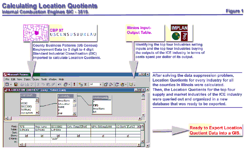
To calculate location quotients for every industry in every county in a state requires detailed employment data. The basic data source used for this purpose was the County Business Pasterns CD ROM available from the US Census Bureau. County Business Pasterns has detailed employment, establishment and payroll data available to the 4-digit SIC level for every county in the nation. This is probably the most comprehensive widely available data that provides detailed employment information by county to the maximum industrial disaggregation (the 4-digit level of industrial detail). However, a serious data problem at the 4-digit level is the Census Bureau’s disclosure rule. Based on the rule when the number of establishments of a particular industry in a county is very small the employment and payroll data is suppressed to ensure the privacy of the establishment and to prevent anyone on getting unique information about a particular establishment. Fortunately to compensate for the gaps in data the Census Bureau provides us with two clues to estimate the gaps in the employment figures. The first clue consists of employment data flags for every industry in a county that has its employment figures suppressed. The flags are essentially a code that gives us a range of the employment in that particular industry in the county. The second clue consists of the figures that describe the number of establishments by county and industry for each of thirteen size classes. Each size class of establishment is again based on a range of employees. Based on the two clues the data suppression problem was solved[1] and estimates of employment even in industries affected by the disclosure rule were formed and finally a complete employment database by county for every industry to the 4-digit SIC code was developed. The data cleanup has to be done in a database management software such as MS Access as the employment data for just the state of Illinois will have thousands of rows. Details of the estimation process can be found in the Appendix.
Once the data suppression problem is solved, location quotients can easily be calculated using equation 1. After the location quotient database was prepared for every industry in every county in Illinois I queried out the location quotient values for the four supplier and the four market industries (as shown in tables1 and 2) for all Illinois counties and organized them in one separate database – ready to be exported into a GIS. Figure 1 summarizes the main steps required to get the database ready.
Figure 1: Calculating Location Quotients
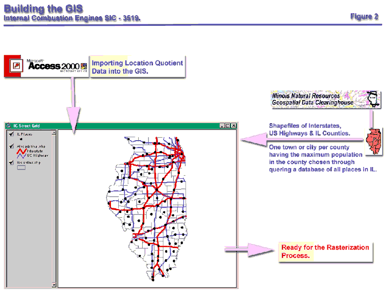
To build the GIS one needs the shapefiles of cities, the counties, and the major interstates and highways in Illinois. A shapefile is a vector file format for storing the location, shape and attributes of geographic features (Heather, 2001). A vector file format uses points, lines or polygons to represent geographic features. The appropriate geographic scale for this macro level analysis required that counties be represented as polygons, roads as lines and cities as points. All this data is freely available and downloadable from the Illinois State Geological Survey website (www.isgs.uiuc.edu). Ideally for such location analysis in addition to the above data the exact locations of the establishments under each SIC industry within each county is desired as a point theme. Such data is available commercially at www.claritas.com for some industries but is expensive and increases the complexity of the analysis. For this research exercise only one town or city per county (as a point theme) was considered based on the assumption that all the establishments that make up a particular 4-digit SIC industry are located within that town or city. Since the most populated city or town in a county would also most likely have the largest labor force among all the other cities, one city or town per county that had the largest 1998 population in the county was chosen. Population data for towns and cities with over 2500 people is available from the census website. For the road network used the interstates and the US Highways in Illinois were used. Other roads lower in the hierarchy of road classification such as state routes and city road networks were not used in the analysis because the flow of goods and services is mainly along the interstate system. Hence at this stage the GIS is built of vector data where the counties are represented as polygons, the road network as lines and the cities as points (see figure 2).
Once the geographic information was setup in ArcView the location quotient data was ready to be imported into the GIS. The location quotient data for all the supply-demand city shapefile[2]. Then a series of queries were performed to isolate the cities that were located in counties specialized in each of the supply-demand industries as shown in tables 1 and 2. The query was performed on the cities in Illinois rather than the counties as it had already been assumed that all the establishments that made up a particular SIC industry in a county were located within the largest city in the county. Querying out the cities located in counties specialized in the supply-demand industries is the first step of the GIS analysis. Only then can the distance from these cities supply-demand be mapped. But what is distance mapping? How will all the varying distances from different industries be mapped and meaningfully overlaid with each other and other diverse criteria such as education and labor force availability? As mentioned earlier in the paper each criterion would be mapped to form one or more layers of spatial information that represents a measure of suitability. But they have to be mapped appropriately such that they each layer can be overlaid and combined based on defined weights. Since it is difficult to meaningfully combine or overlay different types of variables represented in vector format for a suitability analysis other data formats in GIS had to be explored.
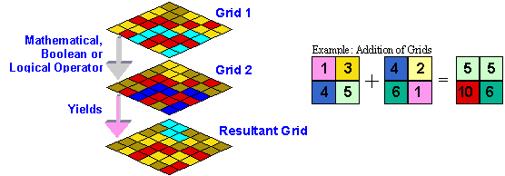
Spatial overlay of layers representing different variables is possible if one uses a Raster data format to represent each variable in the GIS. A raster is a rectangular array of equally placed cells. Each cell in a raster contains one attribute value and location coordinates. When the raster is georeferenced each cell in the raster dataset represents a portion of the earth. Hence each cell of a georferenced raster stores one value of a specific variable that relate to a specific portion of the earth. Cells can store several kinds of data including integer and real numbers and this allows mathematical, Boolean or logical operations to be performed on them. When two rasters have the same cell sizes and the same spatial reference so the cells overlap exactly one can perform mathematical operations on both the rasters and produce a resultant raster that reflect the operation performed. When a raster is composed of equally sized square cells it is also referred to as a grid. The same operations mentioned above are also valid for grid data. Figure 3 illustrates the spatial overlay process using grid data (see Zeiler, 1999 for further details on raster and grid datasets).
Figure 3: The spatial overlay of grids
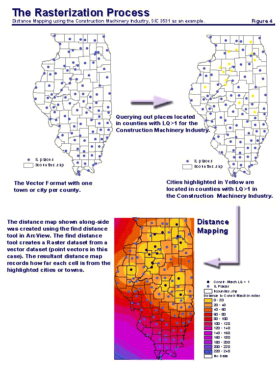
Since it is difficult to meaningfully combine or overlay different types of variables represented in vector format, the shapefiles that store vector data were converted to grids using the spatial analyst extension of ArcView. However, different variables are transformed into raster form in different ways to suitably represent the different criteria for optimal industry location. A Euclidean Distance Map from each of the main supplier or market industries is mapped using the ‘find distance’ function in ArcView. Essentially the ‘find distance’ function creates a resultant raster dataset from a vector dataset (point, line or polygon feature) that records how far each cell is from some chosen sources. In this problem, the sources are the cities that are located in counties specialized in a specific industry, which, is either a supplier, or a market industry of the ICE industry. Care has to be taken such that all the grid datasets have the same cell size and the same map extent. A cell size of 2000 feet by 2000 feet (slightly less than half a mile) was assigned for this analysis, as this size was suitable for the particular geographic scale that was used. Essentially, this meant that the smallest rectangle enclosing the state of Illinois was divided into a grid of equally sized cells of area 2000 feet by 2000 feet and that each cell could store an attribute value (in this case the distance from supplier and market industries) specific to the spatial location of each cell on earth. Figure 4 illustrates the querying process, and then the rasterization of the shapefiles to produce a distance map for the Construction Machinery Industry (the largest market Industry of the ICE industry). Using this process a distance map is prepared for each of the major supplier and market industries listed in tables 1 and 2. Now the GIS was ready to be modeled.
Figure 4: The Rasterization Process
Since the different grids all had the same cell size and map extent they were ready to be overlaid. Generally grid based calculations for a suitability analysis is a two-step process – the first step is a ranking process on an appropriate scale to standardize all the values of different grids, and then a weighting process at the time of the final overlay. Since the aim is to minimize the distance of supplier and market industries, all the distance grids are reclassified and assigned numerical ranks based on the distance from the different sources (the cities located in counties specialized in supply or market industries). A 1 to 40 ranking scale, with each ranking unit denoting a ten-mile increment in distance was chosen such that the maximum distance between the two most extreme locations in Illinois (which would be slightly greater than the length of the state of Illinois) could be included in the ranking. Hence, as shown in each map in figure 4, locations within ten miles of cities specialized in the supplier or market industries are assigned the highest rank of 40, areas in the next ten miles are assigned a rank of 39 and so on till maximum distance is assigned a rank. The logic of the ranking is obvious – places close to a particular supplier or market industry are more suitable for the ICE industry to locate and hence generate higher suitability ranks while places further away get a lower rank. Having all measures on the same numeric scale allows one to spatially overlay multiple layers that represent the different criteria and produce a final suitability map that has considered all the different criteria.
Now, if one simply overlaid the different distance maps one would get a resultant suitability map, that equally weighs the distance from the eight main supply-demand industries shown in tables 1 and 2. However, the ICE industry would be better off being closer to a supplier or market industry that supplies a major portion of its inputs or demands a major portion of its outputs. Therefore, a suitable weighting scheme is required that considers the actual dollar values of the flows of goods and services in terms of transportation costs and minimizes the distance of the flows. In the absence of actual transportation costs of delivering goods and services between the ICE industry and its supplier-demand industries, the purchase and sales coefficients provide the best proxy for the cost of these flows. Hence, each distance map of a supplier or market industry can be weighted in proportion to their purchase and sales coefficients shown in tables 1 and 2. The assumption is that a higher sales or purchase coefficient would correspond to a greater flow of goods and services between the ICE industry and the supplier or market industry and consequently would lead to higher transportation costs. In other words, the coefficients are being used to guess the actual transportation costs incurred by the ICE industry and the supply-demand industries. A weight of 1 was assigned to the market-industry Construction Machinery and Equipment (SIC 3531) as it had the highest coefficient of 0.0972 out of both the sales and purchase coefficients of the major supplier and market industries. Since the weight ‘1’, now corresponded to the coefficient 0.0972, the weights of the remaining industries were calculated based on their corresponding sales or purchase coefficients. The calculated weights for each of the four major supplier and market industry are shown in table 3. These weights quantify the relative importance of locating close to the supply and market industries.
Table 3: Supply-demand industries of the ICE Industry ranked according to the weights used in the analysis
|
IO Code |
SIC Code |
Top 8 Supply-Demand Industries |
Role |
P/S Coeff. |
Weights |
|
311 |
3531 |
Construction machinery and equipment |
Market |
0.0972 |
1.0000 |
|
308 |
3519 |
Internal Combustion Engines, n.e.c. |
Supplier |
0.0799 |
0.8219 |
|
308 |
3519 |
Internal Combustion Engines, n.e.c. |
Market |
0.0799 |
0.8219 |
|
447 |
50--, 5100 |
Wholesale Trade |
Supplier |
0.0745 |
0.7666 |
|
435 |
4200, 4789 |
Motor Freight Transport and Warehousing |
Supplier |
0.0258 |
0.2649 |
|
384 |
3711 |
Motor Vehicles |
Market |
0.0248 |
0.2550 |
|
309 |
3523 |
Farm Machinery and Equipment |
Market |
0.0191 |
0.1961 |
|
475 |
7370 |
Computer and Data Processing Services |
Supplier |
0.0085 |
0.0878 |
Note: Coefficients are measured in dollars of input purchased per dollar of output of the ICE industry.
Data Source: The IMPLAN Group Inc.
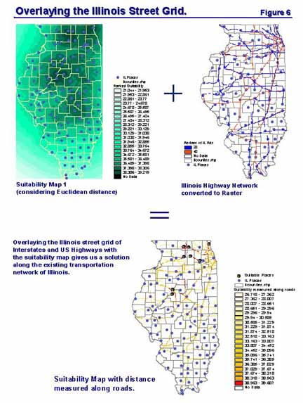
Now the final overlay process of the distance maps! The maps are overlaid through a simple mathematical calculation as shown in figure 5. The final map calculation is a simple addition process of each distance grid map after each grid map is multiplied by its corresponding weight. The weighted sum is divided by 4.2124, the sum of all the weights used in the map calculation so that the resultant map also ranks suitability on a scale of 1 to 40. Darker shades in the weighted suitability map in figure 5 corresponds to areas that have received higher suitability ranks, as they would have minimum transportation costs of flows of goods and services if we assume that travel paths are in straight lines from the origin to destination. However, in the real world surface travel is along railway lines, water bodies, or street networks. For this analysis one can reasonably assume that the majority of the transportation of goods will be through trucks along the Interstates and US Highways as is mostly the case in the United States. Based on this assumption one has to find suitable areas that minimize distance from supplier and market industries by considering that travel is only along the Interstates and US Highways. This can be done by overlaying the calculated suitability map (which considers Euclidean distance) with a rasterized map of the Interstates and US Highways. Care should be taken that during the rasterization process of the Illinois Street file that the cell size is chosen to be the same as the suitability map. Before overlaying the two maps, all the cells denoting the Interstate and US Highways were reclassified and assigned ranks based on the speed limits on both road types. Interstates in Illinois have a speed limit of 65 miles/hour while US Highways in general have a speed limit of 45 miles/hour (except when the US Highways go through cities). Hence, a rank of 40 was assigned to all the cells that contained the Interstate routes and the rank of the cells containing US Highways were reduced to 36 to compensate for the lower speed limit. Since the street grid contains cell values only along Interstates and US Highways the overlay of the suitability map and the street grid will produce an output raster having values only along the street network as shown in figure 6. Hence the final output map represents a suitability map that minimizes distance from the supplier-demand industries along the existing Illinois network of Interstates and US Highways.
Figure 5: Spatial Modeling with Distance Maps
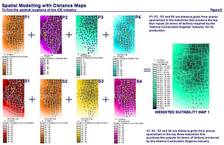
Figure 6: Overlaying the Street Grid
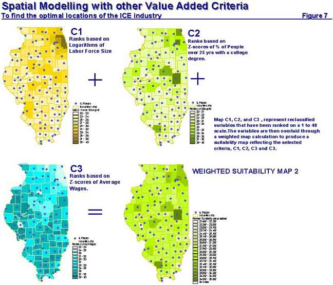
More factors than just the proximity to suppliers and market industries influence the location decisions of firms. As mentioned earlier other criteria like namely labor availability, the education level of the people in a place, and the average wage rate need to be considered too. Now these four criteria along with the first two that have already been dealt with are not an exhaustive list of all the factors that influence the location decisions of firms. Additional criteria can easily be modeled into the problem if they are relevant for the industry being located and provided one has data to represent the criteria. The process of modeling these new criteria into the location analysis is very similar to the way the first two criteria of proximity to supplier and market industries were dealt with. First one has to build a database of the variables, import them into the GIS, go through the rasterization process, rank the variables on the same 1 to 40 scale, assign weights to them and finally overlay the variables with the suitability map already prepared based on the first two criteria. The most recent data available for each of the variables from different data sources to build a database to represent each of the new criteria. The labor force data by county for the year 1999 was downloaded from the website of the US Bureau of Labor Statistics at stats.bls.gov. The average wage for non-farm private employment in every county in Illinois was calculated based on the annual payroll data available in the County Business Patterns CD ROM. The latest education data available by county is still the 1990 education data compiled on the basis of the 1990 census in a CD ROM called the USA Counties. The particular variable used in the analysis was the percentage of people over the age of 25 with a college degree.
The main difficulties in working with these data lie in transforming each of these variables to a suitable form such that they can be meaningfully ranked. In the distance mapping process, it made sense to assign ranks based on 10-mile intervals of distance from supply-demand industries, as that is approximately how transportation costs would vary. However, choosing a suitable interval for ranking is not easy when the frequency distribution of the variables is very irregular and there are extreme outliers. For example, the labor force size varies from 1722 in Pope County to over 2.7 million in Cook County. While 69 of the 102 Illinois counties have a labor force size of less than 20,000 around 11 counties have a labor force over 100,000 with Cook County being an extreme outlier. Hence to scale and rank such extreme variation in labor force, the logarithms (base 10) of the labor force in each county were calculated. The logarithms reduced the extreme variation in the sizes to values ranging from 3.2 to 6.4. Then a rank of 40 was assigned to Cook County that corresponded to the highest log value of 6.4 and the ranks of the other 101 counties were calculated by unitary method on the 1 to 40 scale being used for this problem. Essentially, this meant that at the lower end of the ranking scale where the sizes of the labor force were small, such as 1722 in Pope County, a relatively small increment in size of 1010 in the next largest county (Gallatin County with a labor force of 2732) would correspond to an increase of 1 ranking point. When the labor force sizes were larger at the higher end of the scale such as 217,482 as in Kane County, even an 85,000 increment in the next largest county (Will County) would still correspond to a gain of only 1 point in rank. This variable transformation incorporated the value of having a large labor force without overemphasizing the importance of the counties with exceptionally high labor force sizes. The education and the average wage variables were much easier to deal with. Since they had relatively less variation and no extreme outliers, the variables were standardized by conversion to Z-scores. Values that were more than 3 standard deviations from the Illinois average got the highest or lowest ranks of 40 or 1 depending on the sign of the Z-score. For the average wage variable the negative Z-score values corresponded to counties with low wage rates and hence received higher ranks compared to the counties with positive Z-scores.
Now that ranks had been assigned to the variables a weighting scheme needed to be developed. The amount the ICE industry spent on wages per dollar of its output was calculated from the value added matrix of input-output data. Analysis revealed that the ICE industry is rather labor intensive as it spends more than 20% of the cost of production of its outputs on labor wages (see employee compensation coefficient in table 4). This confirms that factors related to labor would be important location criteria. The variables labor force; wage rate and education would all determine labor productivity. Therefore, the wage coefficient of 0.2033 was equally distributed among the variables related to labor and assigned weights using the same unitary method used earlier (see table 4). Based on the weights shown in table 4 and the ranked maps of these new variables another weighted suitability map is prepared as shown in figure 7.
Table 4: Coefficients and weights assigned to the location criteria
|
Location Criteria |
Coeff. |
Weights |
|
Labor Force Availability |
0.0678 |
0.6967 |
|
Education |
0.0678 |
0.6967 |
|
Average Wages |
0.0678 |
0.6967 |
|
Total (Employee Compensation) |
0.2033 |
2.0902 |
Note: Coefficients in tables 4 and 5 are measured in dollars of expenditure or income per dollar of output of the ICE industry.
Data Source: The IMPLAN Group Inc.
Figure 7: Spatial Modeling with other Value Added Criteria
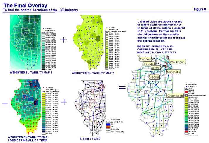
Now for the final overlay process that considers all the location criteria together and produces a final suitability map. The two weighted suitability maps are now overlaid through another map calculation as shown in figure 8. The resultant suitability map is then overlaid again with the street grid map so that we obtain a final solution along the existing road network. As shown in the final map in figure 8, the location analysis has yielded 7 cities that have received ranks of 38 on 40 (a score of 95% or more). Further analysis of these places and their counties at a more detailed scale with additional variables will yield the optimal location for the ICE industry.
Even though the location analysis procedure described above was specific to the Internal Combustion Engine Industry and restricted the geographic scale to the state of Illinois, the methodology can be applied to almost any industry at different geographic scales varying from a national scale to a city scale. Of course, each industry will have its own specific issues that may need to be represented as additional variables and the importance (weight) of each variable may vary but the overall concept of using GIS to spatially represent important variables to determine suitable locations of industries will be useful for almost any industry wanting to find a new location. However, the methodology described above has several underlying assumptions some of which were pointed out during the course of the description. All the assumptions used in the location analysis problem are summarized below so that each of them can be discussed in greater detail and the robustness of the method can be evaluated.
1. Transportation costs for each major input or output of the industry are in proportion to the cents worth of input purchased and the output sold per dollar of output produced (purchase and sales coefficients) by that industry.
2. Industries have the ability to expand to meet new demands. Based on a location quotient analysis if a county is found to be specialized in a specific industry that is a supplier of one or more of the inputs required by the industry being located then that supply industry will be able to meet the demand of the new locating industry.
3. A county that is specialized in a specific 4-digit SIC industry based on a Location Quotient analysis is also specialized in all the component establishments that make up that particular 4-digit sector.
4. All the establishments that form a specific 4-digit SIC industry in any county are located in the most populated city in that county.
5. Transportation of goods is only along the street network.
6. Restriction of the geographic scale to the state of Illinois.
If this analysis was to be performed for a particular client who wanted to find the optimal location of his or her firm, the above assumptions might seem unacceptable. First the client would probably not be very interested in the optimal location of the entire 4-digit industry of which he is a part. Instead, the client would want to know the suitable locations of his particular establishment. Moreover, the assumptions that were made for this analysis do not accurately reflect the way firms actually carry out their transactions with each other and do not reflect the actual costs incurred. After all most of these assumptions and the fact that a four-digit industry was used instead of a specific firm are simplifications of reality and attempt to compensate for the lack of data. In most cases transportation costs will not be in proportion to the values of purchase or sales coefficients as assumed in the analysis– they will vary based on the amount, the bulk and the weight of the commodities being transported. The largest purchase or sales coefficient may correspond to the trade of the most expensive commodity, which might very well be relatively light and small having much smaller transportation costs. Contrary to the second assumption, firms or establishments that form a supply industry may not be able to meet the new demands of a newly locating firm as the existing firms may not have the capacity to expand production and plant size at least in the short run. Moreover, a county that is found specialized in a particular four-digit industry that is a supplier or market industry of the locating firm may not be producing the exact supply commodities that the locating firm requires. In reality, various brands or variations of the same commodities are produced and specialization measures based on location quotient analysis do not guarantee that a particular kind or brand of commodity will be found in a region. Again, this is the problem of aggregation of firms or establishments that make up a particular SIC sector. The problem is further aggravated, as the SIC classification is based on the primary product produced by the firm. As mentioned earlier, secondary products might account for a substantial amount of the commodities traded between firms but some of the firms making up the SIC category might not be producing the secondary products that the locating industry demands. The fourth assumption that all the establishments or firms that make up an industry are located in the largest city is again a way to compensate for the lack of readily available data on exact firm locations within a county. The fifth assumption that road transportation is the main mode of transportation of goods is not a very serious assumption in a country like the USA where most transportation of goods is in fact along the very developed interstate system. However, transportation by rail and water can easily be included into the analysis if the data are available. Finally, this paper describes a location analysis of the ICE industry assuming that a hypothetical client has narrowed down the location problem to the state of Illinois. However, in reality a firm would often have a larger region in mind such as the Midwest or even the whole nation rather than just the state of Illinois. Building the database for a larger region just requires that a larger database for a larger region be built and that more computation time is set aside. The approach to the location analysis problem would remain unchanged.
So do some of these assumptions that simplify reality make the entire methodology redundant if one is trying to do a practical location analysis for a specific firm? While it is true that the above assumptions in the model present a simplified version of reality, the model can easily be tailored to a practical location analysis for an individual firm or establishment. For the most part the analysis would remain exactly the same but the data being used would more accurately reflect the firm’s needs. This is because many of the simplifying assumptions that have been used in this analysis can be replaced by more concrete and detailed information available from the firm itself. The accounts of the firm would provide detailed information about the input commodities that they purchase and the output commodities that they sell. Detailed transportation costs by commodity type would also be accounted for. Hence it would not be necessary to use the purchase and sales coefficients in place of actual transportation costs. The firm would be able to provide first hand information about the variables that are important for location analysis and hence the criteria and ranked suitability for location would largely be determined by information that the firm provides. Obviously some assumptions still need to be made, as we still have to rely on aggregated employment data to find out the places specialized in the specific firm’s supply-demand industries. Even with some of the assumptions, this process is a useful macro search method way to narrow down on the regions that have the potential to be the final location prior to a detailed site evaluation. Then further information could be collected in the regions that have been found to be suitable, such as information about the specific supply and market firms, the commodities they demand and produce and their location in the counties. Relevant information on the cities in the region such as tax rates, real estate prices and unemployment rates can be collected and a more detailed socioeconomic profile of the region could be prepared. In other words the entire process could be carried out again at a more detailed geographic scale with additional information after narrowing down specific regions. This step-by-step analytical method eliminates the need for amassing an overwhelming amount of information for a large geographic scale (such as the nation), as this would be both expensive and cumbersome.
As discussed in the previous section the location analysis methodology can be further refined provided we are able to expend resources for more detailed data and we have first hand knowledge about the firm or establishment that is wanting to locate. However, the problem of aggregation of firms even at the four-digit level of detail hinders the accuracy of the analysis as it forces us to make assumptions. Hence part of the challenge still lies in identifying other establishments that would be potential suppliers or market firms, and finding out if these establishments could supply sufficient goods for production or could form a sizable market. The recently developed North American Industrial Classification System (NAICS), which will be replacing the older SIC system, should improve the accuracy of such analyses. Not only does the NAICS system have a much finer level of disaggregation than the SIC system its classification system has been adapted to match the new structure of the economy. In addition it includes several newer establishments and even industries that were not present or adequately developed when the SIC system was prepared in 1987. The most significant improvement of the NAICS system is a fuller and more detailed treatment of the services sector, which has overtaken the manufacturing sector as the largest economic sector in the USA. The County Business Patterns CD ROM for the year 1998 has just been released in December 2000 having the NAICS classification. However, even the most recent (1997) Input-Output data available on the Bureau of Economic Analysis website at www.bea.doc.gov has not yet been adapted to the NAICS system. Yet, in cases where we have knowledge about the inputs and outputs directly from the locating firm the more recent NAICS classification can be used for specialization measures. While the NAICS system reduces the problem of aggregation we still don’t have an effective way of identifying firm locations and their products for every industry in the nation. This problem still requires us to make assumptions and to develop new analytical techniques that can give us greater accuracy in location analysis methods.
Professor Geoffrey JD Hewings,
Department of Geography
University of Illinois at Urbana- Champaign
1. REIS 1969-98: Regional Economic Information System, Bureau of Economic Analysis.
2. County Business Patterns 1997, Bureau of the Census.
3. USA Counties: Bureau of the Census.
4. IMPLAN Inc.
5. US Bureau of Labor Statistics at stats.bls.gov
6. Illinois State Geological Survey at www.isgs.uiuc.edu
Bergman, M. Edward and Feser, J. Edward (1999). Industrial and Regional Clusters: Concepts and Comparative Applications, Regional Research Institute, West Virginia University. Web book URL: www.rri.wvu.edu/regscweb.htm
Isard, W. et al. (1998). Methods of Interregional and Regional Analysis, Ashgate.
Schaffer, William (1999). Regional Impact Models, Regional Research Institute, West Virginia University. Web book URL: www.rri.wvu.edu/regscweb.htm
Kennedy, Heather, Editor (2001). Dictionary of GIS Terminology, The Esri Press.
Zeiler, Michael (1999). Modeling Our World, The Esri Press.
1) Input Output Accounts
An input output table is an accounting system for the economy of a region. The input output table records the transactions between the different players in the economy: industries, households and the government. The transactions are organized as shown in table A1.
Table A1
Organization of transactions in the input output accounts table
|
I1 - - - - - Ir - - - - - In |
C - - G - - I - - E |
||||
|
I1 | | | | Is | | | | In |
(I) Industry to industry sales of intermediate product |
(II) 1. Final Demand: a) Consumption by households & government. b) Investments 2. Net Exports |
Total Outputs |
X1 | | | | Xs | | | | Xn |
|
|
L | | | N | | | M |
(III) 1. Value Added: a) Industry payments to households and government b) Returns to capital |
||||
|
Total Inputs |
|||||
|
X1 - - - - -Xr - - - - Xn |
|||||
Quadrant I depicts production relationships in the economy, showing ways that raw materials and intermediate goods are combined to produce outputs for sale to other industries and to ultimate consumers. In this matrix of industry-to-industry transactions the number of industries typically vary from 30 to over 500 industries depending on the degree of aggregation or disaggregation of the industrial sectors of the economy. Each row in this matrix (e.g. Is in figure A1) accounts for the sales by the industry corresponding to that row to the industries (I1 to In) identified across the top of the matrix corresponding to each column (from 1 to n). Similarly each column in this matrix (Ir) records the purchases or inputs of the industry corresponding to that column from the industries identified at the left of the matrix corresponding to each row (from 1 to n).
Quadrant II describes consumer behavior, identifying consumption patterns of households and such other local final users of goods as private investors and governments. Another important part of Quadrant II is the net export column, which shows net sales to other industries and consumers outside the regional economy. Since these goods would not normally reappear in the region in the same form they are regarded as part of final demand.
Quadrant III shows incomes of primary units of the economy, including the incomes of households (L, in Table A1), the depreciation and earnings of industries (N), and the taxes various levels of government (M). These payments are also called value added.
Since the input output accounts is a double entry system of accounting that records the flows of money between all the players in the economy including profits, losses, depreciation, taxes, etc., as value added in quadrant III, the total purchases and payments must equal total sales. In other words the total inputs of the economy must equal the outputs, which explains the term ‘input-output.’
2) Commodities produced by the ICE Industry
Table A2
List of all the commodities (primary and secondary) produced by the ICE Industry in the year 1997, their value in millions of dollars and the percentage of total production – derived from the Make Table of Illinois’ Commodity-By-Industry Input-Output Accounts.
Data Source: The IMPLAN Group Inc.
|
COMMODITY |
COMMODITY NAME |
VALUE* |
% OF TOTAL |
|
308 |
INTERNAL COMBUSTION ENGINES, N.E.C. |
2370.591 |
95.40% |
|
311 |
CONSTRUCTION MACHINERY AND EQUIPMENT |
57.77654 |
2.33% |
|
386 |
MOTOR VEHICLE PARTS AND ACCESSORIES |
33.18291 |
1.34% |
|
394 |
RAILROAD EQUIPMENT |
9.451035 |
0.38% |
|
14002 |
INVENTORY ADDITIONS/DELETIONS |
3.568665 |
0.14% |
|
332 |
PUMPS AND COMPRESSORS |
2.350287 |
0.09% |
|
309 |
FARM MACHINERY AND EQUIPMENT |
1.683945 |
0.07% |
|
350 |
CARBURETORS, PISTONS, RINGS, VALVES |
1.583665 |
0.06% |
|
384 |
MOTOR VEHICLES |
0.9794412 |
0.04% |
|
307 |
STEAM ENGINES AND TURBINES |
0.7665995 |
0.03% |
|
218 |
GASKETS, PACKING AND SEALING DEVICES |
0.6348963 |
0.03% |
|
312 |
MINING MACHINERY, EXCEPT OIL FIELD |
0.5118588 |
0.02% |
|
357 |
MOTORS AND GENERATORS |
0.4628956 |
0.02% |
|
289 |
SCREW MACHINE PRODUCTS AND BOLTS, ETC |
0.2484917 |
0.01% |
|
285 |
SHEET METAL WORK |
0.230839 |
0.01% |
|
337 |
INDUSTRIAL FURNACES AND OVENS |
0.1963811 |
0.01% |
|
276 |
HAND AND EDGE TOOLS, N.E.C. |
0.1548834 |
0.01% |
|
354 |
INDUSTRIAL MACHINES NEC. |
0.1181797 |
0.00% |
|
284 |
FABRICATED PLATE WORK (BOILER SHOPS) |
0.1083211 |
0.00% |
|
342 |
COMPUTER PERIPHERAL EQUIPMENT, NEC. |
0.1051569 |
0.00% |
|
334 |
BLOWERS AND FANS |
0.0939245 |
0.00% |
|
381 |
ENGINE ELECTRICAL EQUIPMENT |
0.0551279 |
0.00% |
|
310 |
LAWN AND GARDEN EQUIPMENT |
0.0536258 |
0.00% |
|
393 |
BOAT BUILDING AND REPAIRING |
0.0454936 |
0.00% |
|
341 |
COMPUTER TERMINALS |
0.0008437 |
0.00% |
|
340 |
COMPUTER STORAGE DEVICES |
0.0001146 |
0.00% |
|
TOTAL COMMODITY PRODUCTION |
2484.9551 |
||
|
* Value is in Millions of dollars, for the year 1997 |
3) Overcoming the data suppression problem
The first clue in overcoming the data suppression problem of the county employment data is a column of letters in the field FLAG as shown in the table A3 below. Each industry in a county that has data suppression will have a flag letter corresponding to a range of employees. Hence we can find a maximum and minimum value for the number of employees in industries with data suppression in a county.
TableA3
|
FLAG |
Employment Range |
|
A |
0 to 99 employees |
|
B |
20 to 99 employees |
|
C |
100 to 249 employees |
|
E |
250 to 499 employees |
|
F |
500 to 999 employees |
|
G |
1,000 to 2,499 employees |
|
H |
2,500 to 4,999 employees |
|
I |
5,000 to 9,999 employees |
|
J |
10,000 to 24,999 employees |
|
K |
25,000 to 49,999 employees |
|
L |
50,000 to 99,999 employees |
|
M |
100,000 or more employees |
The second clue gives us the number of establishments in a particular industry (with suppression) in the county in each size class based on the range of employees as shown in table A4. Each size class corresponds to a range of employees as shown in the table below. Here again we can calculate a maximum and minimum value for the number of employees in industries with data suppression in a county.
Table A4
|
Establishment Size Class |
Range of Employees |
|
CTYEMP1 |
1 to 4 |
|
CTYEMP2 |
5 to 9 |
|
CTYEMP3 |
10 to 19 |
|
CTYEMP4 |
20 to 49 |
|
CTYEMP5 |
50 to 99 |
|
CTYEMP6 |
100 to 249 |
|
CTYEMP7 |
250 to 499 |
|
CTYEMP8 |
500 to 999 |
|
CTYEMP9 |
1000+ |
|
CTYEMP10 |
1000 to 1499 |
|
CTYEMP11 |
1500 to 2499 |
|
CTYEMP12 |
2500 4999 |
|
CTYEMP13 |
5000+ |
Very often the two ranges from the two clues do not overlap. Since both ranges are true when the two ranges do not overlap we can further narrow the gap by selecting the maximum of the two minimum values of the range and the minimum of the two maximum values of the range. The estimated employment is the midpoint of the narrowed range. If the two ranges overlap the estimated population is the midpoint of the any of the two ranges.
The following example will make the calculation clear.
E.g. Assume an industry in a particular county have a FLAG of A and have 2 establishments one in establishment size class CTEMP3 and one in CTEMP4.
Then clue one give us an employment range of 0 to 99 employees.
Clue two tells us that one establishment has 10 to 19 employees and the second 20 to 49 employees. Hence the employment range is 30 to 68.
The maximum of the two minimum values (0 and 30) of the range is 30 while the minimum of the two maximum values (68 and 99) is 68.
The narrowed range is 30 to 68.
The estimated number of employees = 30 + (68 – 30)/2
= 49.
The maximum error = (68 – 30)/2 or 19 employees.
[1] Based on a methodology taught by Professor Andrew Isserman in a course in Urban and Regional Analysis to solve the data suppression problem. The course website is www.aces.uiuc.edu/classes/up406
[2] Since the GIS had been simplified to only one city for each of the 102 counties in Illinois the county FIPS field could be used as a primary key (a unique identifier for a record in a relational database) to link the location quotient data that had been prepared for every Illinois county to the city shapefile.
Ranadip Bose
MUP 2002, University of Illinois at Urbana Champaign
HOK Consulting
2800 Post Oak Bouleveard, Suite 3700
Houston, TX-77056