Figure 1. U.S. Mortality: 1968-72
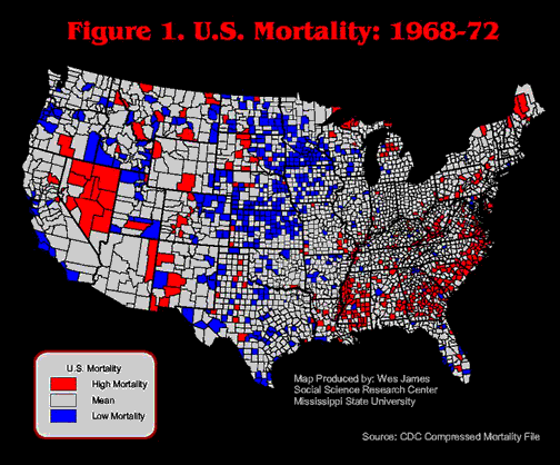
Figure 2. U.S. Mortality: 1973-77
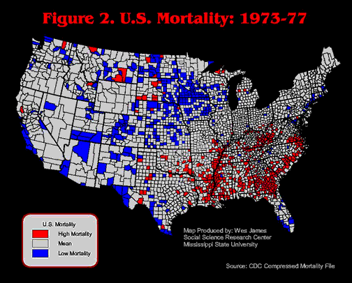
Figure 3. U.S. Mortality: 1978-82

Figure 4. U.S. Mortality: 1983-87

Figure 5. U.S. Mortality: 1988-92
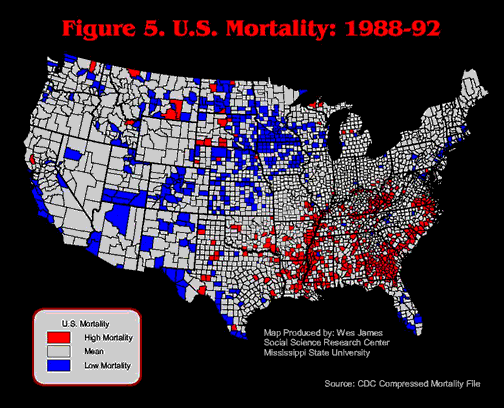
Figure 6. U.S. Mortality: 1993-97

When healthy and unhealthy counties (defined as above or below U.S. average death rates or life expectancy of the population) are mapped, clear instances of spatial clustering are visible. The next question is: If we map mortality for another time-period (i.e., introducing a temporal dimension to the spatial clustering) would the spatial patterns be the same? Put another way: Are high or low county-level mortality rates persistent over time? Investigators at Mississippi State University's Social Science Research Center (SSRC) are using several exploratory data visualization techniques and spatial statistics to determine the degree of spatial/temporal clustering and their statistical significance. These visualization techniques may also be used in a number of other research situations.
As part of a larger rural health research initiative, we are investigating the spatial and temporal patterns of high and low mortality and morbidity places in the U.S. Examinations into the health of our citizens, as well as the placement of, and access to, health care, are often dichotomized into rural and urban categories (Aday, et al. 2001; Ricketts III et al. 1999; Ricketts III et al. 1998). This dual metric has been criticized for masking the wide variety among rural settlements. As Miller, Farmer and Clarke (1994) noted: "If you've seen one rural community, you've seen one rural community. ... Thus, to speak of a singular rural America is folly," (p. 3). Since we are primarily interested in health, within the rural context, we began our inquiry with health outcomes. We ranked counties and mapped mortality rates at the county level for several periods of time.i We noted an apparent spatial "persistence" over time, i.e., the same counties ranked as having high or low mortality in multiple time-periods. The first question was: If different time-periods were mapped, would the same spatial pattern be evident? We chose to hold as constant the geography (counties), controlling for time (six 5-year time-periods), and measure the relative level of mortality rates (Sinton 1978; Goodchild 1992). This enabled us to test the hypothesis of spatial persistence of relative mortality rates among certain counties. If spatial persistence is proven, it will have important implications for both research focus and the spatial/regional allocation of health care and health care facilities (Cossman 1998).
The Compressed Mortality File from the National Center for Health Statistics (NCHS) reports all deaths of residents at the county level, the lowest level of mortality geography available (NCHS 2000; 2001a). The mortality rates for all-causes-of-death were calculated for every county in the United States.ii Five-year average mortality rates were calculated for each county to provide rate stability for low population counties (typically rural counties). To control for different age structures at the county level, the rates were age adjusted via the direct standardization method, using the Year 2000 United States Standard Million (Shryock et al. 1976; Feinleib et al.1992; Anderson et al. 1998a; Anderson et al. 1998b). The standard deviation for each five-year average was calculated and used as the cut-points for each time-period.iii
The text that follows outlines how we used different mapping schemes to address our research question. A detailed discussion of the spatial clusters is presented with the last map. We began by mapping the individual six time-periods using ArcView 3.2 and making visual comparisons among them as to whether or not the spatial clusters of high and low mortality counties were persistent over time. The following maps use red to indicate counties with a five-year average mortality rate that is more than one standard deviation
above the U.S. mean mortality rate. Counties in white are within one standard deviation of the norm. Counties in blue are more than one standard deviation
below the U.S. mean.
Figure 1. U.S. Mortality: 1968-72
Figure 2. U.S. Mortality: 1973-77
Figure 3. U.S. Mortality: 1978-82
Figure 4. U.S. Mortality: 1983-87
Figure 5. U.S. Mortality: 1988-92
Figure 6. U.S. Mortality: 1993-97
There is great individual county variation between the years, but the "regions" appear to remain somewhat consistent over time. However, given the individual maps, it is difficult to discern spatial patterns that might be played out over time. Thus, we took the next logical step, which was to animate the map series. We were actually looking at two aspects of spatial clustering. First, were the same spatial clusters persistent over time? Second, was there a spatial trend relative to the clusters, i.e., were the clusters moving east or west over time, were the clusters growing in a concentric circle fashion? We recalculated mortality rates using five-year rolling averages. This generated 27 mortality calculations that were used for mapping. The animation (Figure 7) was performed in the software package Flash. This technique was expected to increase the variability of rates, and thus the patterns that would be evident. However, by enabling the maps along the temporal dimension we thought that general patterns would become more discernable. A secondary advantage of an animated map is its value as a presentation vehicle.
Figure 7. U.S. Mortality Over Time (animation)
Note: For computer security reasons executable files are not included in this paper.
While the animated map was useful in confirming our suspicions about spatial clusters it was merely a visual confirmation. We recoded all the counties for each of the six time-periods. This was done by assigning a
+1 to each county that was more than one standard deviation above the national mean mortality rate in one time-period, and a -1 to those that were below the mean for mortality rates. Tallying up the scores for all six time-periods, we classified counties as having had high mortality rates in six of the six time-periods (a score of 6), five out of six (score of 5), and four out of six (score of 4). We did the same for low mortality counties. This visualization technique focuses on the overall score of high and low mortality counties. It is entirely possible that a county could have had a high rate for three time-periods and then have dropped into the normal range, or even have been both high and low, thus canceling out each score. For this analysis we chose to focus on the overall rate as opposed to possible rate trends among counties.
Using SpaceStat, a spatial statistics program which operates as an extension to ArcView 3.2, we plotted a local Moran's I scatter plot and used a first order adjacency matrix to assess the degree of spatial clustering. First order adjacency refers to those counties that share a boundary with the target county. To identify significant spatial clustering, the standardized value of the variable of interest for the target county is compared to the standardized average of all adjacent counties. For example, if a target county has a high mortality rate and is surrounded by a number of adjacent counties whose average mortality rate is high, then the target county is classified as a "high-high" county. Using this statistical technique, we are able to identify significantly unhealthy places as those counties that have not only high mortality rates, but are also surrounded by a series of adjacent counties with a correspondingly high average mortality rate.
In the following map (Figure 8), red counties refer to high mortality counties adjacent to high mortality counties (High Cnty-High Cnty). Blue counties indicate that a relatively low mortality county is adjacent to a series of counties that share a similarly low average rate of mortality (Low Cnty-Low Cnty). The pink counties indicate that a "relatively" high mortality county is adjacent to counties with a low average mortality rate (High Cnty-Low Cnty). Light blue counties indicate that a relatively low mortality county is adjacent to a number of high mortality counties (Low Cnty-High Cnty). White counties are not statically significant indicating that the mortality rate for the target county is independent of the rates of neighboring counties (No Significance).
Using this spatial statistics technique we confirm that statistically significant spatial clustering is occurring in a number of regions of the U.S. Keeping in mind that rates for sparsely populated counties are somewhat unstable despite the five-year average used, some spatial patterns do emerge. Four distinct clusters of high mortality counties emerge. The largest forms a high mortality belt across the Southern U.S., roughly encompassing the Piedmont areas of Southeast Virginia, North Carolina, South Carolina, and Georgia. There appears to be a break in the pattern across Alabama. The second cluster of high mortality counties is centered on the Mississippi Delta region and includes Louisiana, Mississippi and Arkansas. The third cluster of high mortality counties consists of a portion of Appalachia, Kentucky and West Virginia. The final cluster is a five county group in Nevada.
The low mortality counties appear to be almost entirely confined to the Great Plains. The northern-most cluster of low mortality counties covers parts of Wisconsin, Iowa, Minnesota, North and South Dakota. The second cluster, to the southwest of the first cluster, covers parts of Nebraska, Kansas and Northeastern Colorado. There is also a small cluster of low mortality counties in Northwest Oregon. We believe the low mortality counties along the Texas-Mexico border to be an artifact of the data set. The Compressed Mortality file excludes non-residents in both the death and population counts, which may under-represent deaths in these border towns with large numbers of immigrants (NCHS 2001b, p. 19).
Figure 8. Local Moran's I Scatter-Plot of Persistent Mortality in the U.S.: 1968-1997
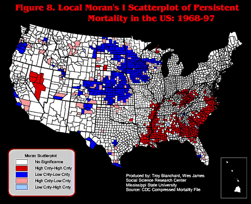
The value of the Local Moran's I scatter-plot is that it plots a county's high and low mortality rates relative to adjacent county rates. Thus it reveals relative local relationships, which is an aspect of spatial clustering. While this is an important way of visualizing the data, it also has its disadvantages in two respects. First, the ratings are relative to adjacent neighbors, so high or low mortality clusters are as much a function of the "neighborhood" as they are of absolute scale at the national level or for that time period. The second disadvantage is that the temporal dimension is not explicit in this map. It does not suggest any patterns that might unfold over time. To remedy that masking of the temporal dimension we used the recodes of the counties (+6 to -6) and created layers for the top three scores for both high and low mortality counties.
In the following map (Figure 9), dark red counties refer to high mortality
most persistent counties (high mortality in 6 of 6 time-periods). Lighter red counties refer to high mortality
less persistent counties (high mortality in 5 of 6 time-periods). Pink counties refer to high mortality least persistent counties (high mortality in 4 of 6 time-periods). White counties refer to those counties that either had median-range mortality or they had high/low mortality in 3 or fewer time-periods. Dark blue counties refer to low mortality
most persistent counties (low mortality in 6 of 6 time-periods). Lighter blue counties refer to low mortality
less persistent counties (low mortality in 5 of 6 time-periods). Finally, the lightest blue counties refer to low mortality
least persistent counties (low mortality in 4 of 6 time-periods).
When plotted, the map (Figure 9) exhibited spatial clusters similar to those in the Local Moran's I map (Figure 8), but it also has some important differences. First, fewer counties were highlighted as having relatively high or low mortality rates across the six time-periods. Of those that it did highlight, there is an interesting internal spatial pattern. In the large clusters there is the rough pattern of a set of core counties (i.e., high or low mortality in six of six time-periods) surrounded by less persistent counties. It appears to be a pattern of concentric circles, with the most persistent at the center and lesser and
least persistent counties radiating out in the temporal form of a distance decay model.
Figure 9. Persistence Over Time of Mortality Rates: 1968-1997
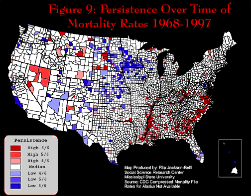
The important thing to note in this map (Figure 9) is the spatially anchored persistence over time of some of these clusters of high and low mortality counties. A county with high mortality rates in six of six time-periods has had relatively high mortality rates for 30 years! This map has clearly demonstrated a spatial "persistence" of high and low mortality in some counties in the U.S.
At first glance it is difficult to explain the clusters on
the basis of their internal characteristics. Whereas the low mortality clusters in the Great Plains have experienced out-migration for the past 30 or more years (Rathge and Highman 1998; Gober 1993), the high mortality counties in the Delta (Aratame and Singelmann 1998), and Appalachia (Cushing 1999) have also experienced out-migration. Thus, the same population movement has resulted in two radically different mortality outcomes. Within the high mortality cluster in the southeast, the population movement picture is mixed. Some counties in the South, those adjacent to metropolitan areas and those with natural amenities, have experienced in-migration, while those that remain rural and poor have experienced continued out-migration (Cromartie 2001). The same wide variety can be found in the demographic (e.g., age, sex and race) and socioeconomic (e.g., education, occupation, income, poverty, access to health insurance and social networks) characteristics of these counties. Clearly, the levels of mortality will not be explained by a cursory review of current local conditions. Further, given the
role that time (elapsed, biological, cumulative and historical) plays in the determination of mortality, current socioeconomic conditions in these places and among these populations may have little or no
relation to observed mortality (Hertzman et al. 1994).
These results have provided a preliminary answer to the first substantive research question: Over time, do some places persistently have relatively high or low mortality rates?
Clearly, there is a temporal persistence anchored to specific locations, either place or people. This conclusion has implications for both research and policy.
First, if high mortality areas are spatially clustered and stable over time, it is logistically easier to study, and provide services to, those areas.
It may also be that the processes that lead to individual mortality in these locations vary.
In other words, it is not just that someone lives in an area with a high proportion of blacks (demographic), or an area of poverty (socioeconomic), or a largely humid rural area (environmental), but whether they reside in one of these persistently high and low mortality locations.
For every variable just cited, there are counter examples available, as well.
Thus a recategorization, along the lines of high and low mortality areas, may be a more useful way to rank these areas, as opposed to the current "rural versus urban" categorization.
Second, this naturally begs the question as to the role that a particular "place" versus "population" plays in mortality rates.
To put it another way, as we hold the geography constant over time, is the population that we are observing permanent in that place, or is the population base constantly changing due to in- and out-migration?
This directly addresses the issue of population mixing over time in those counties.
Once we have quantified the relative "permanence", we may begin to assess the relative role of "place" versus "population" characteristics in the determination of high and low county-level mortality rates.
Researchers should note that similar temporal and spatial patterns can be
visualized for different causes of death and morbidity in a particular
area. Finding consistent spatial patterns in mortality would lead us to believe that there are
similar patterns in the causes of mortality. Therefore, this
healthy and unhealthy places model has potential uses for contextual health research, not simply mortality research.
Nonetheless, there are several fundamental issues that are yet to be resolved.
Even when we have spatially situated health outcomes, the actual determinants will still remain unresolved.
For example, what relative or multiplicative roles do physical place, resident population, population migration, socioeconomic status, social networks and access to medical care have on medical processes and outcome? These questions make up the next series to be addressed by this ongoing research into rural health in America at the SSRC.
Our initial task was to map relative mortality at the county-level and assess whether spatial clusters were present. Although the individual maps (Figures 1-6) and the animation (Figure 7) were useful intermediate steps, the calculation and plotting of the Local Moran's I (Figure 8) was the most useful visual display and quantification of spatial clusters. This particular map displayed a breadth of pattern that the other treatments did not, although one must keep in mind that the calculations were based on neighbors and not national averages. However, the Local Moran's I presented the data as one static map of persistence, treating the 30-year time-period as one data set. Although we had quantified spatial clustering, we still sought to visualize the temporal dimension, by recoding and assigning different classes to each county, ranging from most persistent (six of six time-periods) to not persistent (less than four out of six time-periods). The map of persistence over time (Figure 9) was the most useful in terms of visualizing the temporal persistence of high and low mortality. This map enabled us to see
where high and low rates have been spatially anchored over time, which can have important implications in terms of research focus and medical intervention. The visualization of multiple time-periods proved to be as useful a tool for assessing this aspect of
mortality as the more rigorous spatial statistics test. In this particular case, the simpler mapping procedure proved to be the more informative about the temporal permanence of high and low mortality.
This research was made possible by grant number 4 D1A RH 00005-01-01 from the Office of Rural Health Policy of the Department of Health and Human Services through the Rural Health, Safety and Security Institute, Social Science Research Center (SSRC), Mississippi State University. Its contents are solely the responsibility of the authors and do not necessarily represent the official views of the Office of Rural Health Policy.
i Implicit in this data visualization of spatial clusters technique is the assumption of an
isotropic plain, a flat, featureless plain which contains no physical or social barriers to movement and access to
health care (e.g., rivers, mountains, roads or lack of roads, administrative or service boundaries or discrimination in the provision of care). We recognize the possible roles that physical, financial and social barriers or facilitators could play in terms of the spatial patterns of mortality that are visually evident and
we do not mean to discount them.
ii The compressed mortality file contained 3,143 records. We combined independent cities with their counties and eliminated counties with zero population, reducing the file to 3,107 records. Note that the data set does not include non-residents in either the reported deaths or population. Thus some immigrants (both legal and illegal) are not reflected in these calculations. Also excluded from
these maps are rates for Alaska. Mortality at the county level in Alaska was not reported until 1988, thus eliminating that state's county level data from more than half of the time-periods being studied.
iii This methodology of calculating cut-points (above or below one standard deviation from the mean) relative to each 5-year time-period spotlights the highs and lows for those periods within the context of each of the six time-periods. While this ranking identifies counties that are relatively high or low over time, this methodology does mask possible absolute trends over time (Pickle 2002; Howell 2002). A county could begin as high and slowly drop over time, yet if it ranked as high in four of the six time-periods that it would be identified as a high county. In this article we chose to focus on
"relative", (within each time-period) rankings of mortality for our initial inquiry.
Aday, L.A., Quill, B.E., and Reyes-Gibby. 2001. "Equity in rural health and health care," in
Loue, S., and Quill, B.E. (eds), Handbook of Rural Health. New York, New York: Kluwer Academic/Plenum Publishers. Pp. 44-72.
Anderson, R.N., Rosenberg, H.M. 1998a. 'Report of the second workshop on age adjustment.'
National Center for Health Statistics. Vital Health Statistics 4(30).
Anderson, R.N., Rosenberg, H.M. 1998b. 'Age standardization of death rates: Implementation
of the year 2000 standard.' National Center for Health Statistics. National Vital Statistics Reports 47(3).
Aratame, N., Singelmann, J. 1998. 'Migration and race in the southern United States', in
Schwarzweller, H., and Mullan, B. (eds), Research in Rural Sociology and Development: Focus on
Migration, Vol. 7, pp. 113-130.
Cossman, R. 1998. Extending the modifiable areal unit into TIME. Proceedings
of the GIS/LIS 1998 Annual Conference and Exposition. Fort Worth, Tx.
November.
Cromartie, J. 2001. Migrants in the rural South choose urban and natural amenities.
Rural
America. 15(4), 7-18.
Cushing, B. 1999. 'Migration and persistent poverty in rural America', in Pandit, K., and Withers,
S. (eds), Migration and Restructuring in the United States: A Geographic
Perspective, Lanham, Maryland: Rowman and Littlefield, pp. 15-36.
Feinleib, M., Zarate, A.O. (eds). 1992. 'Reconsidering age adjustment procedures: Workshop
proceedings.' Vital Health Statistics 4(29).
Gober, P. 1993. 'Americans on the move.' Population Reference Bureau, Inc. 48(3).
Goodchild, M. 1992. 'Analysis: The search for pattern', in Abler, R., Marcus, M., and Olson, J.
(eds), Geography's Inner Worlds: Pervasive Themes in Contemporary American
Geography, New Brunswick, New Jersey: Rutgers University Press, pp. 138-162.
Hertzman, C., Frank, J., and Evans, R. 1994. 'Heterogeneities in health status and the
determinants of population health,' in Evan, R.G., Barer, M.L., and Marmor, T.R. (eds).
Why Are Some People Healthy and Others Not?: The Determinants of Health of
Populations. New York, New York: Aldine De Gruyter.
Howell, F. 2002. Personal correspondence. Department of Sociology, Anthropology and Social
Work. Mississippi State University, Mississippi State, Mississippi.
Miller, M.K., Farmer, F.L., and Clarke, L.L. 1994. "Rural populations and their health," in
Beaulieu, J.E. and Berry, D.E. (eds), Rural Health Services. Ann Arbor, Michigan: AUPHA Press/Health Administration Press.
National Center for Health Statistics. 2000. Compressed Mortality File: 1968-88. Centers for
Disease Control and Prevention, U.S. Department of Health and Human Services, Hyattsville, Maryland.
National Center for Health Statistics. 2001a. Compressed Mortality File: 1989-98. Centers for
Disease Control and Prevention, U.S. Department of Health and Human Services, Hyattsville, Maryland.
National Center for Health Statistics. 2001b. Documentation for the Compressed Mortality File:
1989-98. Centers for Disease Control and Prevention, U.S. Department of Health and Human Services, Hyattsville, Maryland.
Pickle, L. 2002. Personal conversation. National Cancer Institute. Rockville, Maryland: National Institutes of Health.
Rathge, R., Highman, P. 1998. 'Population change in the Great Plains since 1950 and the
consequences of selective migration,' in Schwarzweller, H., and Mullan, B. (eds),
Research in Rural Sociology and Development: Focus on Migration, Vol. 7, pp. 71-89.
Ricketts III, T., Johnson-Webb, K., and Randolph, R. 1999. "Population and places in rural
America," in Ricketts III, T. (ed), Rural Health in the United States, New York, New York: Oxford University Press. Pp. 7-24.
Ricketts III, T.C., Johnson-Webb, K., and Taylor, P. 1998. Definitions of Rural: A Handbook for
Health Policy Makers and Researchers. Federal Office of Rural Health Policy, Health Resources and Services Administration, U.S. Department of Health and Human Services. Washington, D.C: Government Printing Office.
Shryock, H., Siegel, J., et al. 1976. The Methods and Materials of
Demography. New York, New
York: Academic Press.
Sinton, D. 1978. 'The inherent structure of information as a constraint to analysis: Mapped
thematic data as a case study', in Dutton, G. (ed), Harvard Papers on Geographic Information Systems (Vol. 7), Reading, Massachusetts: Addison-Wesley, pp. 1-17.
Ronald Cossman, Ph.D.
Research Associate
Social Science Research Center, P.O. Box 5287
Mississippi State University
Mississippi State, MS., 39762-5287
E-mail: rcossman@ssrc.msstate.edu
Office: (662) 325-4801
Fax: (662) 325-7966