By Tiffany C. Vance and Nazila Merati
Abstract
NOAA's Pacific Marine Environmental Laboratory (PMEL) and Alaska Fisheries
Science Center (AFSC), both in Seattle, collect a wealth of data about
the physical and biological characteristics of the Bering Sea and the Gulf
of Alaska. The data are stored in a variety of formats in a variety
of legacy data systems. AFSC makes extensive use of a GIS to store
their data. PMEL has growing expertise in visualizing scientific
data. Routines have been developed to take data from a variety of
sources that have not previously been GIS compatible. ArcView GIS
and ArcView 3D Analyst have been used to create a series of VRML visualizations
of this data. Some of the VRML files have been created directly from
3D Analyst; others have required extensive postprocessing. The use
of EVS to create true 3D visualizations will also be shown.
NOAA's Pacific Marine Environmental Laboratory (PMEL) and Alaska Fisheries Science Center (AFSC), both in Seattle, collect a wealth of data about the physical and biological characteristics of the Bering Sea and the Gulf of Alaska. PMEL is the primary NOAA research laboratory for the study of the physical oceanography of the North Pacific. Research cruises collect data on various water properties including temperature and salinity. Data on currents and water masses are also gathered. The data are stored in a variety of formats in a variety of legacy data systems. PMEL has developed advanced web-based data selection techniques. A variety of web pages allow users to browse, plot and download datasets. PMEL is also developing expertise in the display and visualization of physical oceanographic datasets. Three and four-dimensional representation of datasets are commonly used during analyses and for presentations. AFSC is the primary NOAA laboratory for the study of the biological characteristics of the North Pacific and Bering Sea. Cruises collect water samples for nutrient analyses, samples for the determination of plankton and larval fish assemblages and trawl for fish. Other projects study the biology and habits of the various marine mammals found in the area. AFSC makes extensive use of a variety of databases and GIS's to store and analyze their data. A number of cooperative projects have utilized the GIS expertise at AFSC and the visualization and data selection/dissemination expertise at PMEL to create complex, GIS-based, visualizations.

Standard GIS packages have allowed environmental scientists to visualize results in static 2D views. The advent of 2.5D GIS has given scientists a more advanced method to visualize several layers of 2D data at the same time and to underlay topography, bathymetry and other features. The use of VRML as an output format allows the user to interact with and manipulate a visualization. PMEL has combined efforts with AFSC to apply both 3D GIS and VRML to display and analyze environmental data. To make the results amenable to distribution via the WWW different techniques to optimize visualizations were tested.
Esri's ArcView 3D Analyst's ease of installation and use makes it a good package for learning visualization without excessive programming knowledge. In-situ and gridded oceanographic data are easily formatted into ArcView shape file format and ArcView grids and TINS. Image files (such as .bil and GeoTIFF) are also easily imported and viewed in 2.5D. 3D Analyst allows its users to adjust the aspect and orientation and to set viewpoints for initial display of each scene. Output to VRML has allowed visualizations to be displayed as a stand-alone with the aid of virtual reality viewers such as CosmoPlayer.
What 3D Analyst lacks is the ability to do true 3D. Because it does not calculate volumes for the features displayed one cannot create vertical slices or do volume rendering. Environmental modeling requires looking at phenomena such cold pools, fronts or vertical profiles along transect lines. This requires true 3D capabilities. To solve this limitation, we looked to the geological visualization community to find techniques that were both scientifically robust and provided true volume rendering.
C Tech's Environmental Visualization System (EVS) software allows the user
more advanced levels of 3D kriging, volume slicing and rendering. Data can
be read in their native format and converted and rewritten in ArcView
compatible formats. Algorithms are found in standard modules and can
be combined and modified by more sophisticated users. Visualization outputs
include movies, VRML, and animations.
Two versus three dimensions
Two dimensional visualizations, or maps, are excellent ways of viewing data gathered on the Earth's surface. For better, and worse, oceanographic data tends to be collected on a three dimensional grid. Data are collected at a location; they are also collected down through the water column. For example, marine mammals such as fur seals are fitted with small data collection packages. These collect data about the animal's location, the depth that the animal is at and other quantities such as the water temperature. One of the questions that researchers are seeking to answer is whether the animals diving behavior is related to physical oceanographic parameters. A map of the animal's dive track provides some information:
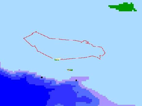
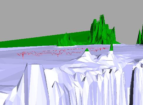
The map does not provide information on when the animal is diving, how deep it dives and whether its dives are related to other parameters. A 3D visualization of the data can provide much more information.
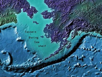
This is a representation fur seal foraging behavior in the Bering Sea. A one-week foraging trip from St. Paul Island made by a sub-adult male is shown here. Animals are instrumented to measure their location, the depth of their dives and water properties. Data are filtered, imported into ArcView and converted to a 3D line file. The ETOPO5 bathymetry and topography and the GTOPO30 topography were merged to create the bottom layer of the image. Enhanced versions of this visualization will include information about bottom temperatures and the presence of a "cold pool" and its relationship to diving and foraging.
For the purposes of this discussion 2.5D refers to representations that
include a z-dimension, but do not calculate and represent volumes. A good
example would be a representation of topography with a series of layers
represented at a depth below or above the surface. A true 3D representation
would involve the calculation of volumes of parameter, allowing for slicing
on the fly, calculation of sub-volumes etc.
In situ data
Measurements of temperature, salinity, irradiance and nutrients are collected by CTD instruments deployed at specific station locations. Typically the data are collected at 1-meter intervals and give the user an idea of the temperature or salinity attributes at each location. The in-situ data, gathered by CTDs, are maintained and stored in EPIC, a system that provides data management, display and analysis programs for oceanographic data. EPIC has a well-developed web interface for data selection and display. Once the dataset is refined the user can create an ArcView compatible output dataset with full metadata. An EPIC program has been written to convert EPIC data into an ArcView compatible format. The output files include metadata and carry the description of cast conditions with each data point. A Java routine to convert the comma-delimited output files to Esri shapefile format has been developed. The data are then brought into ArcView and converted to 3D shapefiles.
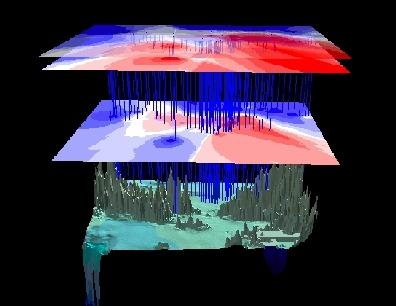
The example shown is a three-dimensional representation of temperature data in the Bering Sea. The topography is the bottom layer of the image. The three layers above are contoured water temperature at 0, 5 and 40 meters below the sea surface. The lines represent CTD casts (where temperature data were collected).
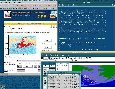
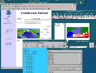
Gridded climatological datasets of sea surface temperatures, wind stress and precipitation rates are maintained or served via the Ferret Live Access Server at PMEL. As with the EPIC server, users can browse and select datasets via a web interface. Data can be downloaded as ArcView ASCII GRIDS or as images to be used in visualizations. Data are imported as an ASCII grid into ArcView and added to 3D scenes as GRIDS, TINS or images depending on the application. Currently, we are testing higher resolution gridded data sets of the Arctic for use in visualizations.
The example shown is a three-dimensional representation of temperature data in the Bering Sea during April 1997. The top layer is SST data from the 2 degree COADS data set. The data grid was produced by the Ferret program. The three smaller grids are water temperature grids produced by gridding routines in ArcView. The three layers are contoured water temperature at 0, 5 and 40 meters below the sea surface from April 1997 in-situ CTD data. The ETOPO5 topography was converted from a grid to a TIN (Triangulated Network) for faster rendering, is used for the bottom layer of the image.
Satellite imagery can provide a synoptic view of a large area of the ocean. Properties such as sea surface temperature or current patterns have a direct effect on organisms in the water. Satellites can also show the presence of biological phenomena such a blooms and frontal areas. Advanced high resolution radiometer data (AVHRR) provides sea surface temperatures. The new NASA SeaWiFS satellite provides true-color images of the oceans, and land. Images can be warped to fit projections. In some cases, GeoTIFFs may be used for visualizations. AVHRR imagery for the North Pacific is available from NOAA's Coastwatch program. SeaWiFS imagery for the North Pacific is available from NASA's Goddard Space Flight Center.
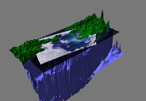
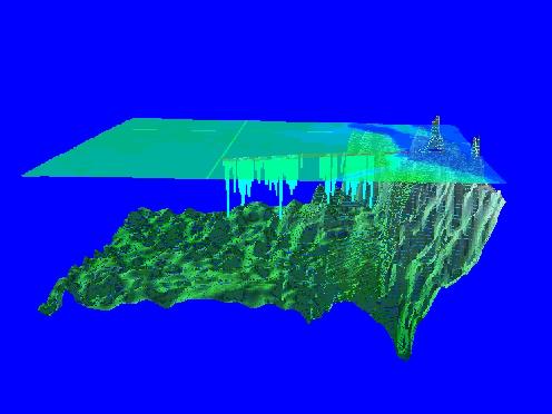
The image shown is a three-dimensional representation of SeaWiFS ocean color data in the Bering Sea. The topography is the bottom layer of the image. A SeaWiFS image is placed above the topography at sea level. The turquoise area is a large coccolithophore bloom that has been seen in the Bering Sea for the past four years.
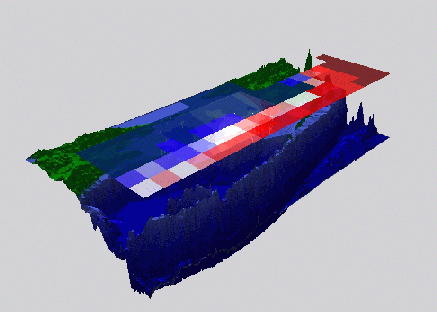
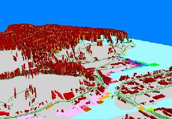
NOAA bears primary national responsibility for tsunami hazard mitigation and warning. As part of this responsibility, it serves as the lead agency for the U.S. National Tsunami Hazard Mitigation Program (NTHMP). This program is a partnership of NOAA, the USGS, FEMA and State Agencies for Emergency Management (EM) of Alaska, California, Hawaii, Oregon and Washington. A critical component of this activity is the development of tsunami inundation maps for threatened U.S. coastal communities; this work is performed by numerical modelers in each state and PMEL's Center for Tsunami Inundation Mapping Efforts (TIME). PMEL produces state-of-the-art results including wave height and current velocity grids. These data are used in support of critical life/property decisions that require the best available science (BAS). Current speeds and wave heights have clear ramifications for shipping in channels and for the destruction of shore-side facilities. Output of the inundation model is a flat ASCII file. The data are translated into an ASCII GRID, made into an ArcView grid, reprojected to the City of Seattle standard projection and overlaid on a variety of infrastructure layers. 3D Analyst is used to create a visualization of the data to better assess inundated areas and potential damage and evacuation problems.
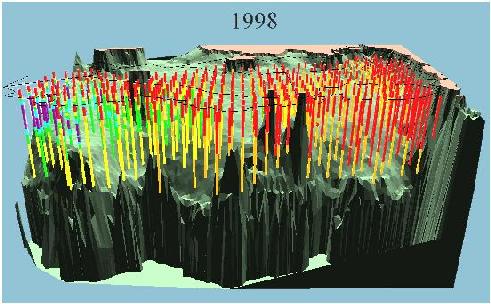
AFSC conducts annual trawl surveys in the Bering Sea. As a part of these studies water temperature profiles are gathered. The data are stored in an Oracle database. Data were retrieved, quality checked and made into 3D shapefiles. A VRML of the 3D Analyst image was created. The VRML was modified to thicken the profile lines for better viewing and to color code the lines to represent temperatures. The image shown is a three-dimensional representation of temperature data in the Bering Sea. The lines represent trawl survey stations (where water temperature data were collected). The color depicts the temperature of the water. Red is the warmest and purple is the coolest. The black lines denote the different habitat strata. Data were gathered as a part of the NMFS/RACE annual Eastern Bering Shelf groundfish survey. The ETOPO5 topography is used for the bottom layer of the image.
Marine mammals are tracked using radio or satellite linked transmitters. Recording devices may also be attached to animals to gather information about the depth and duration of dives. Animals are fitted with depth and temperature sensors. Data are received in flat files, post-processed using FORTRAN routines and converted from point data to a polyline and then contoured over the surface of the maximum dive depths.
At-sea locations of female Antarctic fur seals were obtained by two methods: radio-tracking and satellite tracking. In radio-tracking, individual fur seals were tracked for two to four days, generally corresponding to one foraging trip. These locations were very fine-scale (generally several locations per hour) during the time that the fur seal was tracked. Attribute data for radio-tracked data included the date, time, and event code for each location. Dive data (time, depth and duration of dive) were collected from time-depth recorders attached to each radio-tracked animal. Locations of the dives were calculated from the radio-tracked locations. Fur seals were assumed to have traveled in a straight line between successive radio-tracked locations and the location of dives are calculated by dead reckoning between radio-tracked locations during the times that the dives were recorded.
For satellite tracking, locations at sea were obtained via the
Service-Argos system on board NOAA Tiros-series satellites, using
communications between the satellite transmitters attached to the fur seals
and the receivers on the satellites. These locations were at a coarser
scale than the radio-tracked data, with one to three locations per day;
however, individuals were tracked for 19-87 days compared to 2-4 days tracked
for seals with radio transmitters. Attribute data included date and time for
each location, and a location quality code. Satellite data were filtered to
exclude the lowest quality locations. No dive data were available for the
satellite-tracked seals.
True 3D using EVS
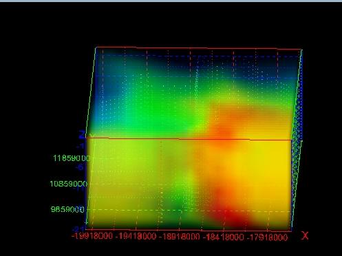
While 3D Analyst provides easy generation of 2.5D representations, C Tech's Environmental Visualization System (EVS) software allows the user to create true 3D models. The package includes more advanced levels of 3D kriging, volume slicing and rendering. Data can be read in their native format and converted and rewritten in ArcView compatible formats. Algorithms are found in standard modules and can be combined and modified by more sophisticated users. Visualization outputs include movies, VRML, and animations.
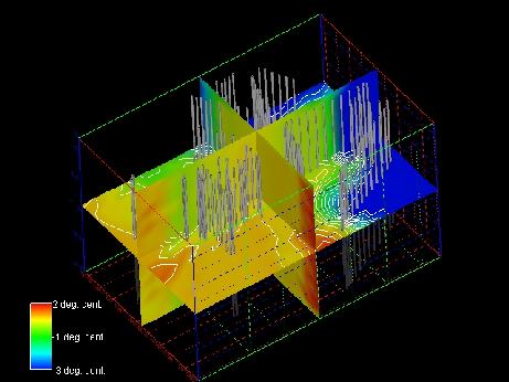
The example shows a true 3D visualization of Chukchi Sea
temperature data. The three snapshots demonstrate how the same data set
can be visualized in three different ways. The first view is a simple 3-D
plot showing sample locations and temperatures for the first 20 m of the
water column. The next level of complexity
slices the data using three orthogonal slice planes with station locations
also displayed. In the viewer, slice planes can be moved interactively
with the mouse. Lastly, volumes are rendered giving the user a good
idea of how the temperature field changes spatially. Output to animations,
graphics files and VRML allows the user to display the visualizations in
by variety of means.

VRML
Trial and error has led to the optimization of these visualizations.
The first VRML files we created with 3D Analyst were very large, and
impractical for download to a viewer such as CosmoPlayer. To enable
us to distribute our visualizations, we had to optimize the results.
For example, we have learned that TINS load faster than GRIDS when
outputting to VRML. Images can be used for underlying
coastlines and bathymetry and render much faster than GRIDS. If output
is just being used for animations or quick visualizations, data can be
resampled to optimize loading while still conveying a message successfully..
Future plans
Future plans include creating "fence diagrams" from hydroacoustic fish location data, creation of VRML on the fly from an ArcIMS and preliminary investigations of ways to include a fourth dimension - time - in our work. The CSV to shapefile Java app is being expanded to handle tracklines and polygons. Ultimately this might be used to create 3D features for use in 3D Analyst. The Ferret LAS's capability to convert netCDF files to ASCII GRID files may also be further generalized.
We will also be expanding our use of EVS, and looking more closely at
the EVS for ArcView extension. While 3D Analyst is useful in conjunction
with ArcView, packages developed for the environmental sciences gives
the user more power over the type of kriging and manipulation of their
data. The ability to create volumes and slices in a world where fronts,
eddies and fish collide makes for easier analyses and a more powerful
visual story.
Acknowledgments
Many individuals have contributed ideas, effort and data to this project. They include Jon Callahan, Jason Fabritz, Angie Greig, Lisa Hiruki-Raring, Shun-ichi Koshimura, Robb Montejano, Christopher Moore, Mick Spillane and Jeremy Sterling. Their continuing support has been vital to the project.
This project has been funded in part by a grant from the NOAA High Performance Computing and Communication Visualization Initiative (http://www.hpcc.noaa.gov/visual.html)
Most of our visualizations were created using data collected and maintained at PMEL. Data were collected by Arctic and North Pacific based research programs at the laboratory.
SeaWiFS imagery for the North Pacific is courtesy of NASA's Goddard Space Flight Center, and especially Gene Feldman and Norman Kuring.
Marine mammal tracks were supplied by the NOAA/NMFS National Marine Mammal Laboratory's Northern Ecosystem group.
Trawl survey data - for further information about data collection and
sampling please contact Gary Walters [email:Gary.Walters@noaa.gov].
References
For more information about the Pacific Marine Environmental Laboratory, please visit the PMEL home page at http://www.pmel.noaa.gov
For more information about the Alaska Fisheries Science Center, please visit the AFSC home page at http://www.afsc.noaa.gov
For more information on PMEL's visualization efforts,
visit the PMEL visualization lab at
http://www.pmel.noaa.gov/visualization/
Information about integrating GIS and visualization is found at
http://www.pmel.noaa.gov/gis/bering_vrml.html
For more information about in-situ and gridded
data sets available at PMEL, please visit the following links:
In-situ data display and download: http://www.epic.noaa.gov/
Gridded climatological data: http://ferret.wrc.noaa.gov/LAS
Author Information
Tiffany C. Vance, Computer Specialist
National Oceanic and Atmospheric Administration
Pacific Marine Environmental Laboratory
7600 Sand Point Way NE
Seattle, Washington 98115
Telephone: 206-526-6767
Email: vance@pmel.noaa.gov
Nazila Merati, Research Scientist
Joint Institute for the Study of Oceans and Atmospheres
University of Washington
Seattle, Washington 98195
Telephone: 206-526-4407
Email: merati@pmel.noaa.gov