John K. Wildgen
Abstract
The banks of the Mississippi River's meandering path between Baton Rouge and New Orleans (Louisiana, USA) support an
extremely large petrochemical complex. Interspersed between the tanks and towers is a heterogeneous mixture of white and black
populations at risk from the toxic releases originating in these plants. The racial balance of risks is one of Louisiana's chronically
unresolved political problems, and has led to charges of environmental racism. The problem is argued in a vocabulary that borrows
words and concepts from chemistry, economics, black studies, political science, sociology, and Marxism. Little advantage has been
taken of increasingly available digital maps, spatial data, and spatial modeling techniques that can make planning mitigation of risk
easier and fairer. An inventory of cheaply available data suggests a wide variety of spatial approaches. One especially appealing
approach explored here borrows from spatial modeling techniques to build a distance-weighted race surface. Traversing this surface,
on both sides of the Mississippi, with a least cost-path gives us a one-dimensional model of racial impact that is an intuitively
appealing planning tool which is easy to understand and useful for decision and litigation support.
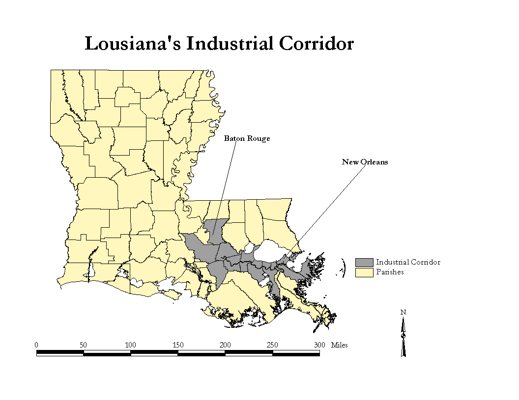
In the 150 km. corridor linking New Orleans and Baton Rouge (Louisiana, USA) there are 1.6 million people living adjacent to one of the world's largest and most important petrochemical complexes. The so-called Industrial Corridor is arrayed on both sides of the Mississippi River's natural levee, as it courses in a meandering pattern through deltaic wetlands. While this complex may not be the U.S.'s greatest environmental problem, the Industrial Corridor, notwithstanding its environmental impact, is a part of Louisiana's greatest political problem, race. It is also a formidable challenge to urban and regional planners who are caught between the often competing demands of economic development and racial justice.
The reasons for this dilemma are complex in detail, but simple in outline. On the one hand Louisiana usually ranks low among the fifty American states on scales of social and economic performance. Often this is attributable to disparities between the state's 70% white majority and 30% black minority, aggravated to some extent by the lingering effects of slavery and endemic racism. On the other hand, few places on earth are as rich in natural resources as is Louisiana. The asymmetry between the state's stunning economic resources and its mediocre economic performance is readily apparent. The Industrial Corridor is a case in point. (Washington and Levine, 1997) Critics of this economic geography feature disparage it as "Cancer Alley" or the "Cancer Corridor." In fact, the billows of steam and tongues of flame rising from the cooling and cracking towers lining the Corridor may have more epidemiological bark than bite (Groves, et. al. 1996). But the perception of harm, at least, is real and well documented. (Burby and Strong, 1997) The reaction on the part of some Louisiana political activists has been to join part of a nationwide environmental justice movement which attacks, among other things, environmental racism. Chemical industry sites in the Corridor release every year millions of pounds of toxic substances into the environment. Some of these locations are close to, or in, minority enclaves. (Washington, 1997) At the very least, the proximity of impoverished minority clusters to billion-dollar petrochemical plants creates an impression of injustice and abuse. Activists in the environmental justice movement view the plants as racist-motivated intrusions on a weak, perhaps helpless minority.
The environmental justice movement, or just EJ, has five explicit aims addressing this problem:
The Planning Problem And The Role of GIS
Planners, who have to deal with both the day-to-day and long-term management of the population clusters in this zone, which
includes a large metropolitan area, a state capital, some small towns, and numerous hamlets, are constrained by four factors:
There is little planners can do about the first three. But they can shed light on mitigation strategies, despite their sometimes very complicated and technical nature. Emissions of toxic substances into the air, water, and ground -- and even off-site disposal create distinct hazard footprints and disamenities, depending on factors such as substance volume, toxicity, weather, and local hydrological and transportation conditions. Every chemical seems to need its own risk model. But, short of that, any mitigation strategy has to be aimed at making people reasonably safe, and making people feel safe. This is where GIS has a role to play. First, any risk assessment and evaluation regime has to have a geographical component. In fact, cartography is the grammar for any vocabulary of environmental risk.
Second, GIS can be fashioned to produce maps that assist the general public in making lay risk assessments, which have become an expression of the environmental justice movement's impatience with conventional, hypothesis-rejection oriented science in favor of a "citizen-science" (Couch and Kroll-Smith, 1997), a movement closely associated with the environmental justice movement. The obvious danger in citizen science is that it cannot help but appear as a kind of techno-McCarthyism. At a minimum it can easily become politically-correct science. It can also be self-serving, given point five of the environmental justice program. On the other hand a lot of scientific language is exclusionary and makes scientists appear cultish. The public has been exposed for years to "tobacco company science," and is understandably diffident when its fears of smokestacks and landfills are met with the cool detachment of company and government chemists, toxicologists, and epidemiologists. Geography is a obvious bridge between the lay community and scientists since, as Mark Monmonier (1993) has noted, "the domain of geographic scholarship is not only too broad for the meager community of researchers trained in the discipline, but also too important to be limited to people with geography degrees. Monmonier's point is that information portrayed in what he reminds us is "earth writing" is readily understood by a far wider audience than the small group of professional geographers and cartographers found in any society. It also bears pointing out that Monmonier (1997) is well aware of the fact that maps may be turned from their role as informants and bent to propaganda. But, so far among EJ activists abuses of statistics predominate over any cartographic manipulation (Colin and Colin, 1997)
What this suggests is that GIS influenced thinking is likely to foster, indeed is essential to, an adequate risk assessment regime for environmental planning, and is also essential to conveying risk assessment information to the public. In the case of the Industrial Corridor no work of this nature has been done, (see Cutter and Soleki, 1995 for a Texas study) even though Louisiana's state-level efforts to make geographic information available are very sophisticated. See
http://www.success-stories.digital.com/cgi-bin/cssextusr/s=display/i=13
At the federal level one very interesting effort is found at http://www.epa.gov/enviro/html/mod/mod.html The methodological
assumption behind this map server is conventional correlational statistics: environmental hazards are correlated with population
density and minority populations. Both are correlated with industrialization, of course. As we shall see later this introduces the
problem of spurious correlation into some statstical analysis of environmental racism. These government sponsored data resources
are a recognition of the inevitability of improved spatial bases for investigating environmental justice. Downloadable maps, though,
are still final products, which while viewable are not readily manipulable. Citizen participation in science, as part of a planning process
emerging from risk assessment task, means making data available to citizens - and in a format accessible to the reasonably technically
competent, even if not hardware and software rich. Moreover, analysis models need to provide a framework for risk evaluation more
intuitive than correlation coefficients or tests of significance. So, planners here, as elsewhere, need to design and provide a kind of
faster, cheaper, better GIS that will support meaningful risk assessment work and still be accessible to the lay public. The basic
function of such a system is to provide a framework for the measurement of risk and the visualization of the spatial characteristics of
the risk. The general benefit is the creation of a basis for avoiding or mitigating environmental injustice while not sacrificing economic
development.
Gathering The Data
In this section I am going to comment on some of the obvious candidate data sets for inclusion in a planning oriented GIS for environmental justice issues. The types of data discussed here are illustrative rather than exhaustive. I will take up:
These items are illustrative, not exhaustive.
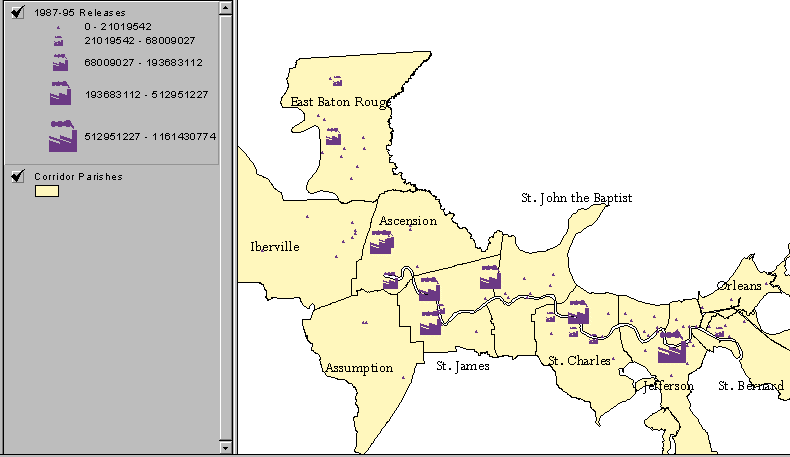
Toxics Release Inventory
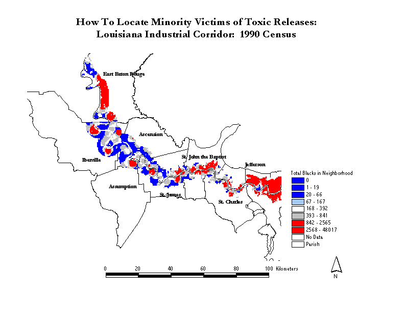
The U.S.A. is a data rich nation with an unparalleled capacity at the grass-roots level to absorb these data. Overall, the availability of data (though not its timeliness) usually exceeds our capacity to assimilate it. So, any strategy for gathering data requires a willingness to tailor database candidate information to local needs. In the case of the Industrial Corridor the most obvious candidate for inclusion in any information system is the EPA's Toxic Release Inventory or simply TRI. This collection of nearly 200 variables (some repeated several times) is a kind of census of toxics. The analogy to the census is appropriate. Any demographer, sociologist, political scientist, or geographer will have complaints about the census in terms of accuracy, timeliness, scope of variables, spatial resolution, data suppression policy, and definitions. But, the census is too big, and too official, to ignore. The same holds true for TRI. The following map illustrates one approach to portraying toxic release over the surface of the Industrial Corridor.
There is a lot to like about TRI CD-ROM editions, which for a couple of years have required two CDs due to the volume of data. The built-in software, a KA-Ware® application, requires using DOS on a PC, and seems dated compared to the smooth Windows application used by, for example, a product such as CensusCD for extracting data subsets. Given the split in data over two CDs for the 1987 - 1995 period (the latest available at this writing) an investigator needs two passes through the software to generate subsets, which then require merging. But, the product does not require anything more than a rudimentary PC and a CD reader. This means that the data are available and useable at the entry level.
For anyone planning on spatially analyzing the data, however, the TRI cd is a mixture of good and bad news. There is a full array of FIPS codes, making it possible to link information to state and county thematic mapping facilities. There are, as well, ZIP code fields. Some investigators like to use ZIP codes as aggregation units when studying environmental justice questions because, by coincidence, the ZIP codes are the modifiable areal unit that seems to maximize the ecological correlations between the racial composition of hamlets and distance to toxic sites. Ecological correlations and regressions are important tools in federal litigation. Very recent work by a political scientist has shed a lot of light on this problem, the manipulation of correlations by the strategic use of space(King, 1997).
At the pinpoint level of resolution, or close to it, the TRI database includes the latitude and longitude of the site. Point level locations of toxic sites have suffered from some ambiguity. The coordinates might refer to an administration building or they could be, more importantly, the location of a smokestack. Detailed EPA metadata now make the issue clearer. However, the database fields are, unaccountably, a pair of alphanumeric strings in degree-minute-second format. For input to a GIS, or even a simple scattergram, these fields have to be converted to a numeric degree-decimal degree format. (1) This quirk of coding is user-hostile.
Once TRI locations are converted to point coordinates, however, there is a lot that might be done with them. One can examine, for example:
Block Level Census Data
The most basic Census data set is block-level PL 94-171 population data designed mainly for reapportionment purposes. These CDs provide amplified geographic detail including for cooperating states, population characteristics for "voter tally districts" often called "precincts" by political scientists. These data have not been greatly exploited by environmentalists, but are finding their way into the literature (Washington State Department of Ecology, 1995). I think the reason for this is that many of the academic and technical activists found within environmental justice circles are trained in sociological statistics, and consequently think of the relationship between risk and race as essentially correlational in nature. So, for them, spatial units are just observational units and amount to methodological targets of opportunity. The choice of county, tract, block group, zip-code, or block is a matter of convenience not tied to any notion of either risk or space.
Some of the flavor of this style of inquiry shows up in Colin and Colin, where they refer to the United Church of Christ's groundbreaking, but wrongheaded study (1987) and note it "concluded that race was the best predictor of hazardous waste site location". What in effect has happened here is that what should be the independent variable is the dependent variable, and there is no element of risk assessment here -- in effect no meaningful dependent variable. Rather we are told "Statisticians poring over the results found only a 1 in 10,000 chance of such siting patterns occurring randomly." (Colin and Colin1997: 226-227). This sounds, and is meant to sound. like an open and shut case of environmental racism. Instead it is an example of the misapplications of statistical inference procedures found often in litigation. There is no reason to assume that race and hazardous waste sites are or should be randomly related. After all, hazardous waste sites are largely an outgrowth of industrialization and urbanization. Since U.S. minorities collect in central cities, the correlation, at the "community" level is obvious, but fortuitous. This correlation cannot by itself establish risk. Unequal risk grows from unequal exposure, which is going to come from the spatial relationships (proximity and direction) between the minority community and the hazard site. The suitable analyses for making this kind of finding, necessarily cartographic in nature, may, hypothetically, uncover instances of the targeting of minority neighborhoods. This kind of finding is not likely to show up as a familiar statistical pattern, but it will show up as a striking spatial anomaly -- such as hazardous waste sites showing up in the rural south. As a result, coarse statistical studies will not serve environmental justice as well as finer-grained spatial and cartographic analyses. See the works by Bullard noted in http://www.cruzio.com/~meuser/ejwww.html .
These kinds of analysis are aided by block-level data which provide geographic coordinates, total population, and racial composition information. As the next trio of maps suggests, it might take a certain amount of cunning to target minority populations for excessive risk in the Industrial corridor. This does not mean it cannot be done. But the patterns established here indicate a pattern of large-scale segregation and small-scale integration. In effect, it would take precision-guided toxic releases to harm one group at the expense of the other.
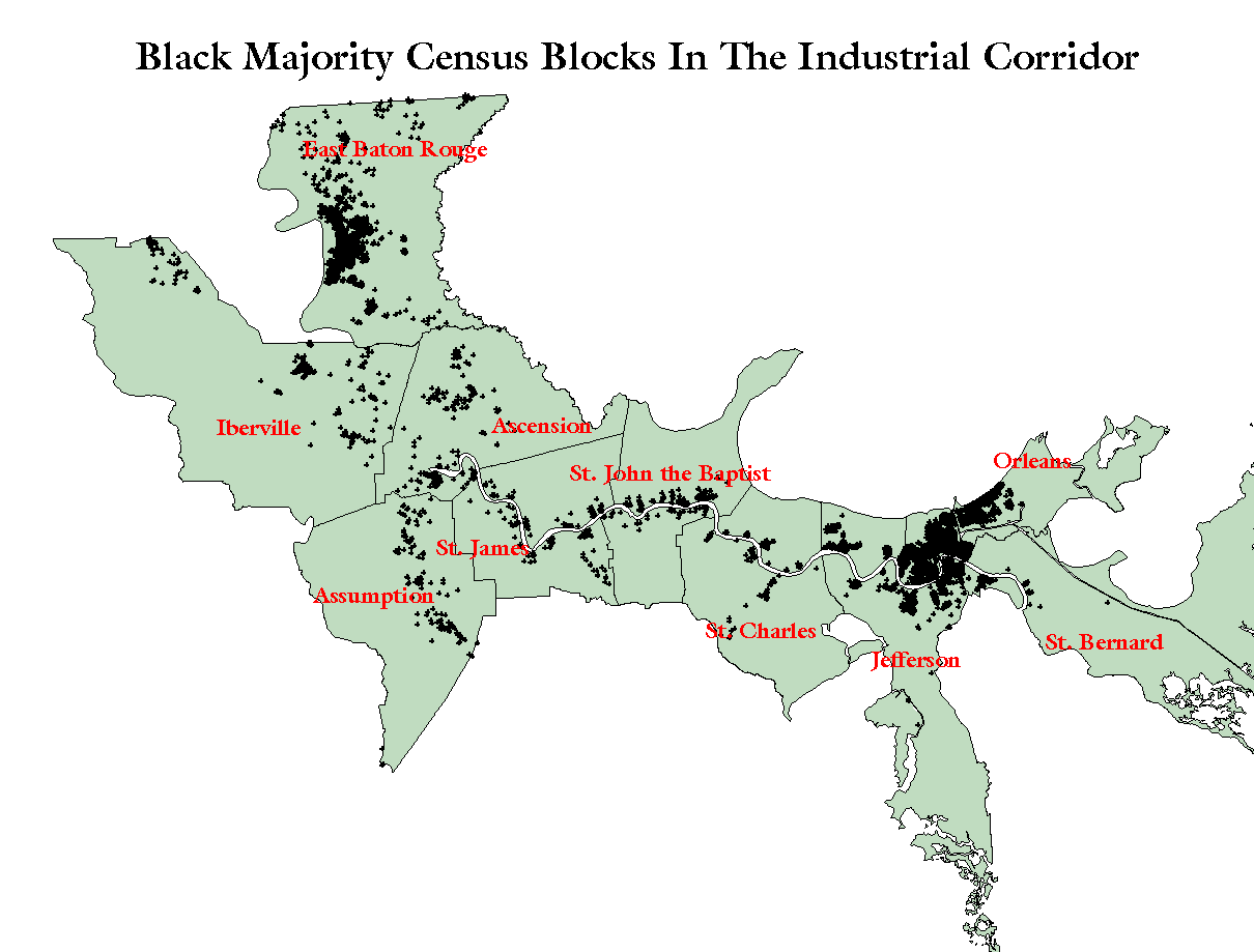
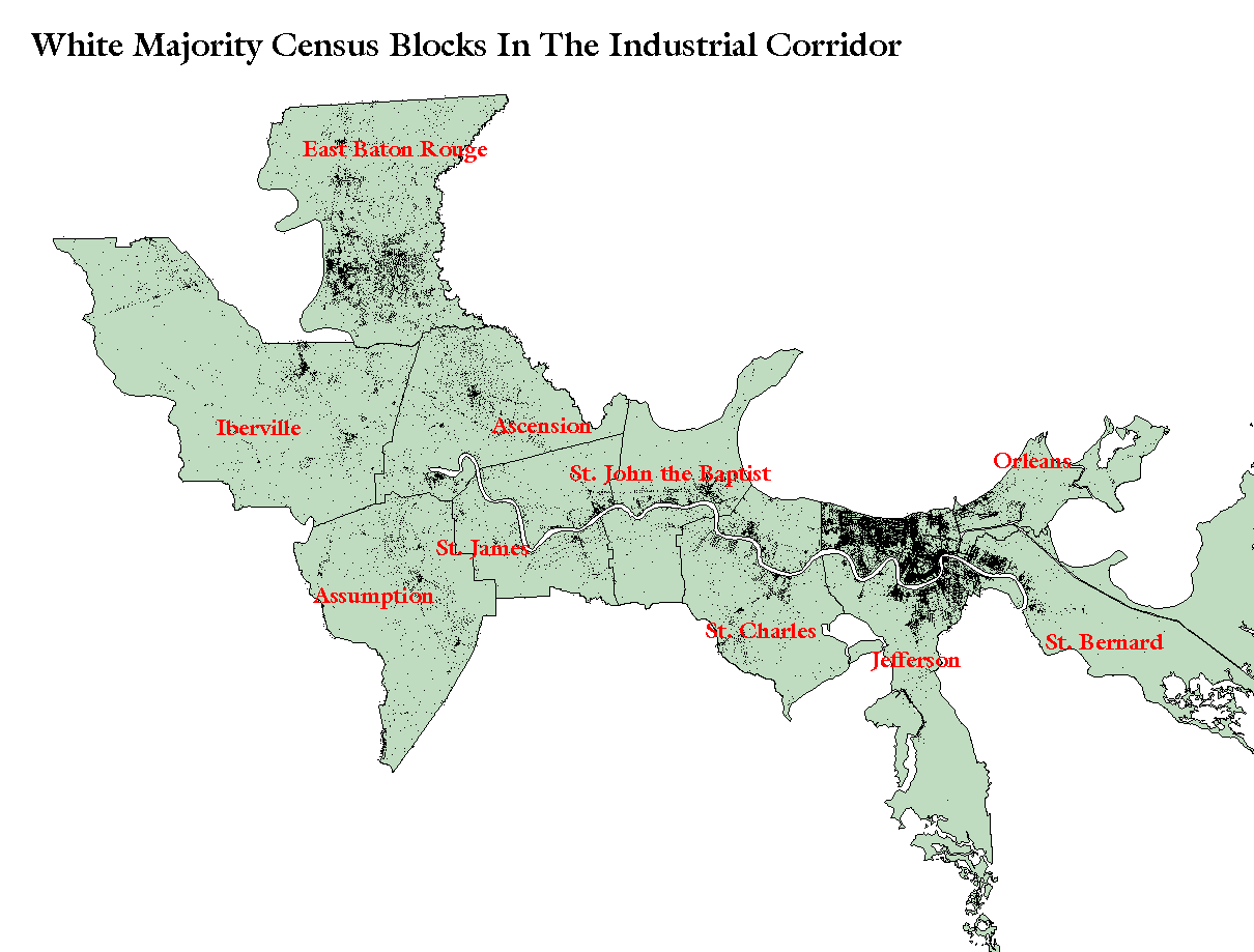
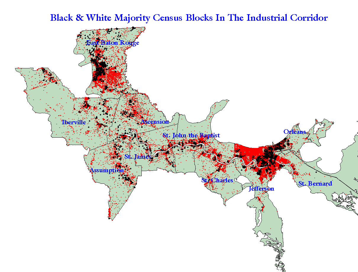
It is not easy to isolate an area of potentially racially exclusive risk. The largest homogeneous black areas are in New Orleans and Baton Rouge. But short of a desire to gratuitously poison blacks, would there by any economic rationale for locating a petrochemical facility in such a zone? Probably not. As we saw in an earlier map most of the major toxic releasing sights are either out of, or on the periphery of the two major urban poles that define this corridor. One obvious rationale for this alignment is proximity to the river and access to the rail lines and roadways that follow it.
The TIGER File
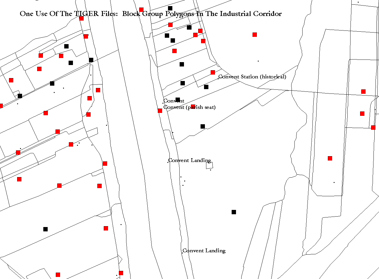
The Census' national digital street and census areal unit map, the TIGER files (topologically integrated geographical encoding and referencing) have been arguably underused in environmental justice studies. To a certain extent this is understandable because successful employment of the TIGER files puts investigators on a steep learning curve. These files are not map files, per se. The files require conversion to GIS format thru a series of processing steps demanding a good knowledge of geography (not as common as one thinks) and Census data conventions (very rare) . After the first appearance of the TIGER files in 1989 a small number of conversion utilities appeared for programs such as Atlas GIS, whose DOS releases got to desktops several years before ArcView or other competitive Esri products. Software of this generation could produce TIGER polygons of very good quality, but did not allow real mining of the TIGER files, which in addition to points, lines, and polygons, also provide data for geocoding operations and network analyses. For many would-be users it was often hard to link polygons to corresponding Census statistical data, such as PL 94-171 or STF3A because of the necessarily complex FIPS codes used to identify polygons. The smaller the geographical level, the harder the problem. This shows up in the next pair of maps, which compares a block-group polygon coverage overlaid with a block level point coverage. It is by no means as visually rewarding as the shaded block level map that follows. The river bend shown in this pair of maps is in the vicinity of a proposed site for a vinyl chloride plant. The proposed plant has created a loud controversy pitting the supporters of the plant, the State and an NAACP chapter, against the principal opponents, Tulane University's Environment Law Center and the U. S. EPA, who both suspect the plant is an example of environmental racism.
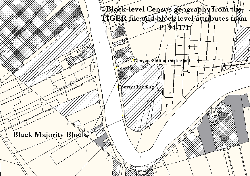
One important response to the problem of access to the Census and the linkage problems of TIGER has been the appearance of commercial editions of Census materials such as CensusCD by GeoLytics and Census-TIGER combination packages such as Wessex' First Street. These products, however, stop at the block-group level of detail. TIGER, though, descends to the block level in its polygonal detail. In urban settings this level of detail is crucial to political reapportionment efforts and, for similar reasons, to environmental justice studies (Wildgen, 1997). There is a certain parallel between voting rights claims and environmental justice concerns, in that control of, or the ability to manipulate, boundaries is an important methodological and litigation tool. Those in the political apportionment field are trying to stake a claim to votes, while those in environmental justice are staking a claim to victims. In rural areas census blocks are not equivalent to city blocks but are usually larger geographically and often are far from rectangular. So, the ability to aggregate populations at this level of resolution, rather than at the block-group level, conveys an obvious edge. This makes them important planning units for large, sometimes sprawling industrial sites. So, at the end of the day, it is necessary to have block level geography and features linked and available for what amounts to the highest level of demographic resolution available.
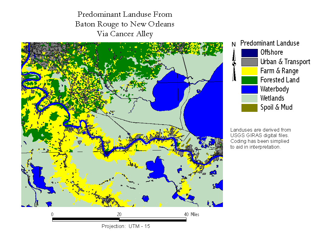
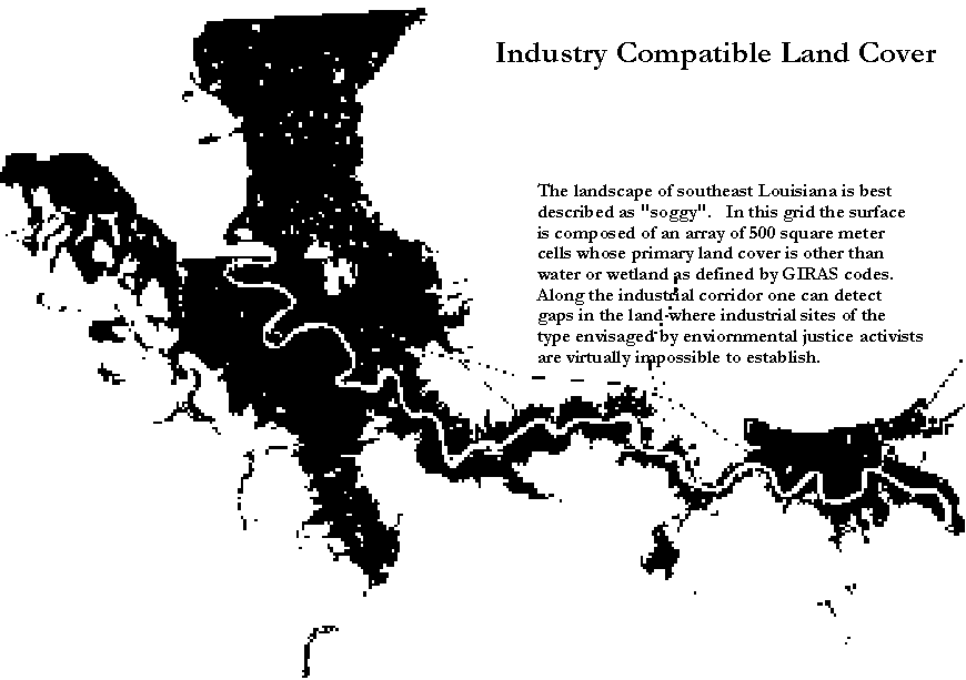
GIRAS & Remote Sensing
Two decades ago USGS began a mapping project known as Geographic Information Retrieval and Analysis. Like TIGER and the Digital Line Graph (DLG) series, GIRAS files are topologically structured files. They are also files whose information content becomes more important with the passage of each year. The GIRAS files offer us snapshots of land use and land cover from roughly the 1970s. In some parts of the country where the geological clock is measured in eons they are quite current, and will be for millions of years. In south Louisiana, however, geomorphology is pretty much a moving target. Major public works such as Corps of Engineers projects, oil company dredging, and local levee projects can, in the span of a generation, introduce major changes in the landscape-wetlands-seascape of the region. And, clearly, major weather events leave their imprint on the map. That is why the GIRAS files are so important here: they are the digital baseline from which we can conveniently assess changes. The EPA has rediscovered the GIRAS files and they are also available from the USGS site http://edcwww.cr.usgs.gov/doc/edchome/ndcdb/ndcdb.html It is necessary to find enhanced importation routines if one wants to integrate GIRAS files with Census or other data. Useful AMLs come from "ftp://ftp.epa.gov/pub/EPAGIRAS/meta/girasarc2.aml". GIRASARC2 creates either lat-lon or projected files unlike the Arc routine GIRASARC (as of 7.1.1). The following map illustrates a major feature of physical geography essential to the analysis of environmental justice in south Louisiana. For purposes of building a petrochemical facility, or any kind of edifice likely to raise suspicions
of environmental racism, it is necessary to avoid construction on the wetlands or backswamps found at some distance from the
natural levees built by major watercourses. Whether one follows the Mississippi, or branches off into one of its old tentacles, Bayou
Lafourche, human-made structures lie atop alluvial deposits which reach, maybe, a meter or two above water level. The landscape
dictates stringtown urbanization and, naturally, stringtown industrialization. For any plant the watercourses are naturally attractive as
both sources of water as a processing chemical and as a transport medium. But, perforce, they have to share that resource with
humans. Neither has any place else to go because they are both hemmed in by the wetlands. In fact, "wetlands" may not be an
altogether proper term. They are disappearing due to erosional process (many man-made or man-induced). Nonetheless, the physical
constraints on habitation and industry are very severe and the borders of development are abrupt. GIRAS-based maps are essential to
illustrating and measuring this limitation. The two digit coding scheme used in GIRAS for classifying land uses allows for
considerable detail, while collapsing land uses to single digits makes for easy to understand general purpose maps.
Updating the GIRAS files is neither easy nor cheap. It is a job for remote sensing and one that requires access to satellite data and image analysis software. The next map is illustrative of some of the problems and prospects faced here. The 1996 SPOT multispectral image we see covers only about half of the corridor. Laid atop the image is a point coverage of toxic sites.
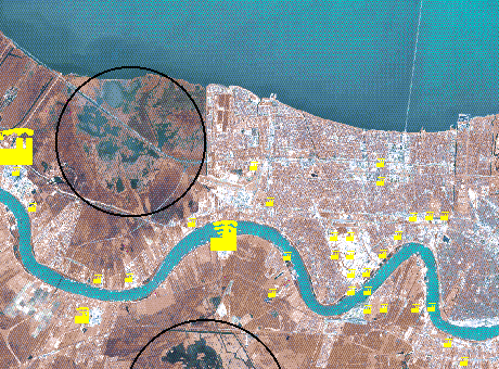
It is clear that the plants work their way around the wetlands, and that larger-release facilities are found in outlying or peripheral areas rather than inside dense urban zones. Imagery capable of detecting land use changes has to offer a combination of spectral and optical resolution suitable to the study area. SPOT and even LANDASAT are adequate for the Industrial Corridor, because geomorphological features subject to change are well within the design characteristics of their sensors. Landsat can detect changes in land use from agriculture or wetland to urban use, and SPOT can usually distinguish a residential zone from an industrial site. Still it is expensive work since change detection requires a battery of images for purposes of modeling wetlands loss and urban creep. It is also the case that relatively few planning agencies have the blend of skills, software, hardware, and money for remote sensing research.
Other Sources In any locale some data sources are going to be more useful than others. For example in areas more intensely urbanized than the Industrial Corridor, TIGER's street files are going to be very useful because of the obvious differences between residential and commercial areas. Some of the differences may show up as simple street patterns in which there is a clear demarcation of arterial roadways and neighboring residential enclaves behind walls and gates. Of course this will not always work since some commercial areas are converted residential areas impossible to discover from vector files. New Orleans French Quarter is a good example of this problem. One inexpensive way of sorting out land uses is to geocode business locations by geocoding. Often yellow pages on CD roms provide Standard Industrial Codes (SIC) which are useful for characterizing land use, and for the location of hospitals, schools, group homes, and other vulnerable sites.
Environmental racism is the location of disamenities in proximity to minorities absent historical precedence or without demonstrable economic or environmental justification. The issue of environmental racism poses historical, scientific, economic, legal, and spatial problems. The above survey of available data creates the impression of a kind of embarrassment of riches for the spatial aspects of the problem. In terms of sheer megabytes of data any set of all but America's smallest counties will require a lot of storage. But what we are looking for is a way of synthesizing these data into a rigorous and intuitively pleasing set of findings that will provide guidance to those involved in the location of industrial plants or other disamenities in a way that minimizes minority exposure to toxics, and industry' exposure to charges of environmental racism. In effect what we have to come up with is a form of defensive planning. This is a tall order since no activity that requires one to blend geography, politics, economics, race, and the law is going to be bullet proof. The definition I introduced above recognizes the multivariate nature of the issue. It is not reasonable to define environmental racism as merely the proximity of hazards to minorities. Often environmental hazards are two edged swords, in that they are not just hazards, but also part of the nation's economic infrastructure. It is perverse to adopt an attitude that says, in effect, economic development has to be racially segregated, concentrated in white enclaves, and done so without regard to efficiency or impact on the environment. I agree that all these cautions and qualifications are subject to Derrida-esque deconstruction, it is worthwhile to confront the complex rather than to embrace simplistic notions that ignore tradeoffs. What this means in operational terms is that environmental justice, or racism, needs to assessed in a framework of measurable cost. The most obvious framework is the distribution of risks and benefits over a surface. The surface itself has to take into account at a very minimum:
The first obvious task is to define the boundaries of the cost surface. In southeast Louisiana land cover, from a distance, is deceptively homogeneous. Ground level and sea level are so close that they challenge all but the best of survey instruments. A fraction of a meter's change in elevation makes the difference between navigation, wetland, agriculture, urban, and industrial uses. As a consequence any kind of development follows a spongy, capillary pattern. In the next map we see an almost fractal, pattern whereby land is interrupted by wetlands and bogs, linked by an almost invisible network of bayous.
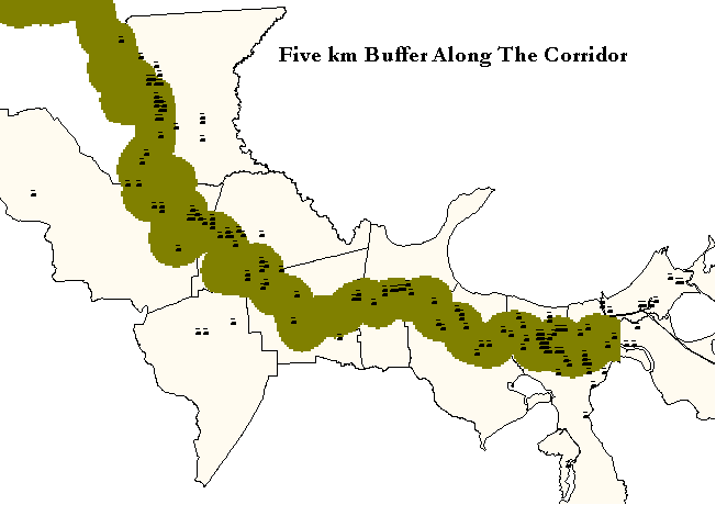
The Mississippi River is so dominant as both a geographical barrier and economic link that, perforce, industry and commerce seek it out. It is, also, from the point of view of the thirsty and exothermic petrochemical industry, a major source of water for both reactive and cooling purposes. Thus there is a strong incentive to get near the river. The next map refines the one above by creating a five kilometer buffer along the river. I have overlaid a point theme showing all TRI locations within the confines of the map. It is clear that the 5 km buffer captures the "corridor" TRI sites.
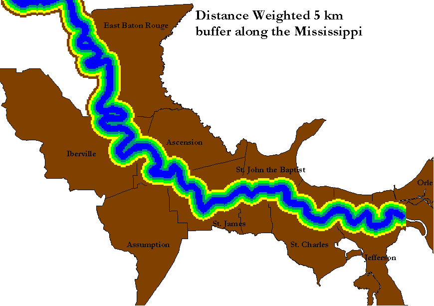
The basic notion behind the buffer motif is that development is not affordable beyond its boundaries, that the costs of access to the river and its vassal land corridors (highways, rail, pipeline, cable, and wire) mount to the insupportable. The buffer can be thought of at least as a kind of dummy variable or mask. But I think it is more useful, even though more venturesome, to make it a continuous variable in which every meter from the river adds its cost of doing business by imposing a distance constraint. The next map captures this idea. It can be used as an operator in calculating more complex cost surfaces.
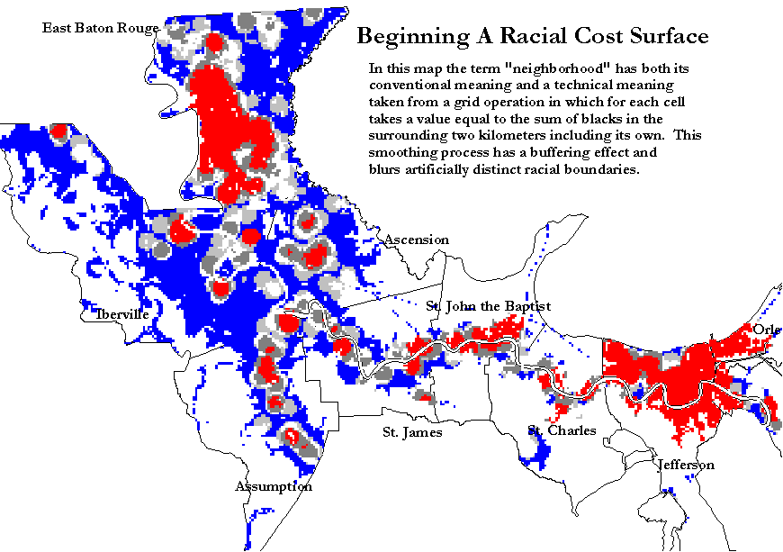
The reason for having a more complex tool available lies in the map below, which illustrates how neighborhood or "focal" operators work in GRID or AV's Spatial Analyst. In this instance I set up a 2000 meter perimeter around each cell and as the routine swept from one cell to the other it counted the number of blacks within the perimeter. The output shows areas where there are lots of minority persons in the 2 kilometer neighborhood. Neighborhood operators are surface generalization tools or smoothers. It takes a certain amount of familiarity with a topic (terrain, for example) to control the smoothing. In this case the 2 km limit seems a reasonable way to strike a balance between generalization and the maintenance of enough heterogeneity to distinguish between white and minority zones. The next map shows how one might use a distance buffer as a mask.
This map is a guide for both environmental racists and their critics. Were one interested in poisoning the maximum number of minority persons in the Industrial Corridor's developable lands, all one would have to do is target the red tinted areas. At the same time, a purely racially-driven environmental policy would advocate sanctuary status for the same areas.
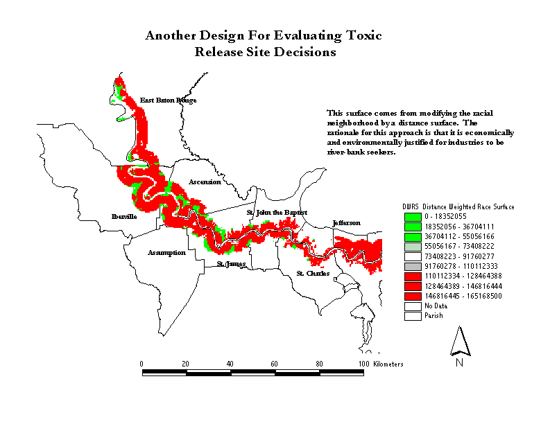
There is something intuitively unsatisfactory about the use of an exclusively racial criterion for evaluating environmental racism. Americans are used to racial gerrymandering for political purposes, but even then try to justify it on non-racial grounds such as "community of interest" -- a vague appeal to class solidarity. Gerrymandering for economic purposes or even for environmental purposes is even less palatable. Political gerrymandering at least has an unambiguous benefit: another elective office for a minority population. In the case of industrial siting, however, the downside of keeping a modern plant out of a minority neighborhood on environmental grounds has a negative externality: distancing economic development and jobs. Moreover, keeping plants away from natural resources or other demonstrable advantages (transportation, labor market, synergistic neighbors) can stress the environment itself by discouraging modernization and efficient process organization. As a result modifying any racial risk surface in such a way that takes these considerations into account is good planning practice. In this map I have introduced only the most obvious modification, in which the racial neighborhood surface is multiplied by distance from the river in meters. This strategy essentially punishes locations in minority residential areas not ideal for industrialization, and rewards industrial development nearer the river. For those not familiar with the Mississippi it bears pointing out that proximity to the river is not an enhancement to residential property, any more than is proximity to an interstate or airport. In the stretch between Baton Rouge and the Gulf, the river has neither aesthetic nor recreational value.
There is a large family of possible functional forms for modifying this cost surface. One might argue that an exponent should be attached to distance (effectively I am using 1 as an exponent) based on assumptions about distance decay or enhancement. Moreover, there are many additional variables which can be called into play. The great advantage of this approach is, in fact, its flexibility and open structure. This surface, or some form of it is at the heart of this approach to environmental justice. It amounts to a harm matrix on which we can locate disamenities and compute measure of harm for choosing that location. This particular matrix is only illustrative of what might be constructed, depending on our values. What is useful about this approach is that it forces us to be exlicit about those values.
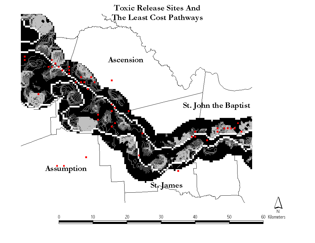
One useful derivative product of this modified surface is a least cost path, a vector that meanders along a corridor that minimizes the sum of traversing the surface. It is, in effect, a way of stringing together a series of local solutions to this aspect of plant location. It also can serve as an illustration and validation tool. The map below shows how the pathway along the two banks works in practice. Sometimes it skirts the swamp-side of the sections, at other times it hugs the banks of the river. The contouring theme may aid in visualizing the logic followed here. This is a starkly crisp planning tool and unabashedly draws from the experience of highway planners. The only difference in concept is the explicit use of racial demographic variables.
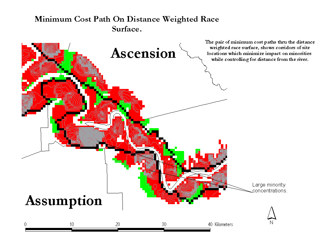
One obvious way to use the pathways is as baselines. If there is a lot of confidence in the pathway, there is a burden on industry to stay close to one. Straying from the vicinity of the pathway may be justified, but the larger the distance the stronger the presumption that a minority population will suffer an inequitable intrusion. The map below shows how easy it is to visually link the pathway to individual sites. In this map one can see how the pathways dodge the hill-like concentrations of minority population clusters. This behavior offers a visual validation of the underlying path estimation process. The path itself suggests a derivative analysis in which we score each discrete segment of the path in terms of the actual cost of the traverse at that point. It might be possible to determine a threshold value on the cost surface beyond which it is simply impermissible to install a plant with a toxic impact. At this point we are not at that point, but it is clearly a researchable issue.
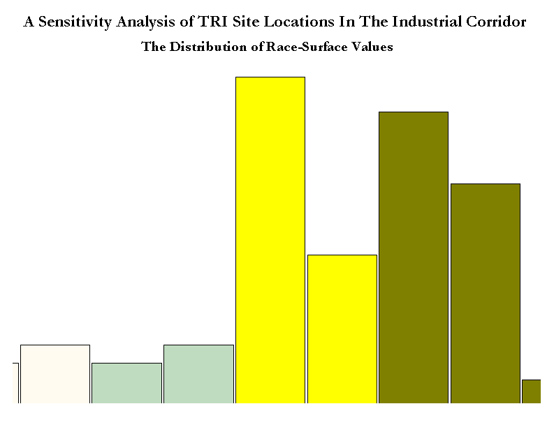
There is, as well, an opportunity to tie the spatially derived findings we have developed here to conventional statistics. By examining the distribution of scores on cells where a TRI site falls on the distance weighted race surface, it is possible to detect sites that fall more heavily on minorities, even after allowing for distance. The raw distribution is highly skewed, so logging it (as we see in the inserted chart) makes it easier to see that there are cases much more likely than others to have an inequitable effect. These sites are an obvious priority for closer examination. It is by no means the case that they are, ipso facto creating environmental injustices. In addition to merely being in a neighborhood, one has to measure actual toxicity and the difficulty of finding alternative sites that are superior environmentally. One aspect of the data summarized in this simple histogram is that the cost surface approach is useful for discriminating differences among individual toxic release sites that merit more detailed examination.
The environmental justice movement is the political manifestation of lingering unease about the state of race relations in the United
States and the interplay of race with the hazards of industrialization. To date this movement has generated, more than anything else,
sympathy. As we have seen, this is a self-imposed limitation for two closely related reasons. First, many activists in this movement are
influenced by a suspicion of science in general. That suspicion, in turn, seems motivated by an undertone of New (and old) Left
attitudes reminiscent of the 60s. An examination of the themes taken up in
http://www.nyu.edu/law/environmental-center/landuse/ej/biblio.htm
or http://www.cruzio.com/~meuser/ejwww.html illustrates what
I mean.
One of the prices of these occasional indulgences in class warfare has been a lack of scientific rigor in the movement's strategy, in a
historical period in which science is virtually unchallenged as the organizing paradigm for credible public argument. This has
entrained an avoidance of the obligatory drudgery of systematic data analysis, and an under-exploitation of spatial approaches in a
controversy that is about space. Both labor and imagination have been taxed. Systematic data analysis is essential to a cogent and
uniform policy that can serve as platform for environmental justice. The examples I have employed above form a mixture of
descriptive and analytical tools that presume some basic knowledge of geography and statistics. But the overall approach relies on no
arcane theories that strain the envelope of common sense. Moreover, the ensemble of hardware, software, and data necessary for an
initial spatial assessment of the status of environmental justice in any region is not unduly expensive. The major departure here from
the larger body of environmental justice is the adoption of a planning framework that is designed to generate testable hypotheses
about industrial siting through the use of spatial modeling. It does not tell one whether or not a specific plant is or is not, a racial
injustice. That kind of decision requires an intensive examination of the totality of circumstances. It does, however, offer guidance to
those who want to minimize racial injustice.
Burby, Raymond J., and Denise E. Strong 1997. "Coping With Chemicals: Blacks, Whites, Planners, and Industrial Pollution" in Washington, Robert O. and Joyce N. Levine, eds. Living with Industry, Coping with Chemicals: Environmental Movements and Expert Knowledge. 1997. New Orleans: University of New Orleans / College of Urban and Public Affairs. 63-78.
CensusCD. 1997. GeoLytics, Inc. Brunswick, NJ 08816. USA.
Collin, Robert W. and Robin Morris Collin. 1997. "Urban Environmentalism and Race" in Thomas, June Manning and Marsha Ritzdorf, eds. 1997. Urban Planning and African American Community: In the Shadows. Thousand Oaks, CA.: Sage.
Couch, Stephen R., and Steve Kroll-Smith. 1997. "Environmental Movements and Expert Knowledge: Evidence for a New Populism. In Washington, Robert O. and Joyce N. Levine, eds. Living with Industry, Coping with Chemicals: Environmental Movements and Expert Knowledge. 1997. New Orleans: University of New Orleans / College of Urban and Public Affairs. 155-174
Cutter, Susan and William Solecki. 1995. "Setting and Environmental Justice in Space and Place: Acute and Chronic Airborne ToxicReleases in the Southeastern United States." Urban Geography.
Groves, Frank D., Patricia A. Andres, Vivien W. Chen, Elizabeth T. H. Fontham, and Pelayo Correa. 1995. "Is There A 'Cancer Corridor' in Louisiana., Journal of the Louisiana State Medical Society 148 (April): 155-164.
King, Gary. 1997. A Solution To The Ecological Inference Problem. Princeton, N.J.: Princeton University Press
Monmonier, Mark 1993. Mapping it Out: Expository Cartography for the Humanities and Social Sciences. Chicago: Chicago University Press. 3.
Monmonier, Mark 1997. How To Lie With Maps. Chicago: Chicago University Press.
United States Environmental Protection Agency 1997. Toxics Release Inventory 1987- 1995 CD-ROM.
Washington, Robert O. and Joyce N. Levine, eds. 1997. Living with Industry, Coping with Chemicals: Environmental Movements and Expert Knowledge. 1997. New Orleans: University of New Orleans / College of Urban and Public Affairs.
Washington, Robert O. 1997. "When Environmental Justice Confronts Risk Communication: A Case Study of the Agriculture Street Landfill, New Orleans. In Washington, Robert O. and Joyce N. Levine, eds. Living with Industry, Coping with Chemicals: Environmental Movements and Expert Knowledge. 1997. New Orleans: University of New Orleans / College of Urban and Public Affairs. 177-189.
Washington State Department of Ecology. 1995. A Study on Environmental Equity in Washington State. Olympia, WA: Washington State Department of Ecology.
Wildgen, John K. 1997. Emergency Response and environmental Racism: The Utility and Limitations of GIS in Crisis Situations. In
Washington, Robert O. and Joyce N. Levine, eds. Living with Industry, Coping with Chemicals: Environmental Movements and
Expert Knowledge. 1997. New Orleans: University of New Orleans / College of Urban and Public Affairs. 177-189.
119-130