
Alexander Evans
Alexander Evans
Abstract
Many employees of the U.S. Geological Survey (USGS) in Menlo Park have a difficult commute; some travel 3 hours a day. The stress and time spent commuting requires planners to consider alternatives and mitigation measures. Mapping of employee's homes and commutes along with standard USGS digital data is an easy and inexpensive way for planners to visualize commuting difficulties. The addition of travel times and demographic data creates a decision support tool. Analysis in a geographic information system, in this case ArcView with Spatial Analyst, enables planners to react to the commuting situation based on the best available information.
Introduction
The San Francisco Bay area continues to grow at an exciting pace. New businesses and jobs are attracting more and more people to the area. The down side of growth is clogged roads and long commutes. By the year 2000 the population of the nine bay area counties is projected to increase to 6.8 million, 147% of the 1970 population. The number of vehicle miles driven per weekday is projected to increase 280% over the number traveled in 1970(Census 1990).
The western region office for the USGS is located at the heart of the booming bay area in Menlo Park, California. The USGS Western Regional Council has the task of planning for the office's future in changing circumstances of Menlo Park. It was the Western Regional Council that inspired this project by asking the GIS lab to map where employees live. GIS can be more than a cartographic production tool and can provide a full range of decision support tools. This project expanded beyond the Regional Council's original cartographic request in order to demonstrate the potential for GIS to aid the Council plan for the future of the USGS office in Menlo Park and its employees.
The first output of the project was a cartographic display of employees' residences in the context of the San Francisco Bay area. The next step was an analytic look at commuting to the USGS campus. What are the distances that employees commute and how can they be measured? Four different measures of distance provided a variety of answers. However, distance is only one of many factors that affect commuting. US Census Bureau data helped to map some of the other factors which the Regional Council might want to include in planning decisions. The last part of the analysis expanded the geographic focus beyond the bay area to the USGS's western region. How do conditions in Menlo Park compare with the rest of the region? The Regional Council has responsibility for the whole western region and the power of GIS can help support decision on a regional scale as well.
Project Initiation
The first project goal was to create a visual display of the Menlo Park campus employees' geographic distribution. The maps included USGS digital line graph (DLG) data for land, roads, and water. A payroll record of mailing addresses provided the employee home locations. Etak's geocode server converted the street addresses into latitude and longitude locations (Etak 1999). ArcView, the GIS selected for this analysis, integrated the geocoded addresses with other USGS data. USGS's DLGs are the source for standard data on land areas, water bodies, and roads. The Bay Area Regional Database (BARD) developed and maintained by the USGS's Western Mapping Center made access to the DLGs significantly easier. BARD saved time and effort by having the files centrally located and ready to import. The roads layer still required some manipulation in order to extract the highway type information. Each type of road is coded differently in the Major/Minor pairs of the DLGs, but a sophisticated set of queries to ArcView yielded the major road network. The different information layers were combined in the Universal Transverse Mercator (UTM) projection and presented as a finished cartographic aid to planners.
Geographic Analysis
The analytic work began with a statistical look at the distance employees lived from Menlo Park. Distance can be measured in many different ways. Four different ways of measuring commuting distance were available for the USGS campus in Menlo Park. Each of the four measures of distance has different strengths and weaknesses. Each measure provides slightly different answers to queries about distance, time, and travel to the USGS campus. One of the questions the Western Regional Council would want to ask about commute distance to the USGS campus might be: is commute distance variation related to GS grade? The example hypothesis is that employees at higher GS levels can afford to live closer to Menlo Park than lower grade employees. Testing this hypothesis with each measure of distance provides a good comparison between them.
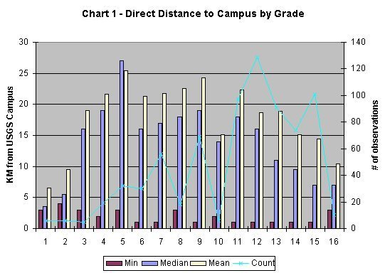
The easiest way to measure distance to the USGS campus is create a set of polygonal rings emanating out from the USGS campus like ripples. These polygonal rings were used to code the employee records with a straight-line, or direct distance, to work. The "spatial join" operation within ArcView transferred distance information from the polygonal rings to the employee records used. The "summarize field" function created statistics on distance to Menlo Park for a variety of employee categories. The median direct distance to Menlo Park campus is 15 km (9.3 miles)while the mean is 19.2 km (12 miles). Chart 1 shows that the maximum direct distance to campus varies between federal government general schedule (GS) grades, but the means are relatively consistent. The second axis on the Chart 1 plots the number of observations per grade. The few observations for grade 10 help explain why both its mean and median appear lower than the trend. A regression of division and grade showed no significant relationship to the direct distance to the Menlo Park campus. Direct distance is not necessarily a good measure of travel since living 20 miles down the road from the office is very different from living 20 miles across the bay.
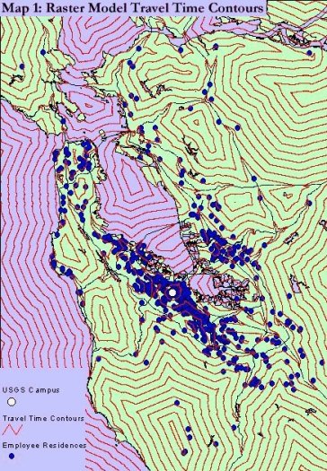
Since the direct distance is an oversimplification of the route Menlo Park employees take to work the next step is an attempt to better model real travel. One way to model real travel is to take into account roads and road size. The effort to create a more realistic picture of the commuting distance uses the USGS transportation data layers. The major roads provide network that employees use to get to Menlo Park. Of course, minor roads and city streets are crucial for commuting as well, so both must be included in the analysis. Queries in ArcView can select the different types of roads and convert them into a raster grid. The transformation of roads into a raster surface takes into account the increased speed of travel on major roads without excluding areas accessed by minor roads. Major road cells within the raster grid received a higher speed value than the surrounding area. Contours derived from the major roads raster model are shown in Map 1. The raster road model included two different ratios between the speed on major roads and areas accessed by minor roads. In the first model, travel on highways was assumed to be 5 times faster than areas accessed by minor roads; a ratio of 1 to 5. A second ratio of 1 to 10 reflects a travel time cost increase of 10 times off the major highways. Neither model of travel time was able to predict more than 1% of the variation in employee grades. In other words, commuting time, as depicted by the raster road model, failed to reveal any connection between grade and distance to work.
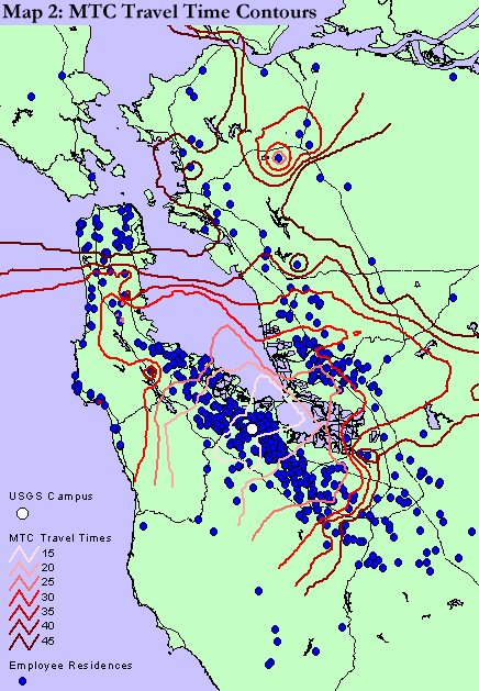
The Metropolitan Transportation Commission (MTC) provides the third model of distance by mapping travel time to work. The MTC has records for travel between Menlo Park and cities throughout the bay area from 1990 (MTC 1990). GIS linked the MTC data into the rest of the analysis based on the geographic location of cities. In this case ArcView tied the Esri city data to the MTC travel time information using city name. The resulting point map generated a set of contours of travel time to Menlo Park in 15-minute increments. Map 2 shows the MTC travel time contours. A statistical analysis of MTC travel times compared to employee grade indicates that an employee’s GS grade predicts about 15% of the variation in travel times at the 95% confidence interval. The MTC data suggests that there is a slight downward trend in travel time to work with increasing grade. However the regression is not predictive enough to make any decisions based on the slight downward trend. The slight connection between MTC travel times and GS grades may mean that the MTC travel time model is an improvement over both the direct distance and the raster travel time model.
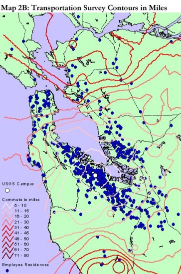
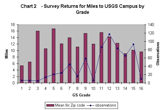
The final option for measuring distance in this case is based on survey information. The city of Menlo Park conducts an annual travel and transportation survey of area business. The city made available the 1994 survey data available for the USGS. The survey included a question on the home zip code of the respondent as well as the one way mileage to work. The home zip code provided the link to geography for the survey data. An average summarized the reported distance to the USGS campus for each zip code. The Esri zip code shape file provided the centroid of each zip code area. Map 2B shows contours of reported distance to the USGS Campus, interpolated from the 108 zip codes in the transportation survey. ArcView joined the employee residence file and the 108 zip codes together by pairing the zip code centroid with the nearest employee residence. The joined file permitted a summary of employee distance to work extrapolated from the transportation survey data. Chart 2 shows the average number of miles to the USGS campus for each employee based on the zip code. The values in Chart 2 are the result of two averages: first the 108 zip code locations are an average of the survey responses, and second, the value for each grade is an average of employees at that grade. The general trends in Chart 1 and in Chart 2 appear similar. Regression analysis shows that the transportation survey commute distances are even less connected to employee GS grade than the MTC travel time data.
While it appears that employees' commutes do not vary according to their GS grade the Western Regional Council may want to ask other questions which require one or more of these measures of distance to the USGS campus. One of the initial goals for the analysis was to include some type of commuting predictions and forecast travel time into the future. Unfortunately the relatively weak data on current travel times did not provide a good base on which to build future scenarios.
Census Data
The analysis of commuting to Menlo Park can make use of a range of demographic considerations by including US Census Bureau data. The US Census Bureau collects data on all sorts of demographic information from the costs of housing to the educational level of the occupants. Census tracts divide counties into blocks of reasonably homogeneous populations from 2,000 to 8,000 people. Census tracts stay geographically consistent from census to census except where major changes require splitting or slight restructuring. The Census Bureau’s aim is to maintain consistent areas for statistical comparison between censuses (US Census Bureau). Census data was downloaded from both the ArcData Online web site <http://www.Esri.com/data/online/tiger/index.html> and the Socioeconomic Data and Applications Center’s Demographic Data Cartogram Service at <http://plue.sedac.ciesin.org/plue/ddcarto/>. The Census Bureau also has downloadable files on their web site: <http://www.census.gov/geo/www/cob/tr.html>. The demographic data currently available are from the 1990 Census, but despite their age they paint a picture helpful for understanding commuting to the USGS Campus.
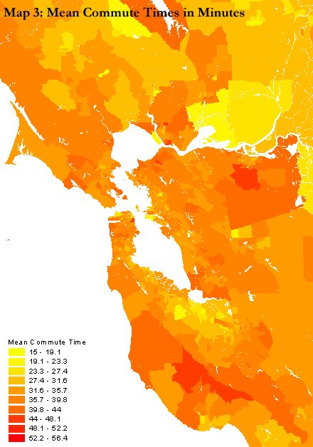
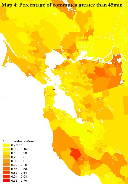
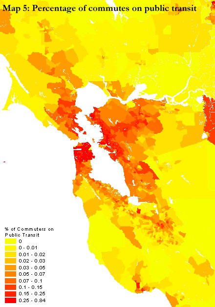
The Census Bureau keeps track of commuting times for each census tract. The commute times for the census tracts are less specific than the MTC data because the commuting destination is not listed. Instead, the population of each tract is broken into four groups based on the length of commute. The population weighted summation of commute times yielded a mean commute time for each census tract. Map 3 shows the mean commute times for the bay area by census tract. The census data in a GIS allows for a view in Map 4 of the percentage of the population in each census tract that has to commute longer than 45 minutes to work. A visual inspection of this map suggests that the percentage of the population that commutes more than 45 minutes is lower in the bay area's urban centers. Map 5 is almost the geographic inverse of the previous map. Map 5 shows the percentage of the population in each census tract that uses public transit to commute. Again the bay area's urban centers are highlighted by the commuting data. These three maps provide a small sample of the demographic statistics that can be mapped out for the bay area.
How do USGS employees fit in the bay area regional commuting picture? The MTC provides a way to investigate commutes to Menlo Park compared to other commutes. The employee residence locations can link to census tract mean commute time data, just as they link to MTC commute time data, via geography. The MTC commute times to Menlo Park and the mean census tract commute time are comparable once they are both in the employee residence file. A comparison between commute times to Menlo Park and mean commute times answers the question: Is commuting to Menlo Park more or less time consuming for USGS employees than their neighbors commutes? The answer is not clear cut but in 79% of the cases commuting to Menlo Park is shorter than the average commute for the census tract. This suggests that while commuting to Menlo Park can be a problem, it is no more difficult than most commutes.
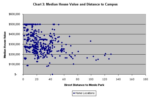
Census data can also introduce other demographic elements to the analysis of commuting to Menlo Park. Many of the variables recorded in the census impact commuting directly, such as use of public transit, or indirectly, such as housing costs. Geography integrates the demographic data from the census with the home locations of USGS employees and their commuting distances. The spatial aggregation of the census data helps maintain anonymity for employees. Additionally, the aggregation gives a neighborhood view based on many more data points, covering more area than data on just the ~750 USGS employees would. Chart 3 shows the relationship between direct distance to Menlo Park and the neighborhood median house value. The individual houses in which the USGS employee lives may be more or less than the median value for the census tract. However, the median value for the neighbor provides a good estimate for the costs a new employee might face buying into the neighborhood.
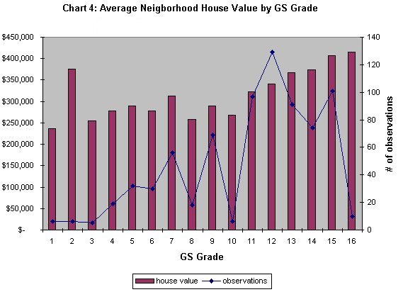
Chart 3 suggests that USGS employees who live further away from the campus live in neighborhoods with a lower median house value. Regression analysis indicates that the direct distance from the USGS campus explains approximately 15% of the variations in the median neighborhood house value. The median house value in employees' neighborhoods can also be compared to their GS grade level as in Chart 4. Chart 4 suggests that employees with a higher GS grade live in neighborhoods with higher median house values. While this is not a surprise, it supports the theory that lower GS level employees might not be able to afford the same housing options as higher GS level employees. The right axis of the chart records the number of observations. The scarcity of observations in the GS 2 grade helps to explain why it does not conform to general trend.
Regional
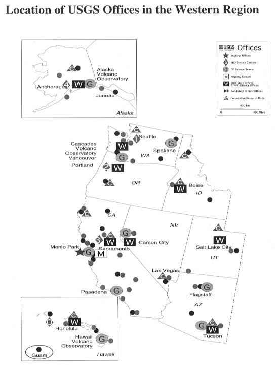
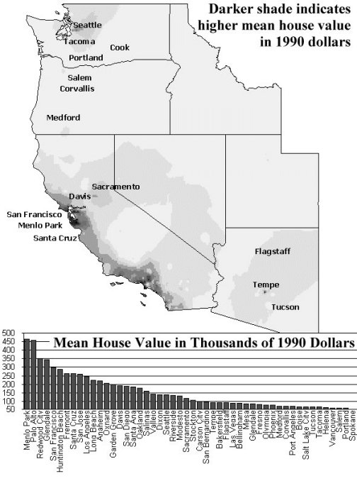
The next level of consideration for planning at the USGS Menlo Park campus is regional. How do the issues of bay area commuting compare with the rest of the western region? How does the Menlo Park location compare with other current and potential locations? Map 6 shows the location of USGS offices throughout the western region. GIS can improve the understanding of these locations by mapping the geographic characteristics of the region. Housing cost is an important characteristic in the Menlo Park area that can be expanded to regional scope. A surface showing the mean house value as a continuous variable throughout the western region is a useful way to visualize the phenomenon. Map 7 shows the continuous surface of house mean house value in 1990 interpolated from the cities listed in the graph at the bottom of the map. Of all the locations for offices in the western region, none had as high a mean house value as Menlo Park in 1990. The high cost of housing might provide incentive for USGS to shift or increase its presence in other areas over the long term.
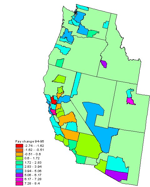
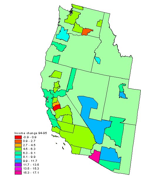
Where are good locations for USGS offices? The US Census Bureau records provide some clues to answer that question. Some of the census variables of particular interest for planning office locations are salary and income. Maps 8 through 10 focus on the counties or groups of counties that house the census' metropolitan areas. Aggregating at the county level may not always be ideal, but for this regional view it provides a good overview of general trends. Map 8 separates the counties by personal income per capita. It is not surprising to see the Seattle area and the San Francisco Bay area highlighted, but Reno and Santa Barbara's prominence might not be expected. Map 9 paints the metropolitan areas with colors according to income change between 1994 and 1995. Focusing on the increase between 1994 and 1995 unveils trends that are hidden in the static snapshot of income from 1995. In the Portland area, incomes grew an average of 8.5% from 1994 to 1995, while the Phoenix area grew over 10% (Census 1990). If Portland and Seattle continue to grow at exactly the same rates, then the Portland metropolitan area would have a higher per capita income in 6 years. While this is an unlikely scenario, it shows that the geography of changes is as important as the current conditions. Map 10 shows change, this time in pay between 1990 and 1994. The Census Bureau uses the primary metropolitan statistical areas (PMSAs) instead of the larger MSA for this metric, so Map 10 is at a slightly finer scale. The finer scale of the PMSAs allows for the distinction between the Seattle area and the Tacoma area or the San Francisco area and the Oakland area. Maps 8,9, and 10 are based on data from the Census Mapper CD, but the CD is just a small sample of the records the Census Bureau keeps. Use of more detailed census tract data opens other analytical options.
Suitability analysis
The census data can be taken a step further by integrating together a number of variables into one map. The overlay of data can show the coincidence or relative scarcity of benefits. The combination of multiple variables through map overlay provides a way to model site suitability. The style of site suitability analysis used here is essentially the same as introduced by Ian McHarg in his 1969 work "Design with Nature" (McHarg 1969). Where McHarg used color on transparent map overlays, this analysis employs numbers on a digital map. This site suitability analysis is an example of what is possible, which could easily be tailored to planners' specific questions.
This analysis is focused on the geographic mechanism for identifying suitable sites, not the decision about which factors are most important for locating facilities. However, some obvious factors important to siting science offices include the availability of trained workers and property costs. Since maps of the availability of skill workers and office facilities are not directly available, census data fills in as an analog. The mean house value is a reflection of cost of property, and the percentage of the population with graduate degrees can be used to map likely locations of skilled workers. The comparison of mean house value and the population with college degree might suggest good locations for USGS science centers.
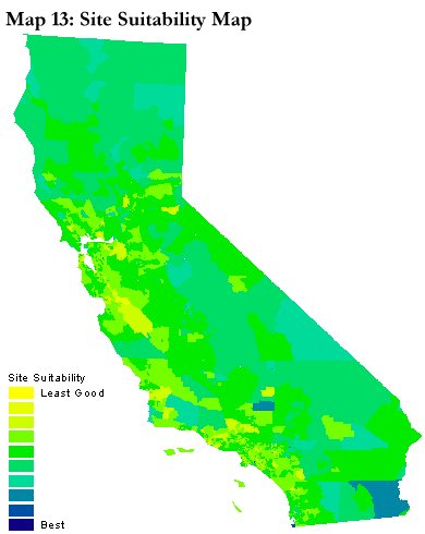
Maps 11, 12, and 13 are composites of the census tracts for each county in California. The map could be enlarged to show the entire western region. The small scale of the regional map would obscure the detailed information of the census tracts, so for this initial effort only California was used. California alone contained over 5,600 census tracts. Map 11 grades the median house value from 1990 on a ten point scale, which divides the median house values into ten quintiles. The ten-point scale is all-inclusive. The analysis includes all census tracts even if they have no housing, or if the cost of housing is astronomical. A limit could exclude census tracts with housing cost beyond a certain level, but truncating the range might frustrate time series comparisons. Additionally, a limited map might hide areas with high house values but also very high numbers of well trained potential employees. A final reason not to exclude any areas is the potential for surprising options to emerge from the map. Creative possibilities for office location might appear in an area on a combination map which common sense would have suggested excluding (Tomlin 1990).
Map 12 divides the percentage of the population with graduate degrees into a similar ten-point scale. The scale for the two maps is reversed so that high concentration of graduate degrees is positive while high house values are negative. Map 13 averages these two maps together, which creates a map with a one to ten scale. A value of ten on Map 13 represents the happy coincidence of high percentage of graduate degree holders and low house values. Map 13 is an effort to display suitable office sites, areas likely to have both low property costs and a well-trained potential workforce.
Other factors can be added into the site suitability map. College degree holders could be included to capture a better measure of the potential workforce. The Census Bureau records could create a more inclusive education component with differential weights for each of the levels of education. The ethnic makeup of the population listed in the census could add to the site suitability model if a diverse potential workforce was a desirable element. The suitability index could include any number of other census data such as availability of public transit, income levels, and population age makeup. Additional analysis could bring geographic factors such as proximity to other USGS facilities into the suitability index as well. The decision about which variables to include in the suitability analysis should depend on what decision makers value or want to avoid in siting a facility. It is the geographers' job to construct and map these variables.
Conclusion
This project started out as a simple cartographic question about mapping employees' locations. It grew as GIS exhibited its ability to provide a new insight into geographic phenomenon. The final stages of this project serve as a road map for future work. Depending on the planners' needs, the analysis could follow many different paths. More effort could go into better models of distance, travel time, and forecasts of future commuting. Mapping of commuting times could be tailored to justify a new telecommuting policy or more flexible schedules. The site suitability model could be built on a regional scale based on planners' requirements to site new offices. Whatever the final destination of the project, geographic analysis will improve the ability to make a good decision.
References
ArcData Online, Environmental Systems Research Inc. (http://www.Esri.com/data/online/tiger/index.html)
Bay Area Regional Database. US Geological Survey. (http://bard.wr.usgs.gov)
Cohen, Stuart and Donham, Matthew. Downward Mobility. Berkeley, CA: Bay Area Transportation Choices Forum. 1999.
Demographic Data Cartogram Service, Socioeconomic Data and Applications Center (http://plue.sedac.ciesin.org/plue/ddcarto/)
Etak, Inc. (http://www.etak.com/geoprod.html)
McHarg, Ian. Design with Nature. New York: Natural History Press, 1969.
Metropolitan Transportation Commission. Electronic Publication #1. Bay Area Place-to-Place Journey to Work Characteristics: April 1993.
Metropolitan Transportation Commission (http://www.mtc.dst.ca.us/)
Tomlin, C. Dana. Geographic Information Systems and Cartographic Modeling. New York: Prentice-Hall, 1990.
U.S. Census Bureau. Statistical Abstract of the United States: 1997
U.S. Census Bureau (http://www.census.gov)
Census Tract information (http://www.census.gov/geo/www/cob/tr_info.html)
Alexander Evans
US Geological Survey
345 Middlefield Rd. MS 531
Menlo Park, CA 94205
aevans@usgs.gov